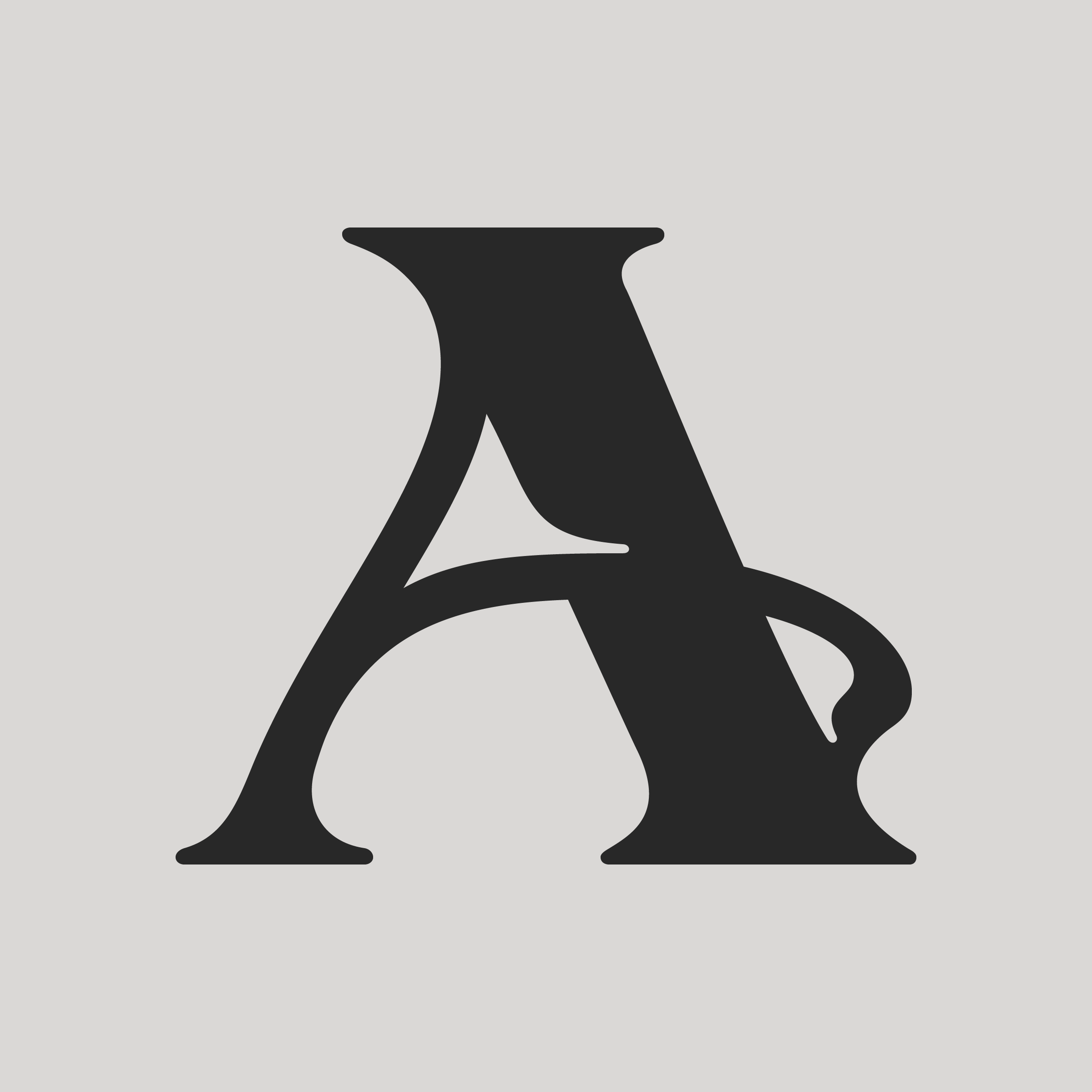
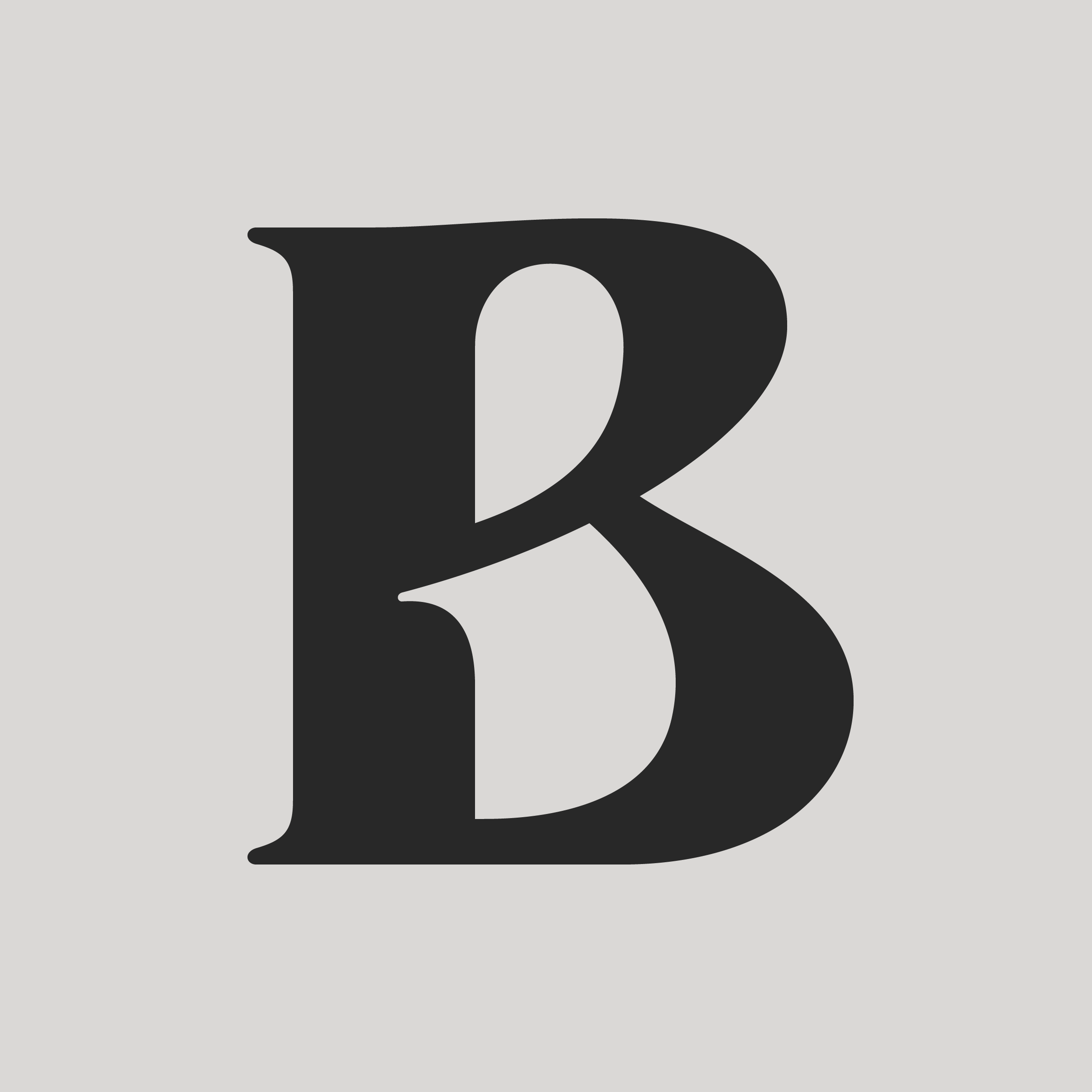
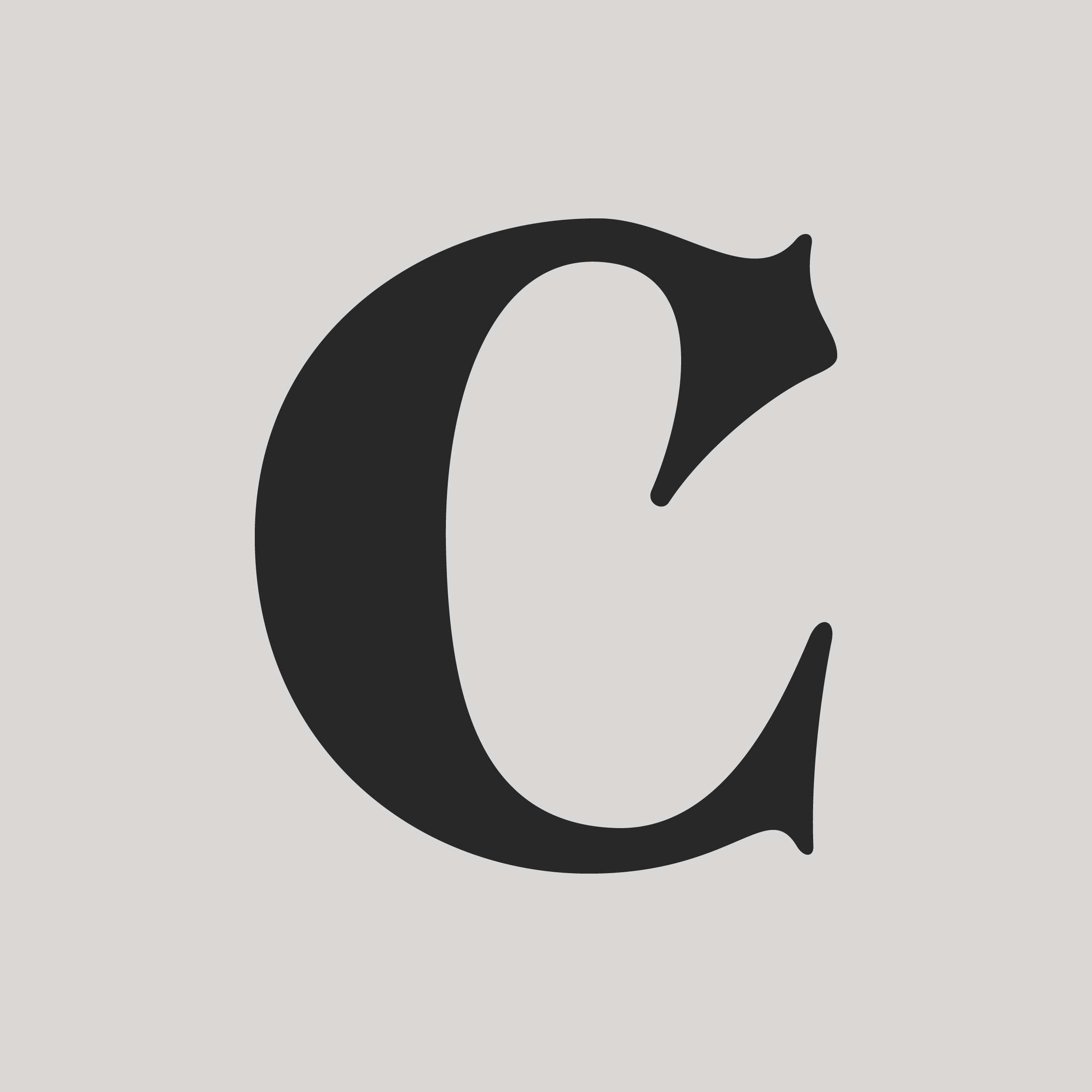
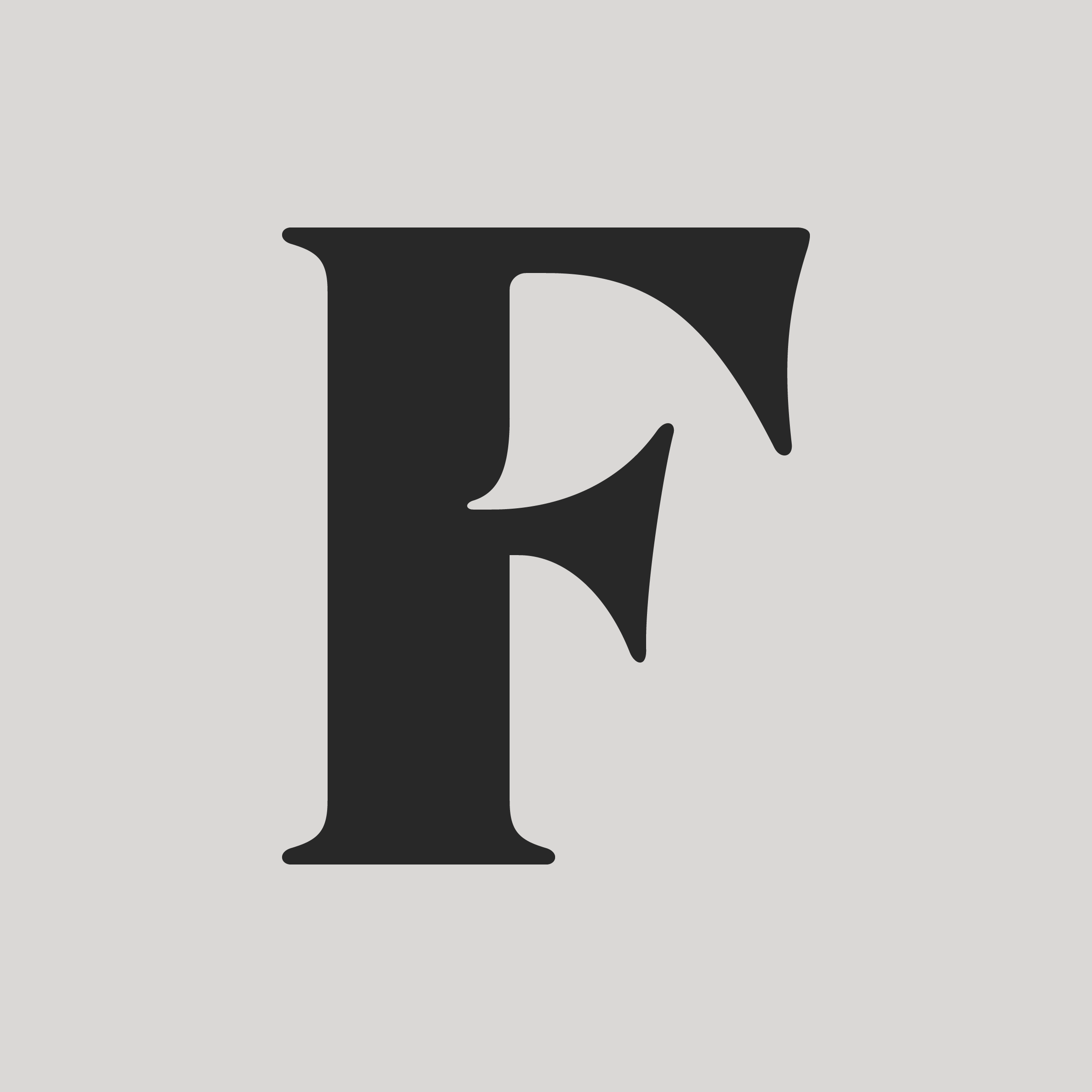
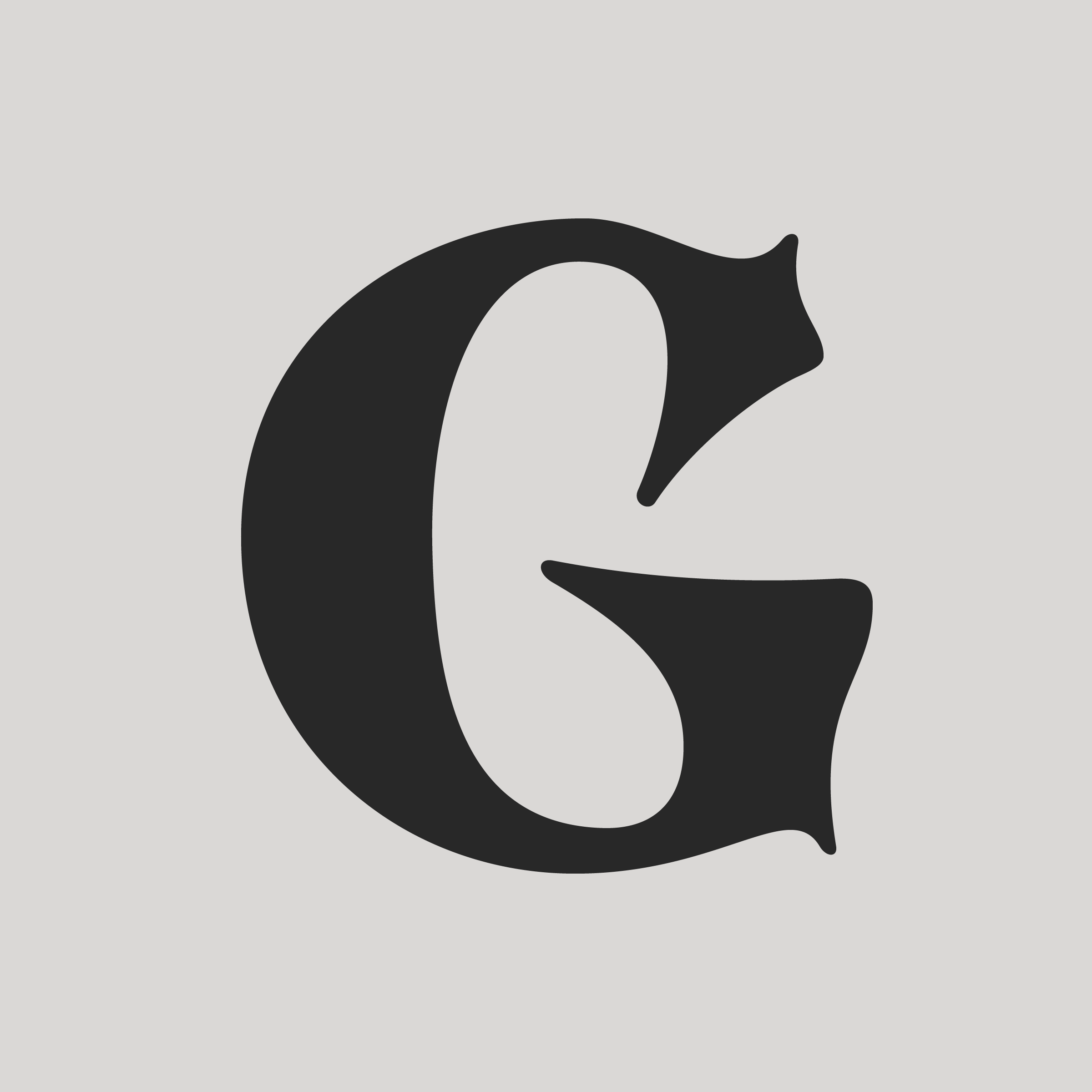
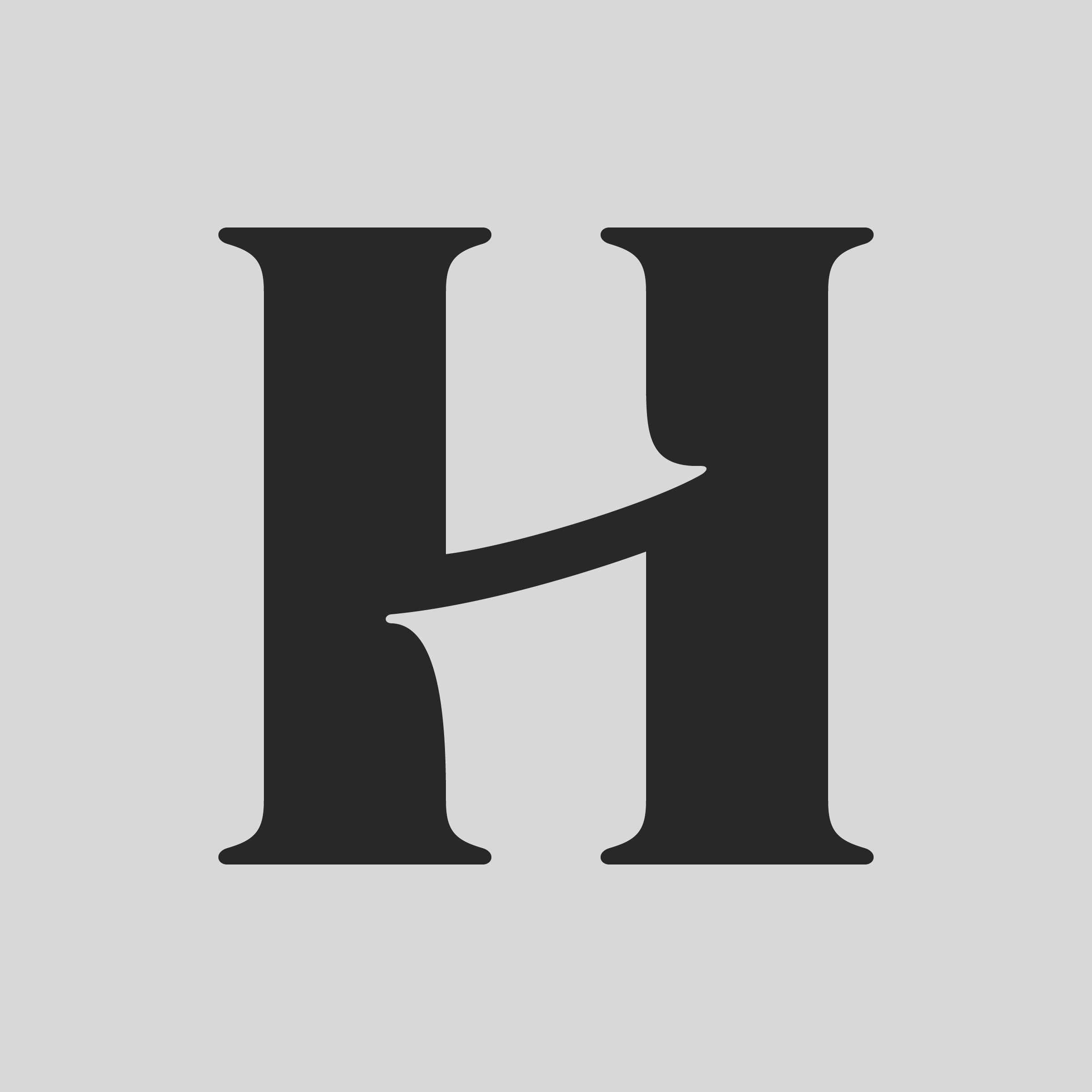
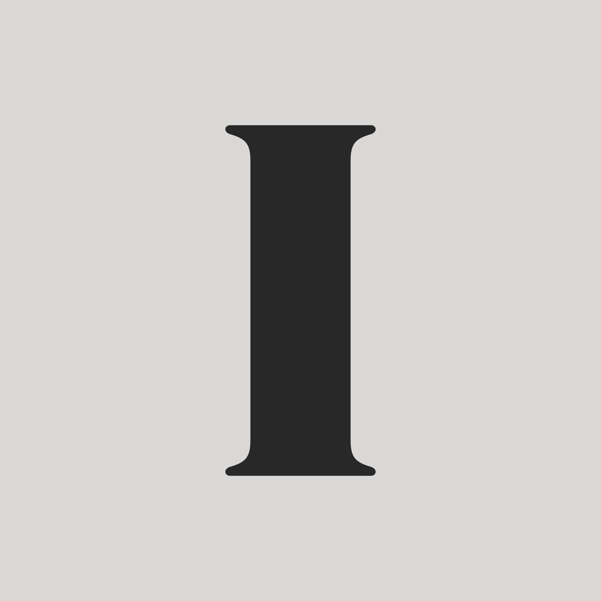
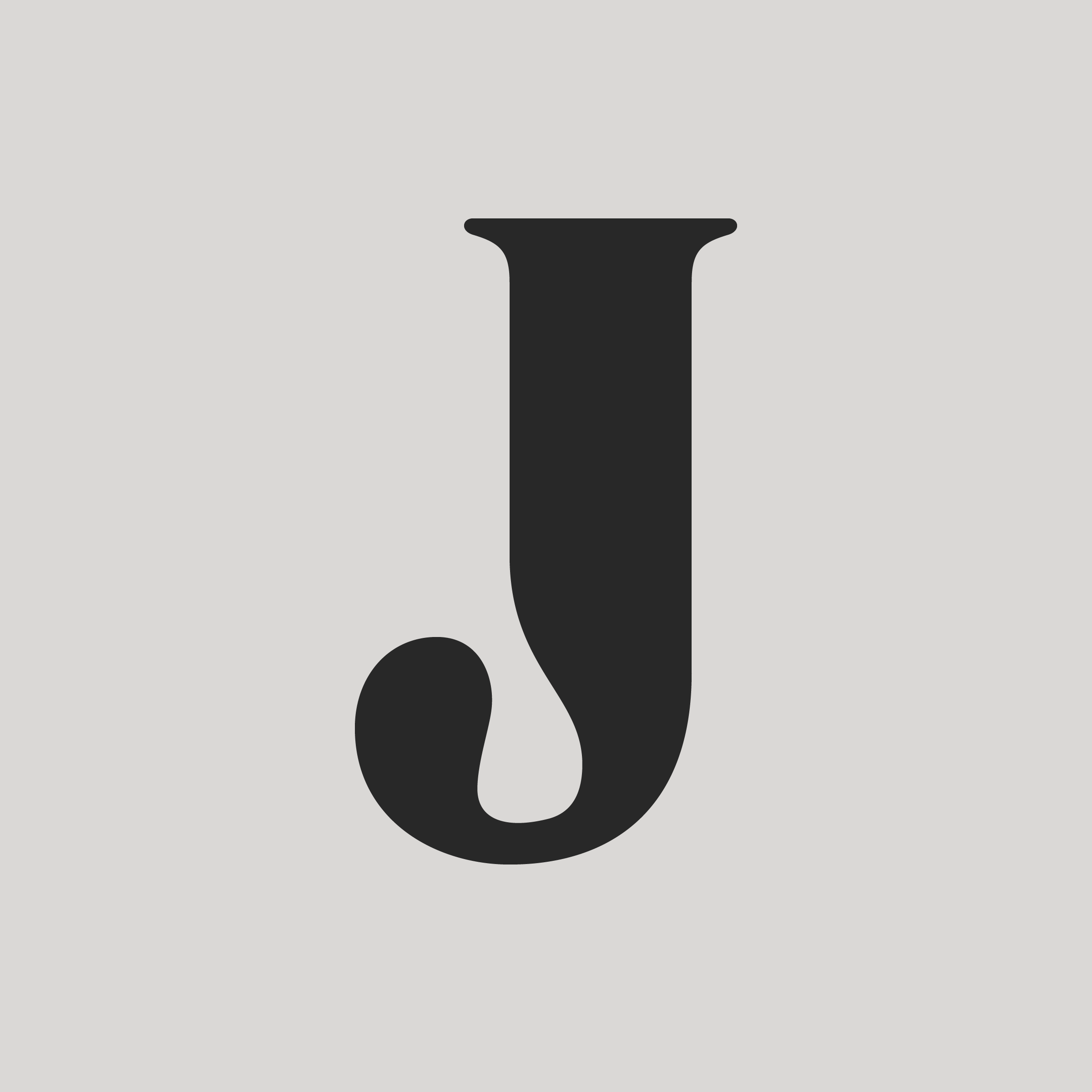
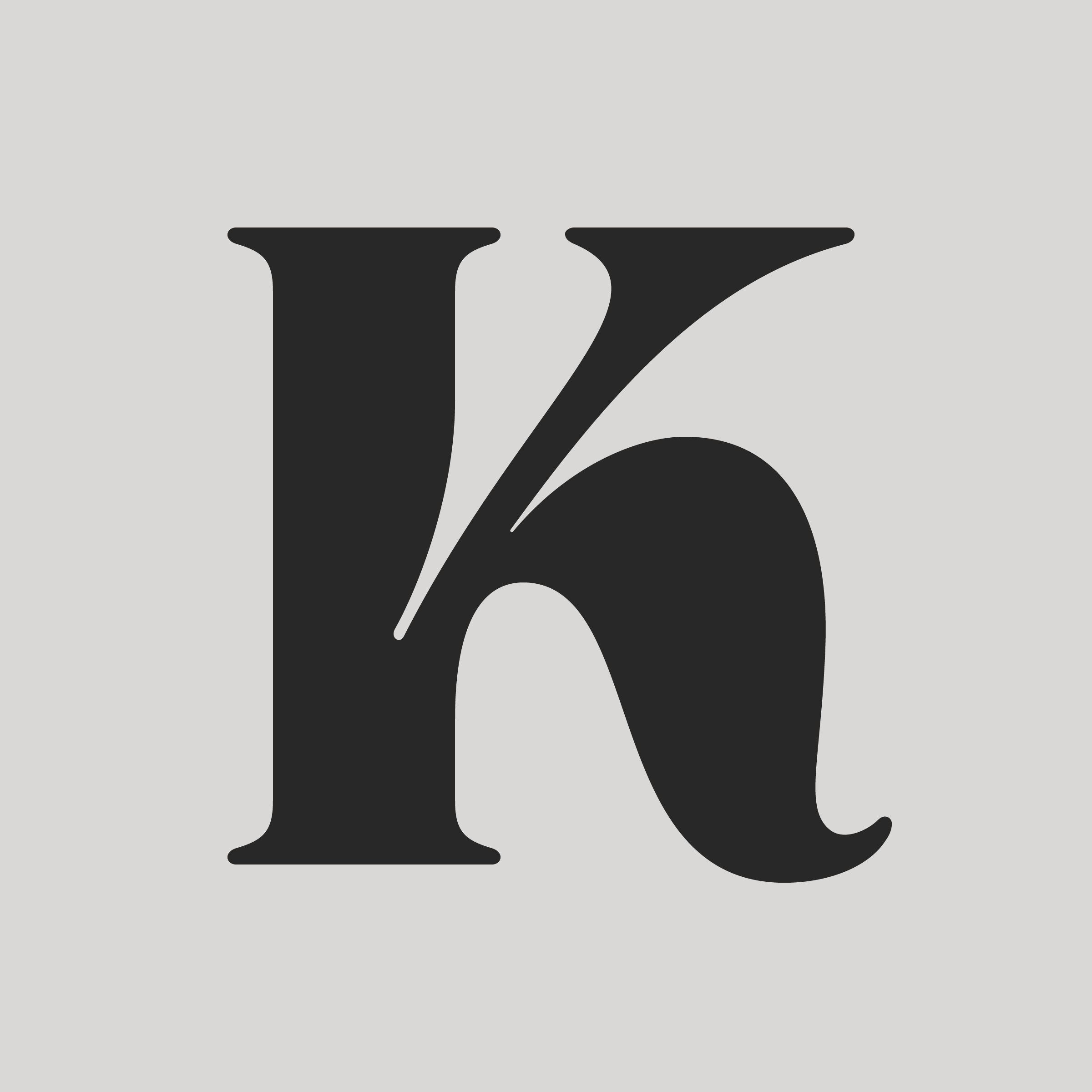
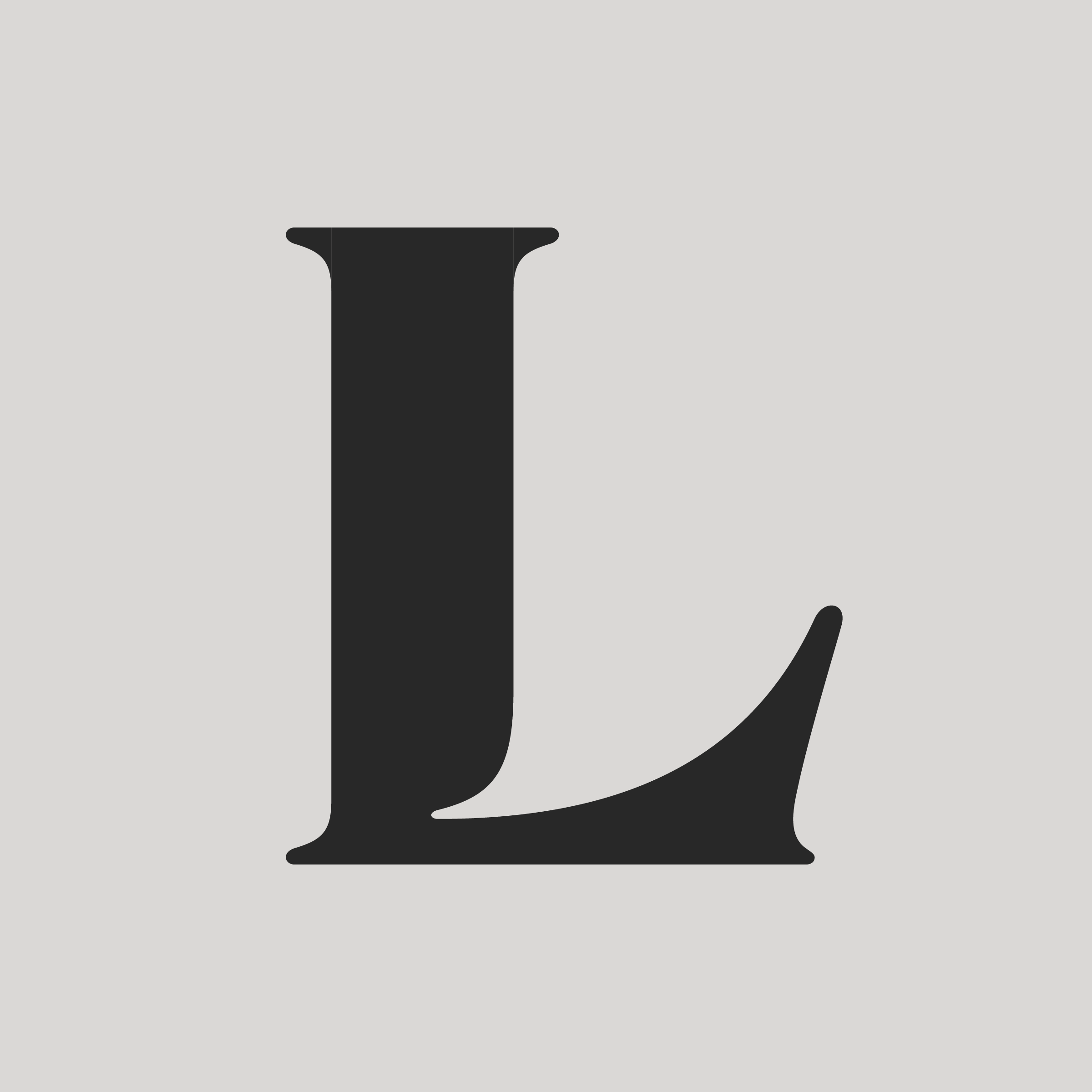
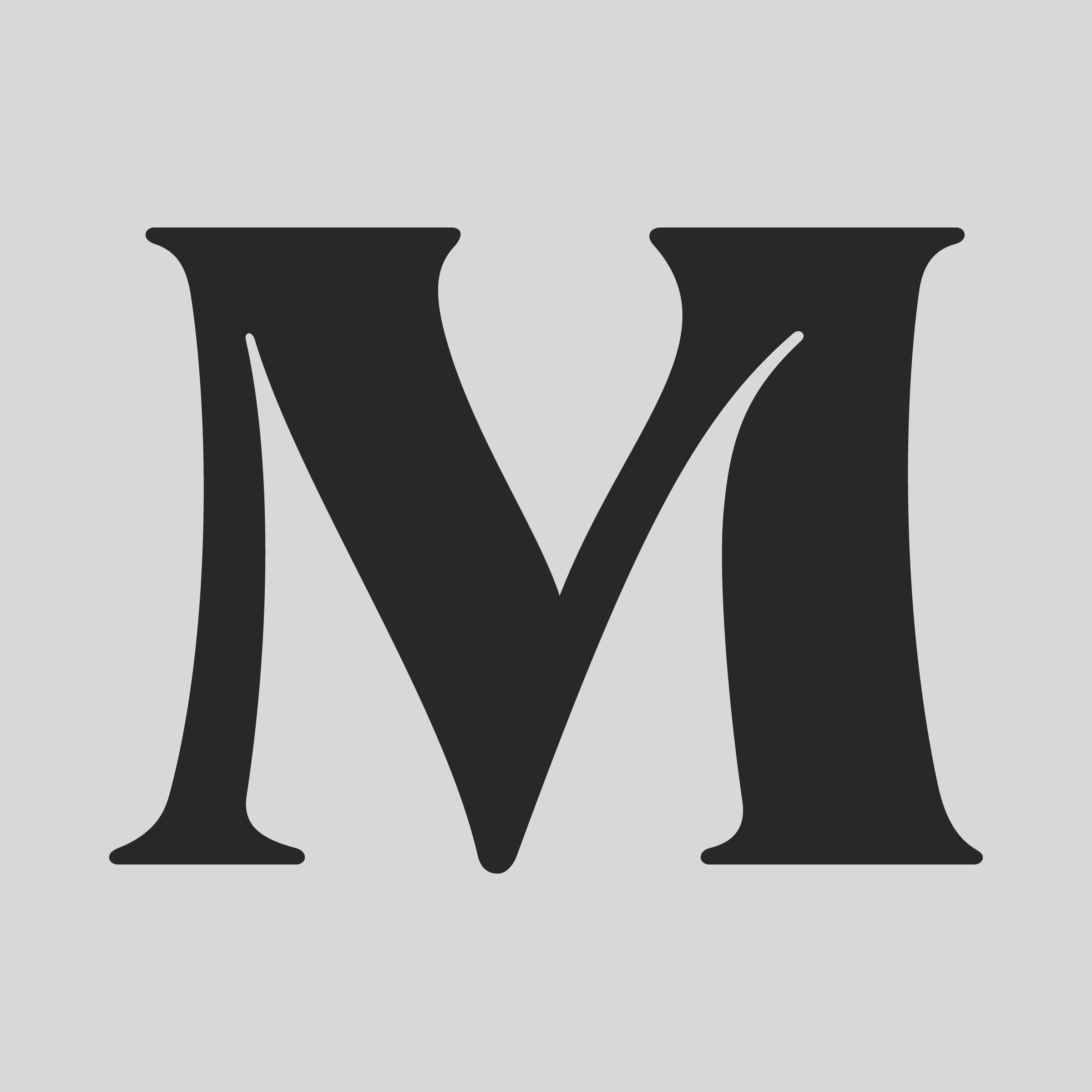
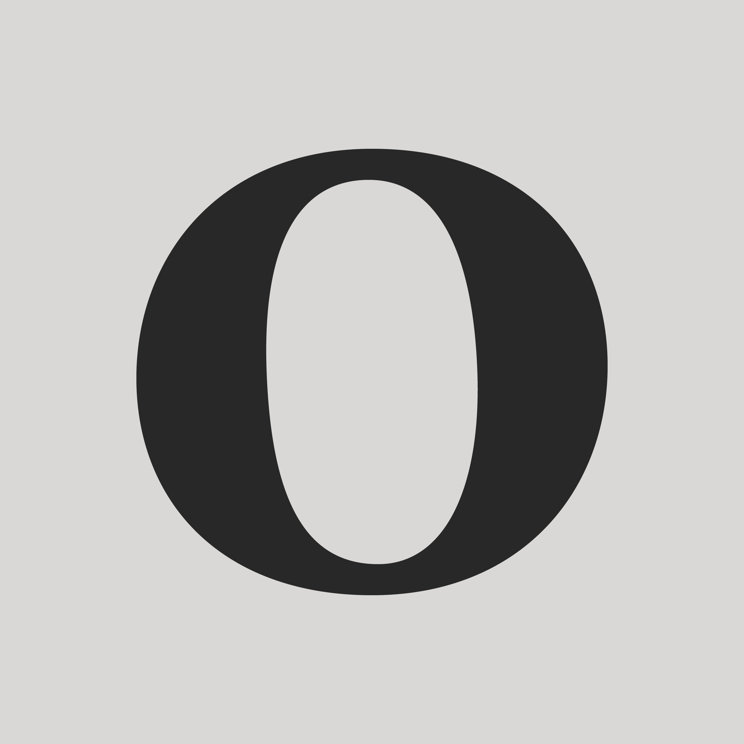
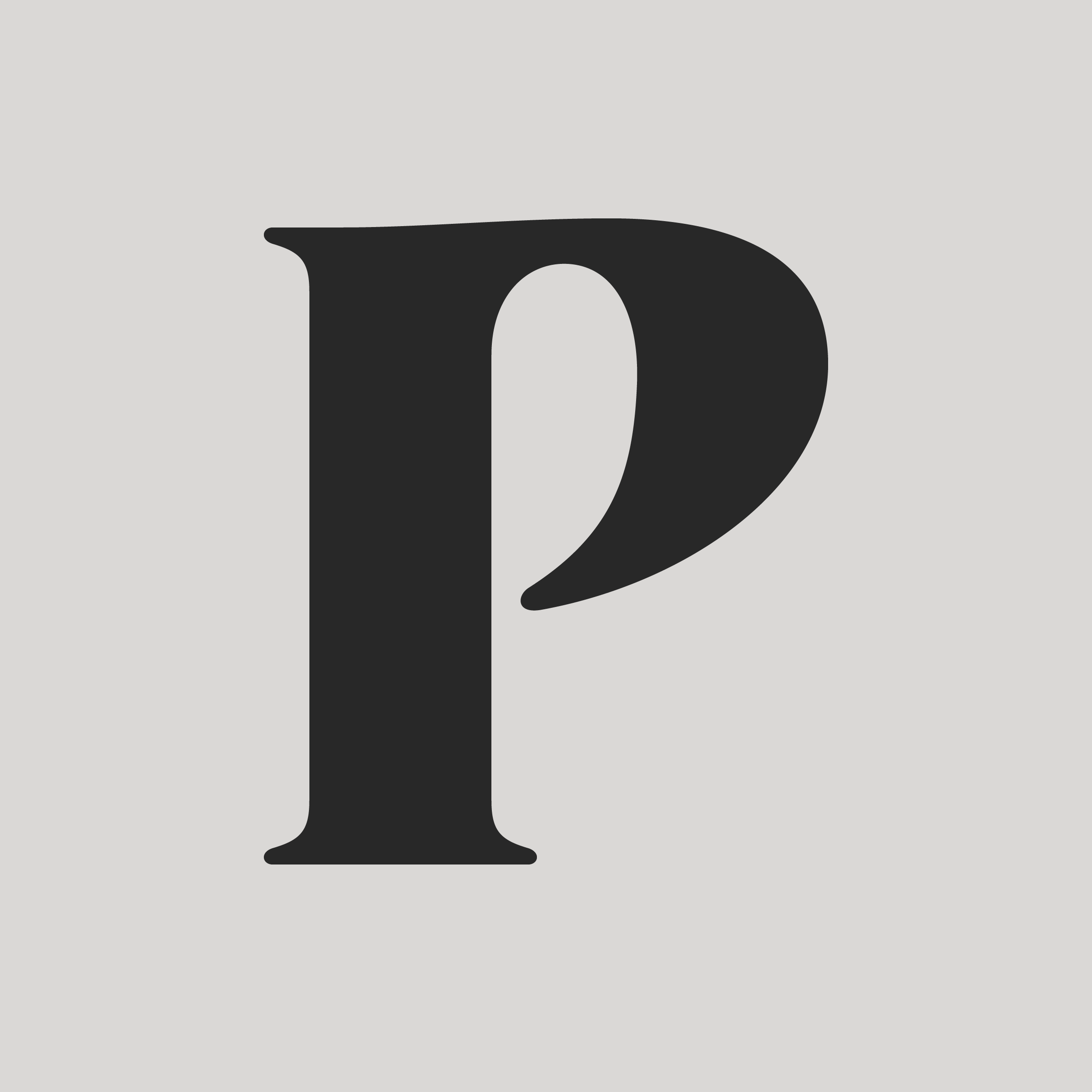
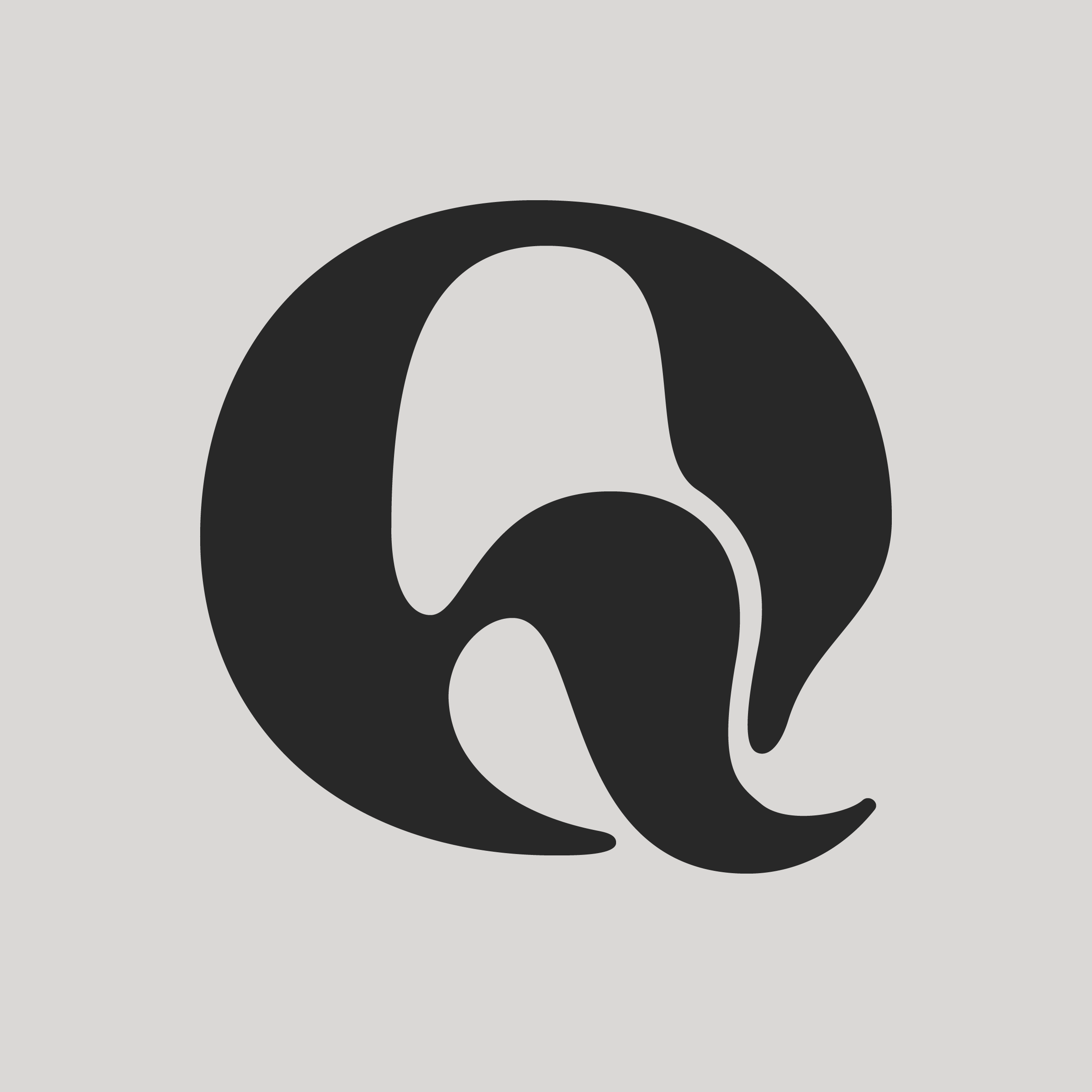
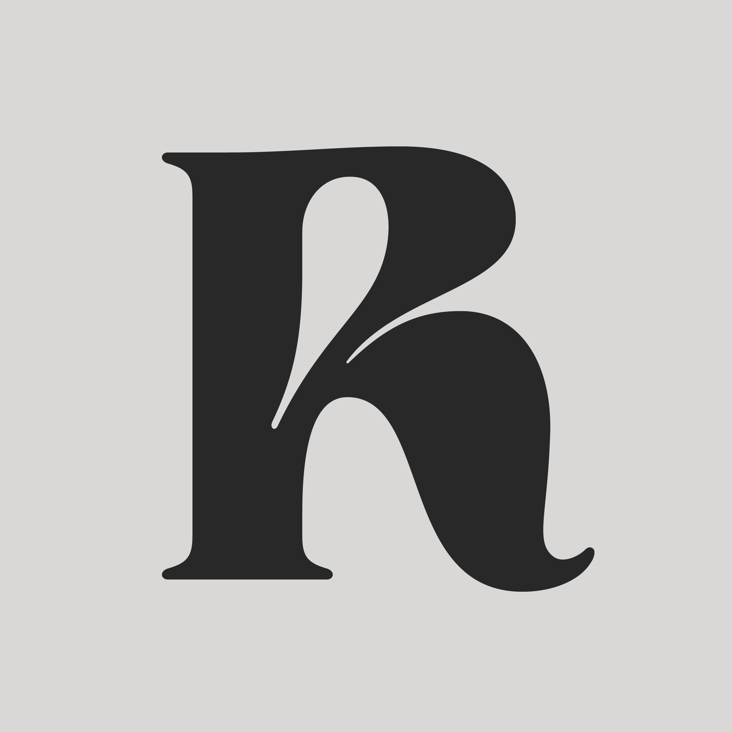
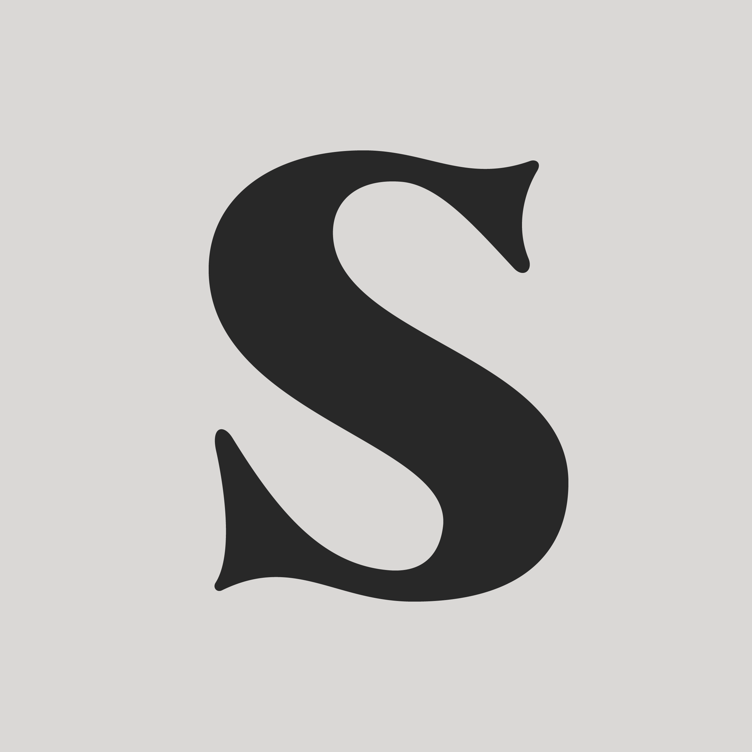
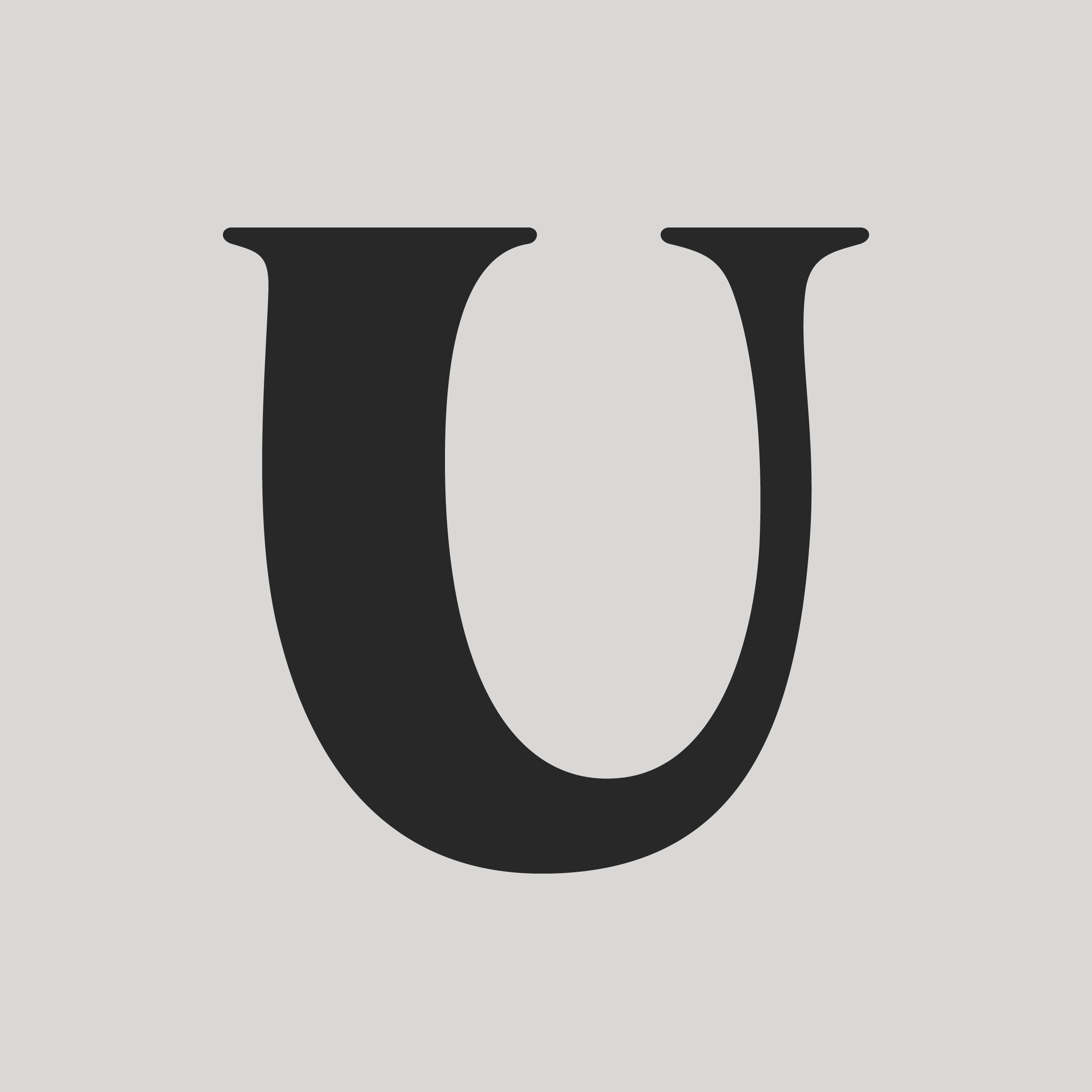
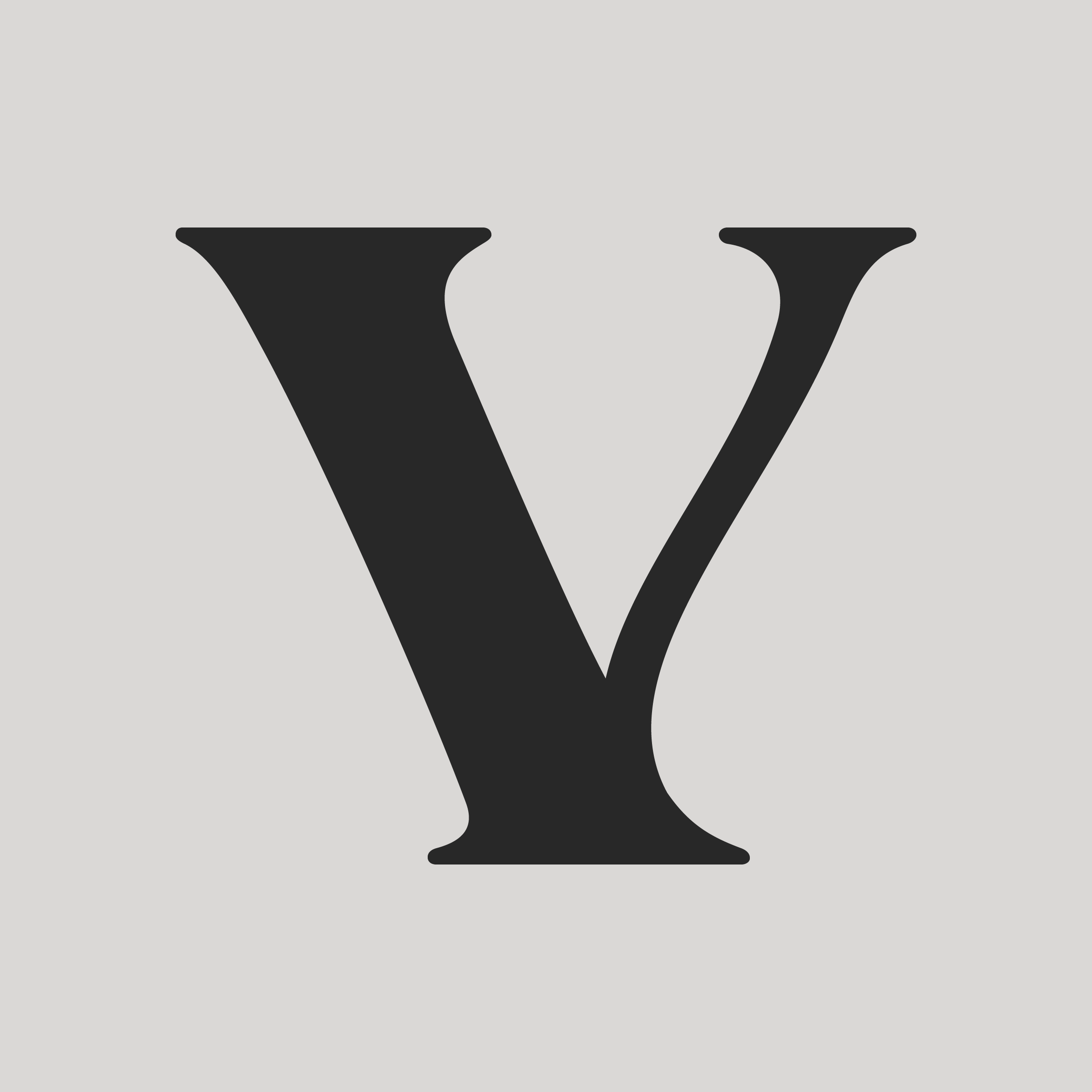
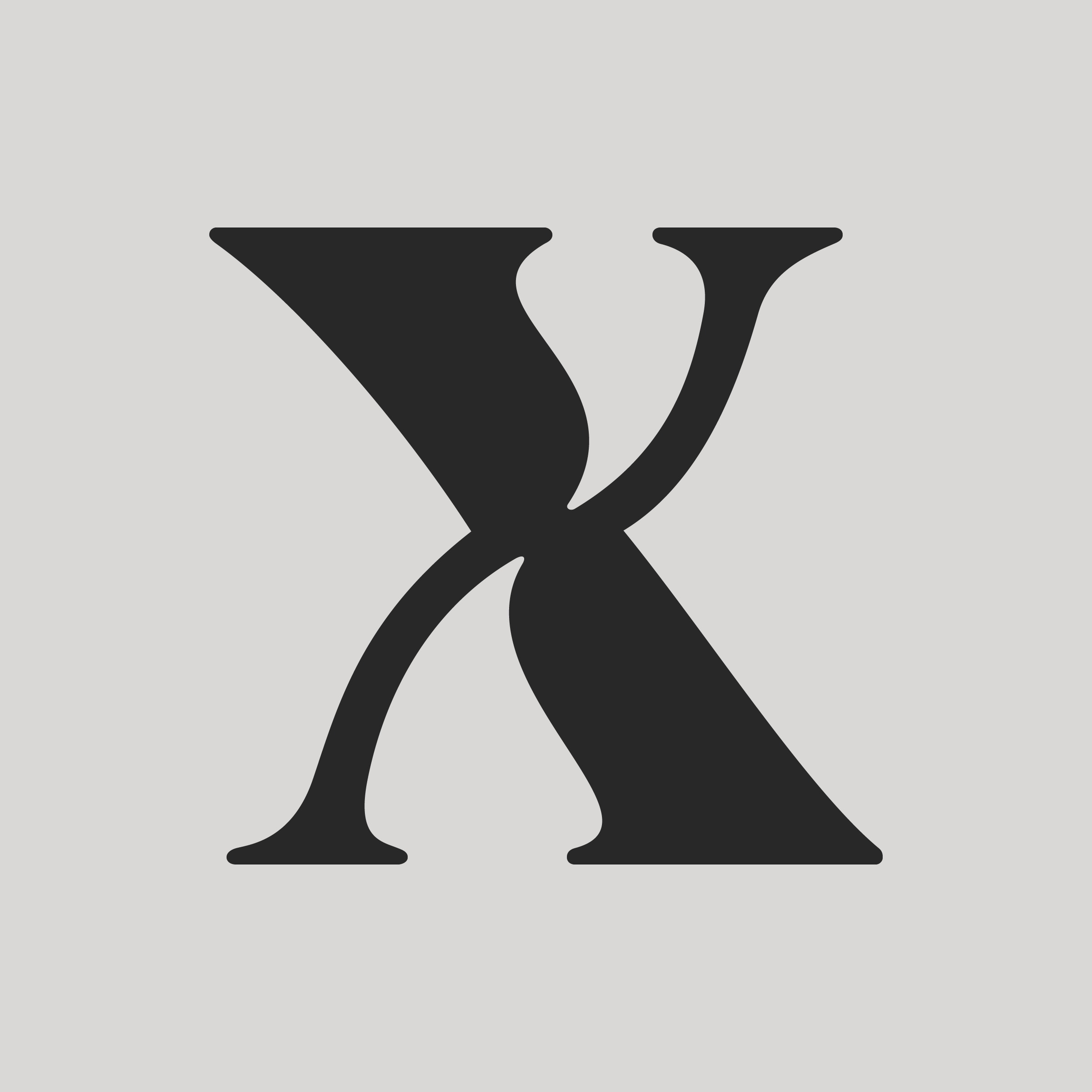
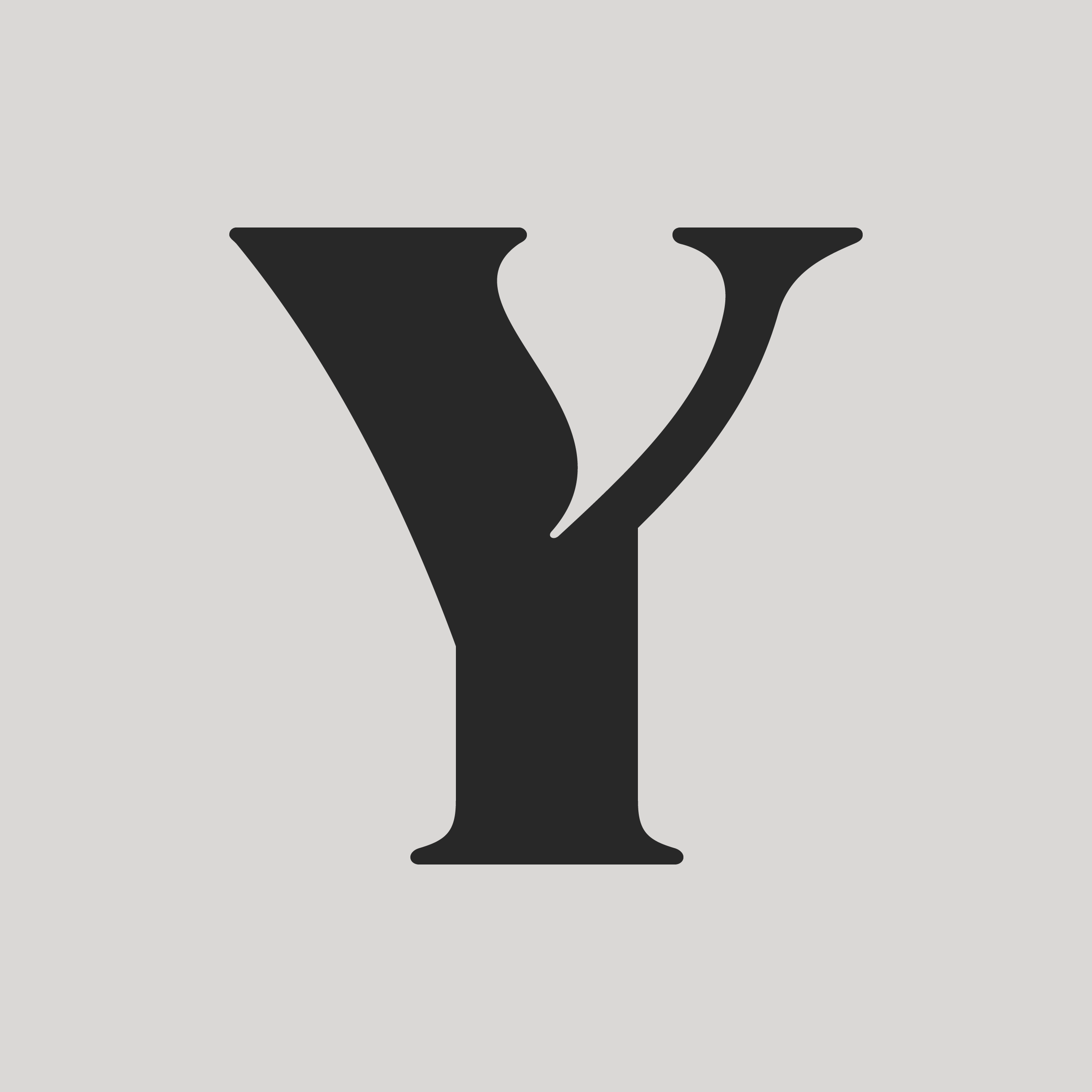
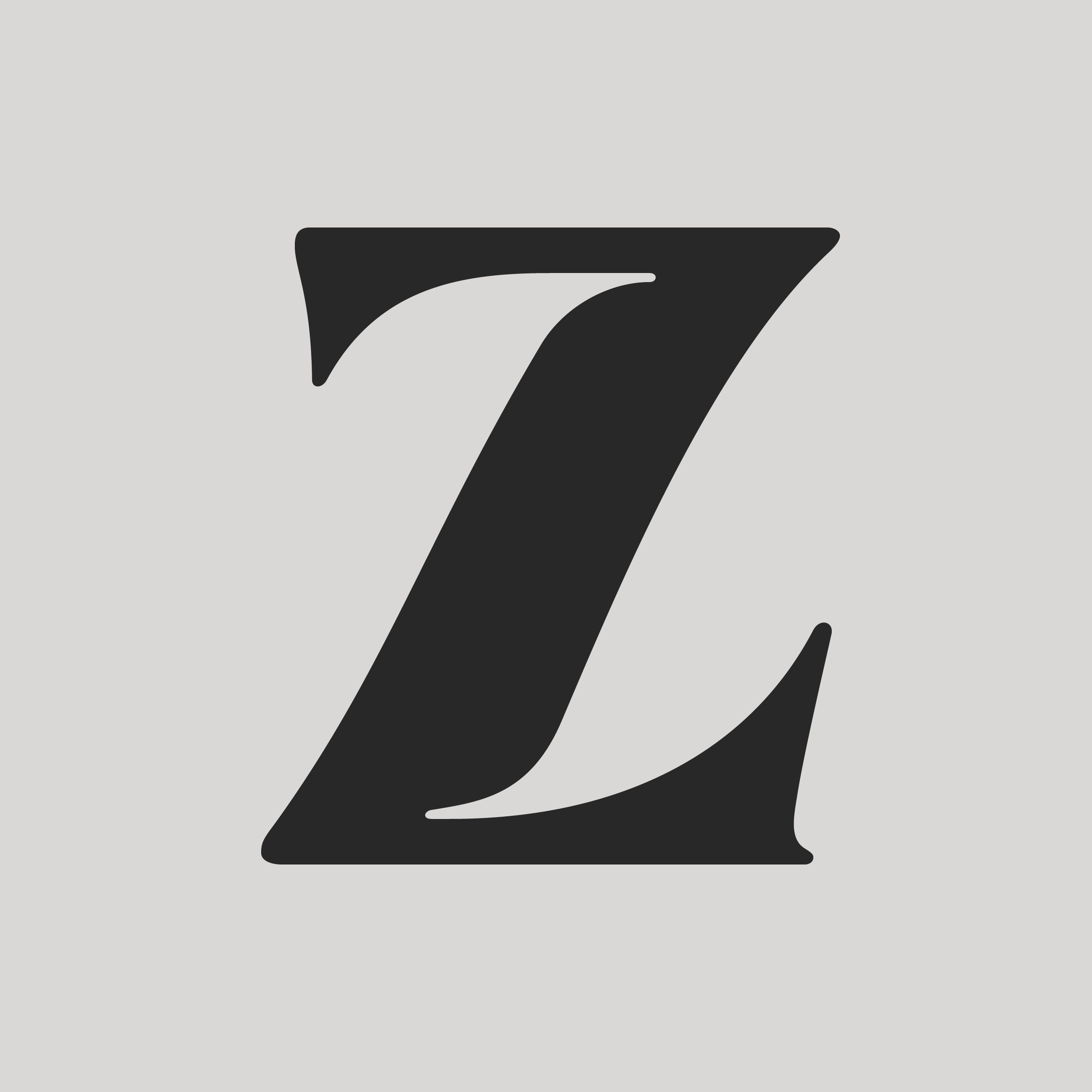
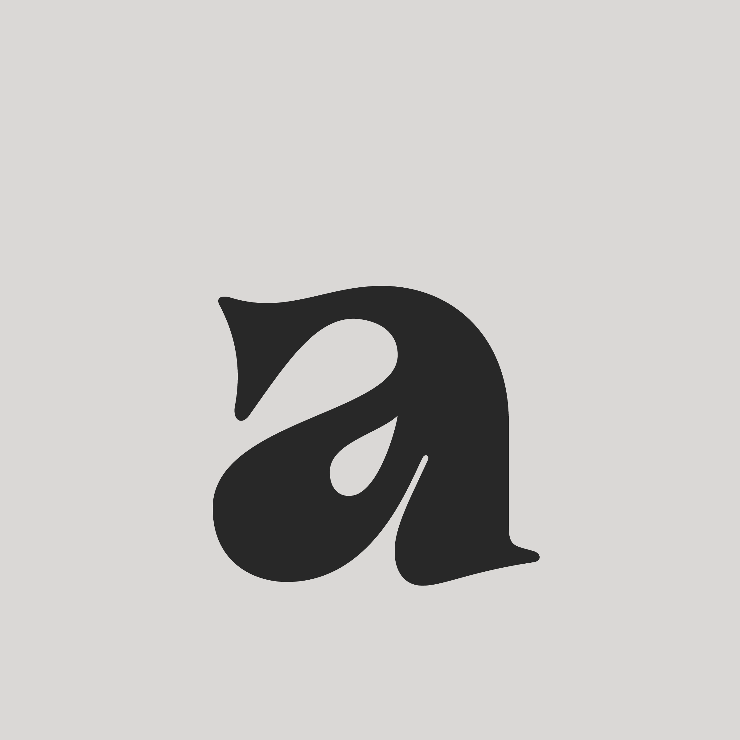
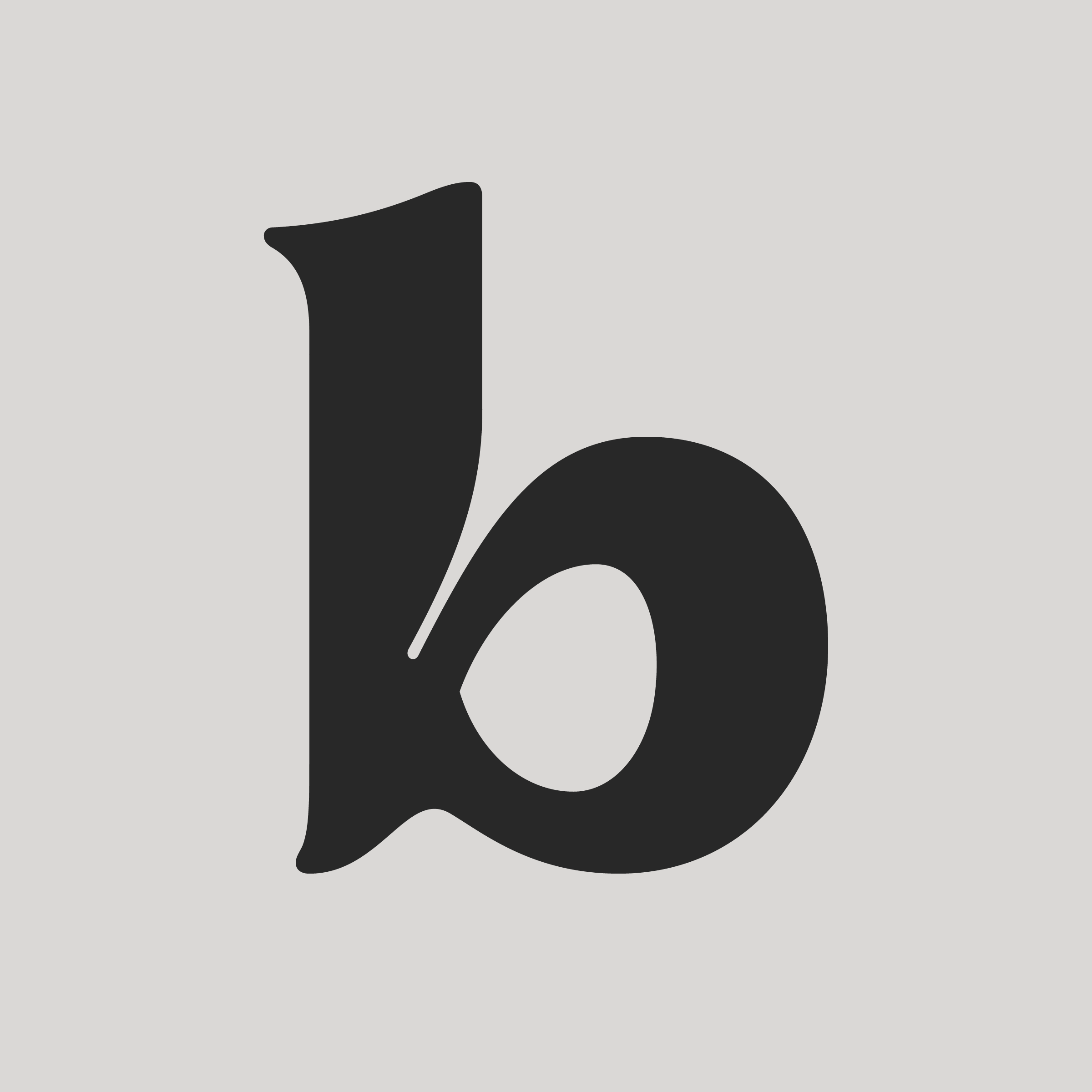
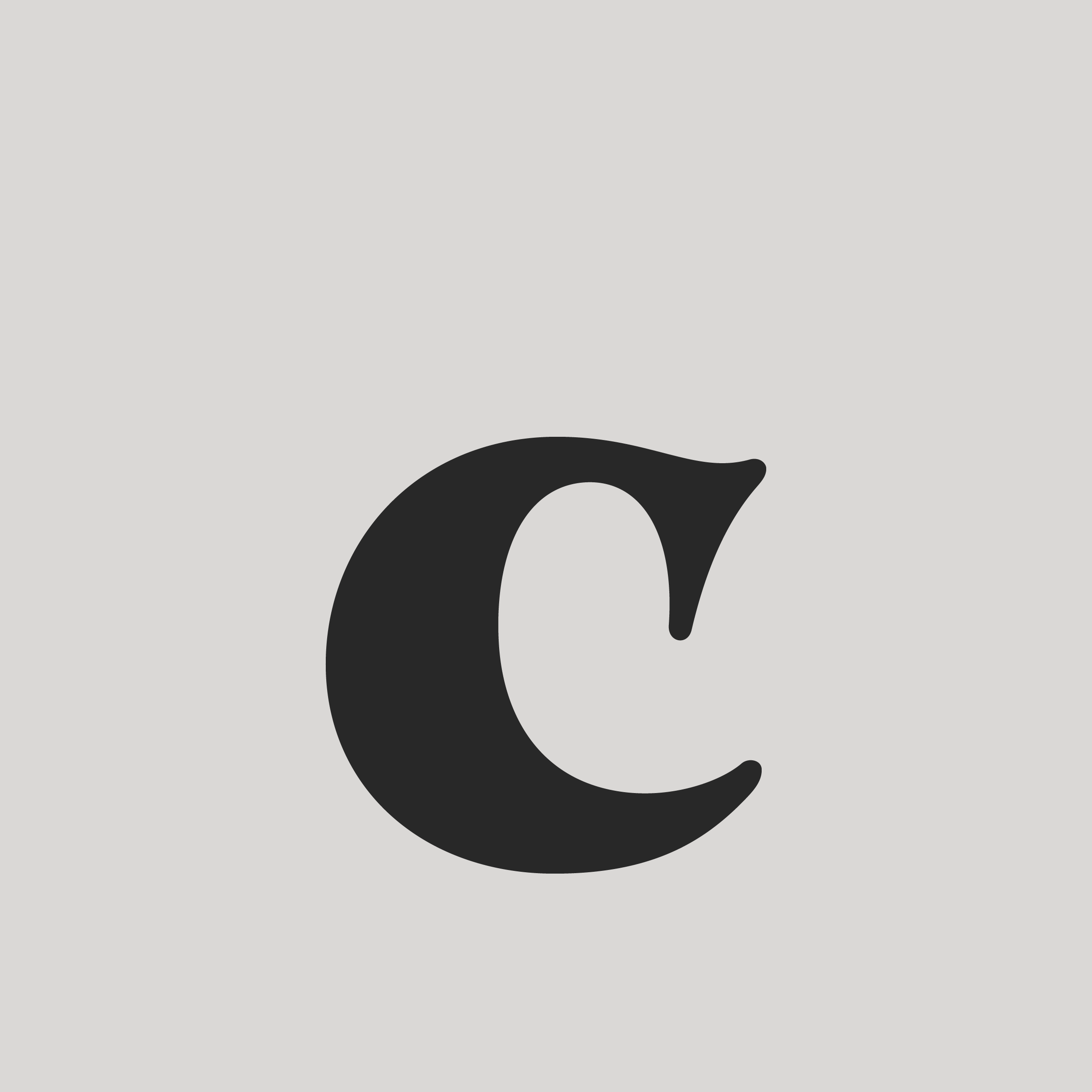
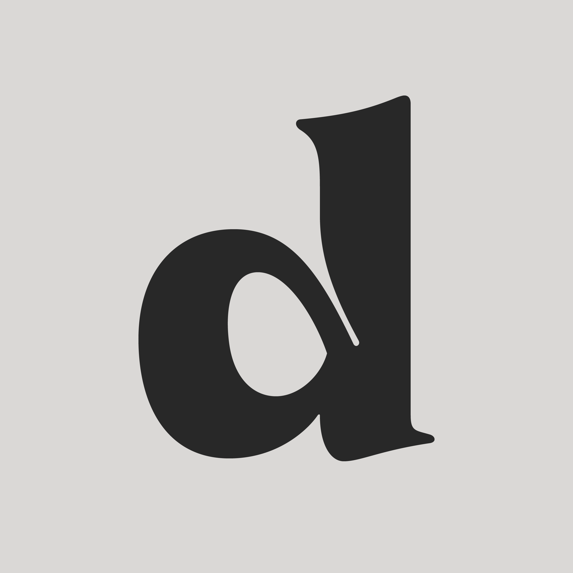
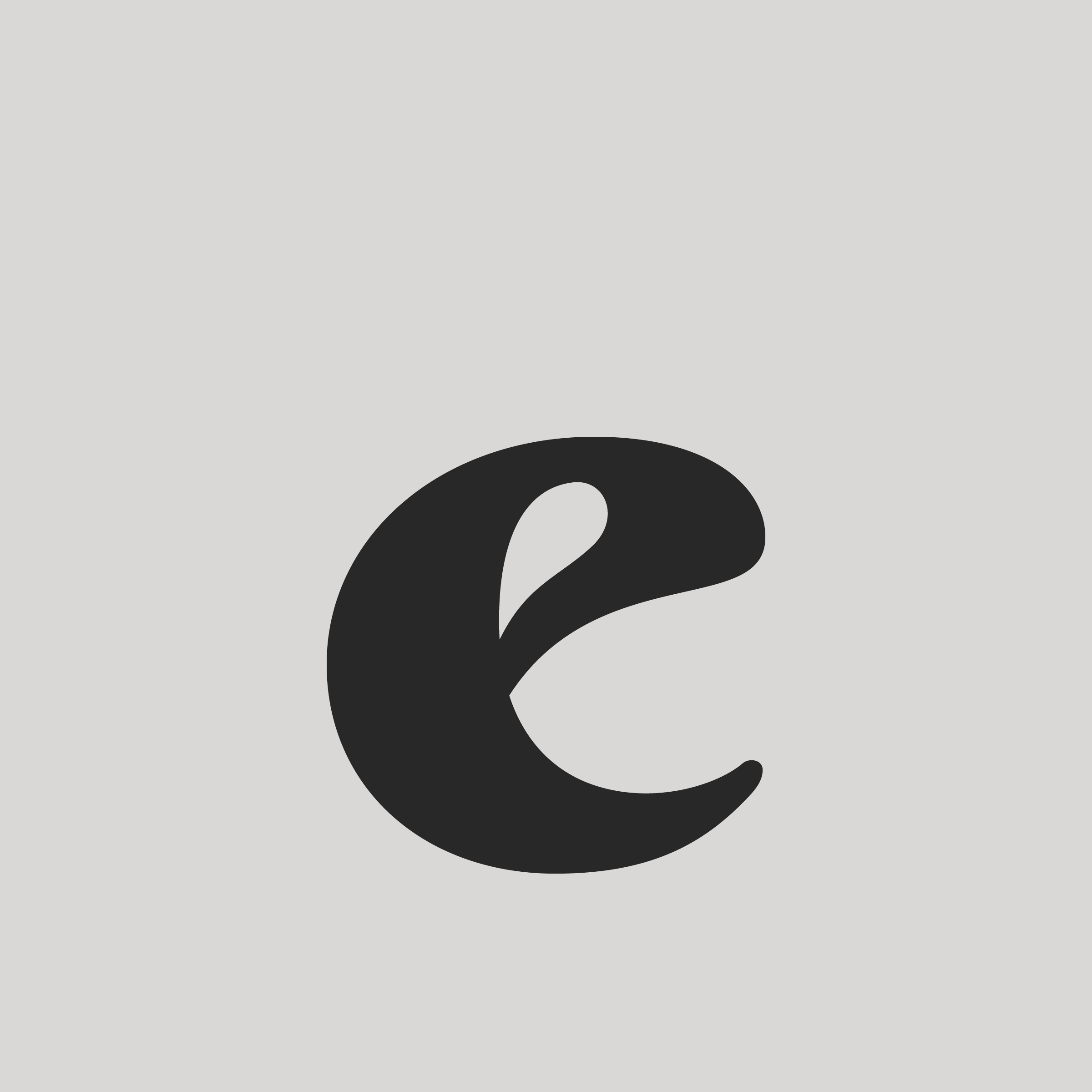
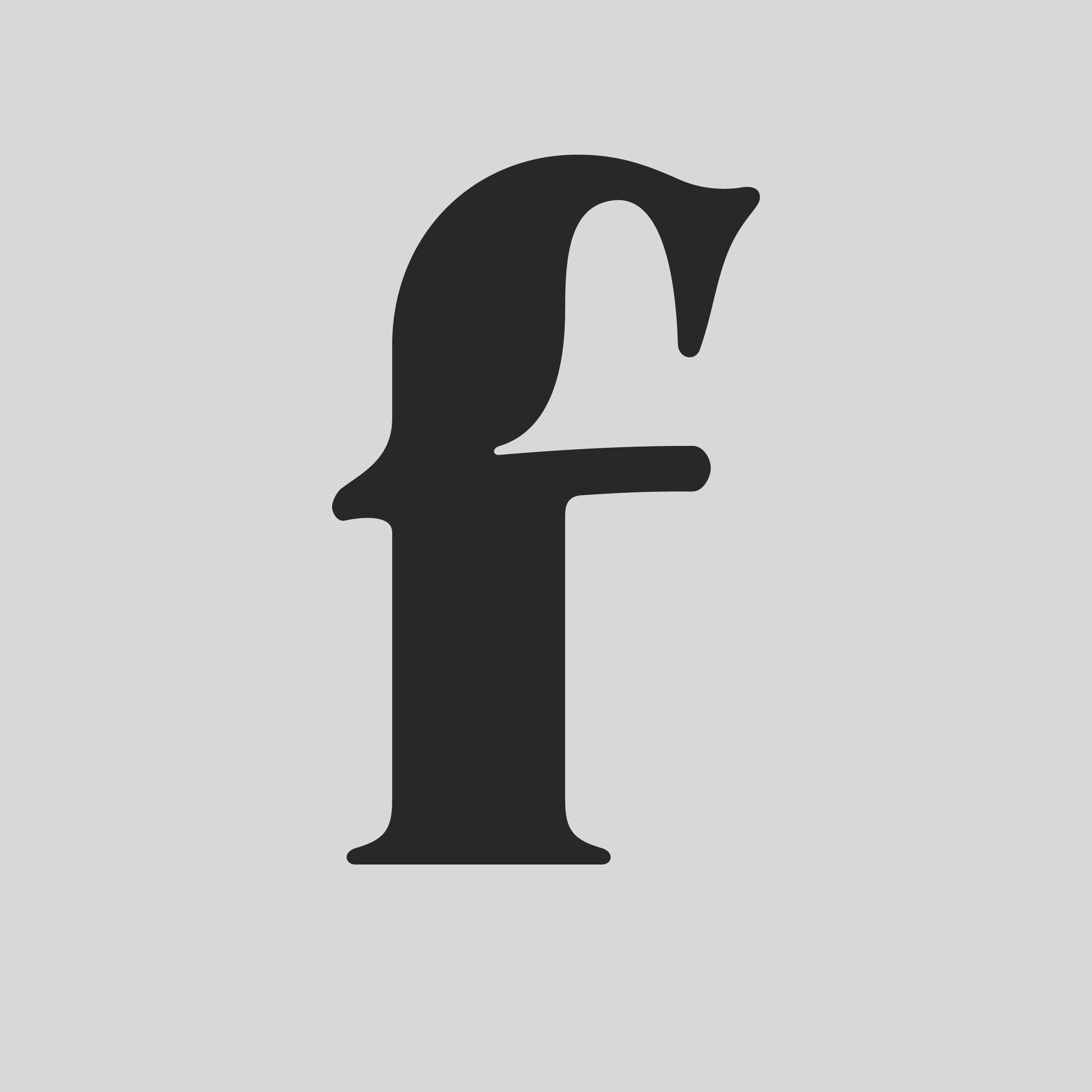
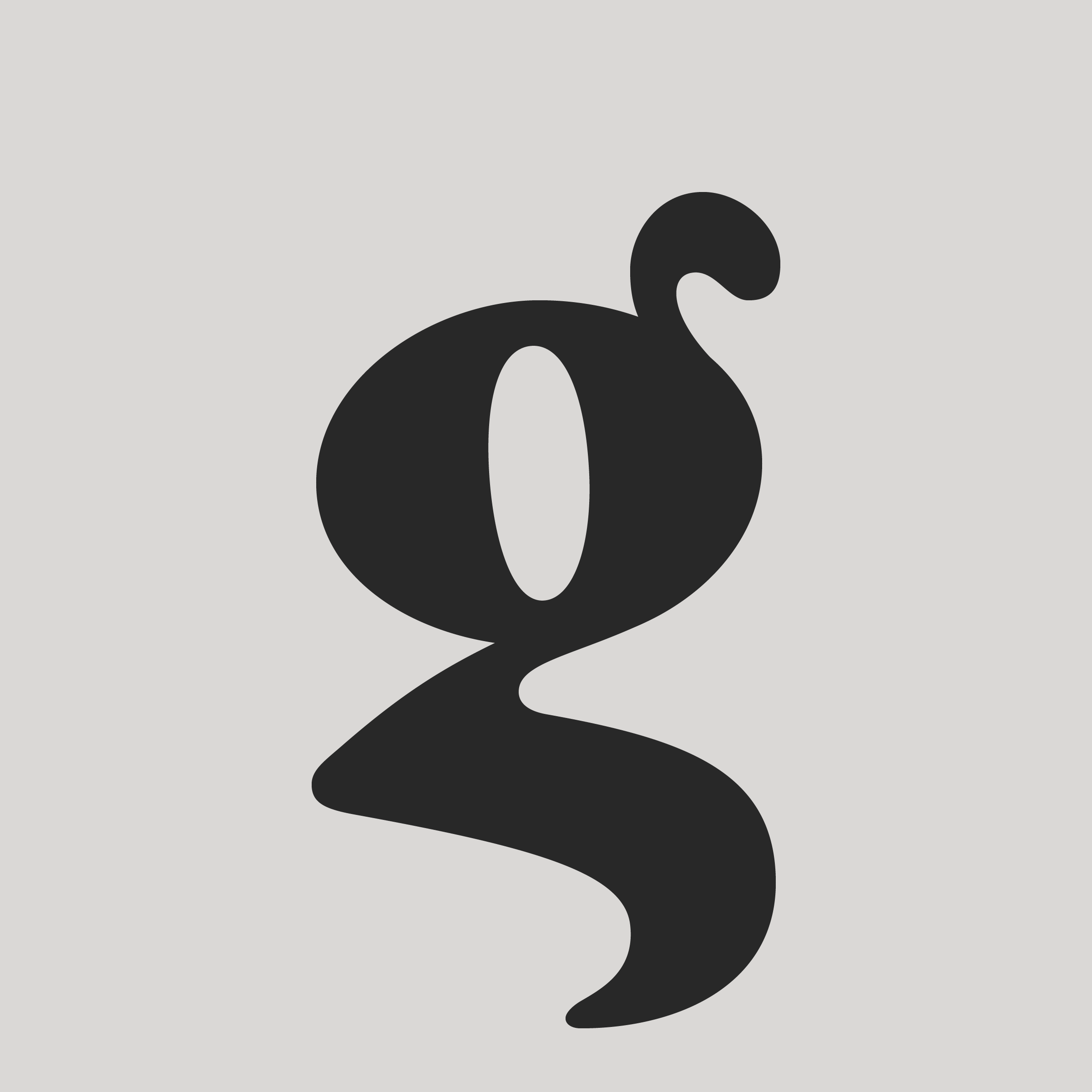
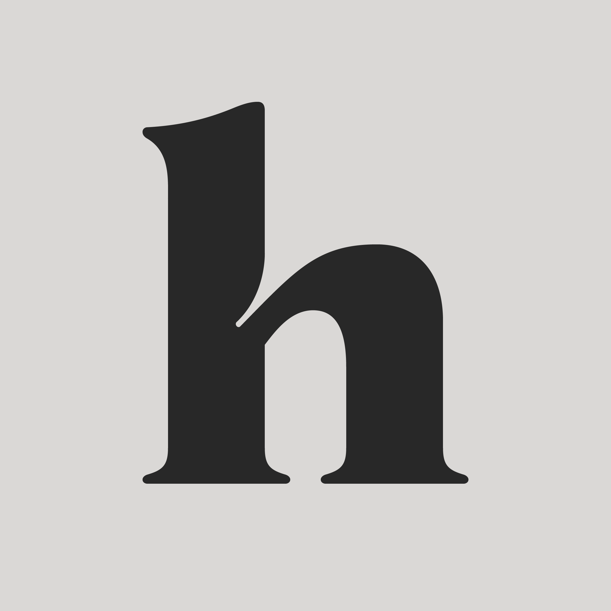
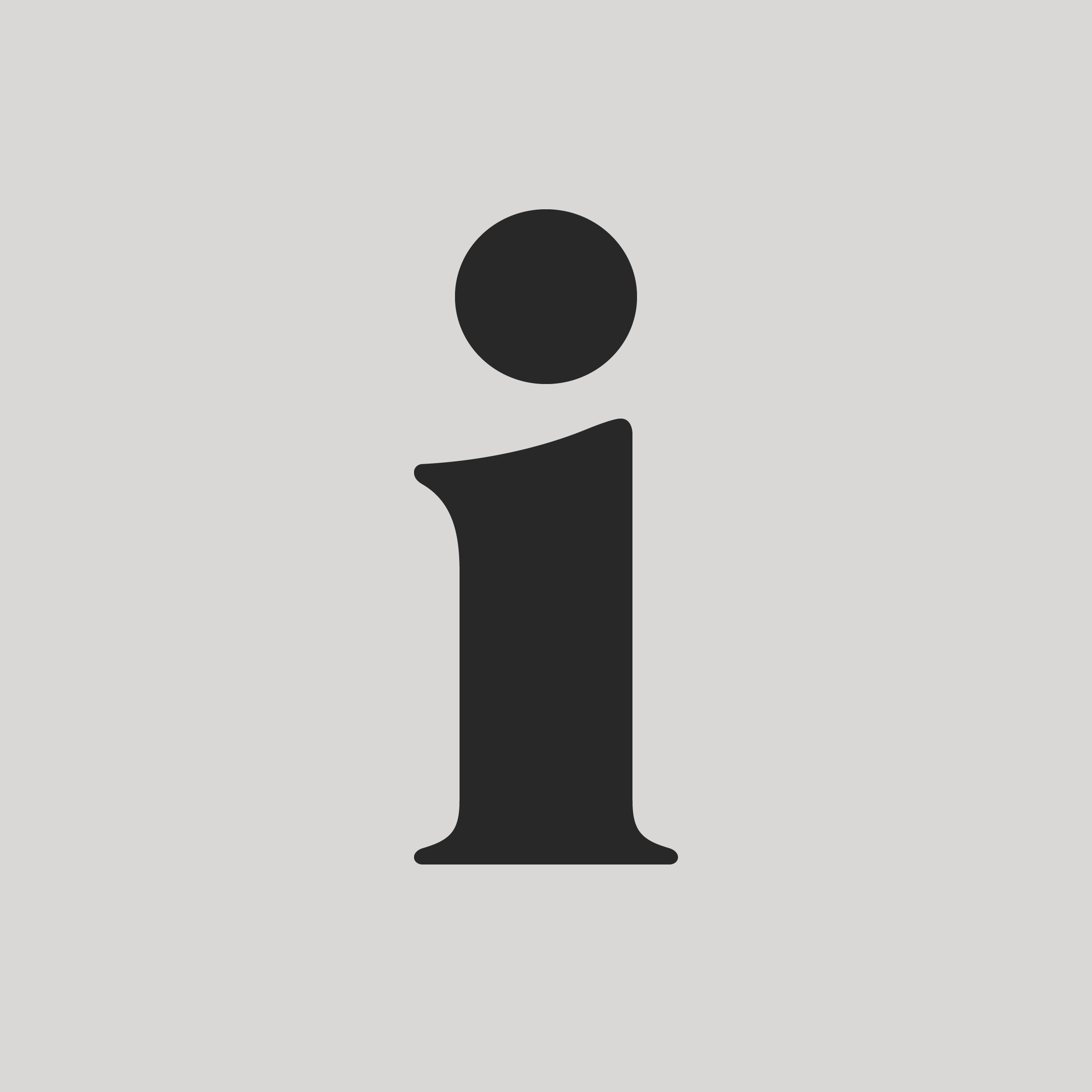
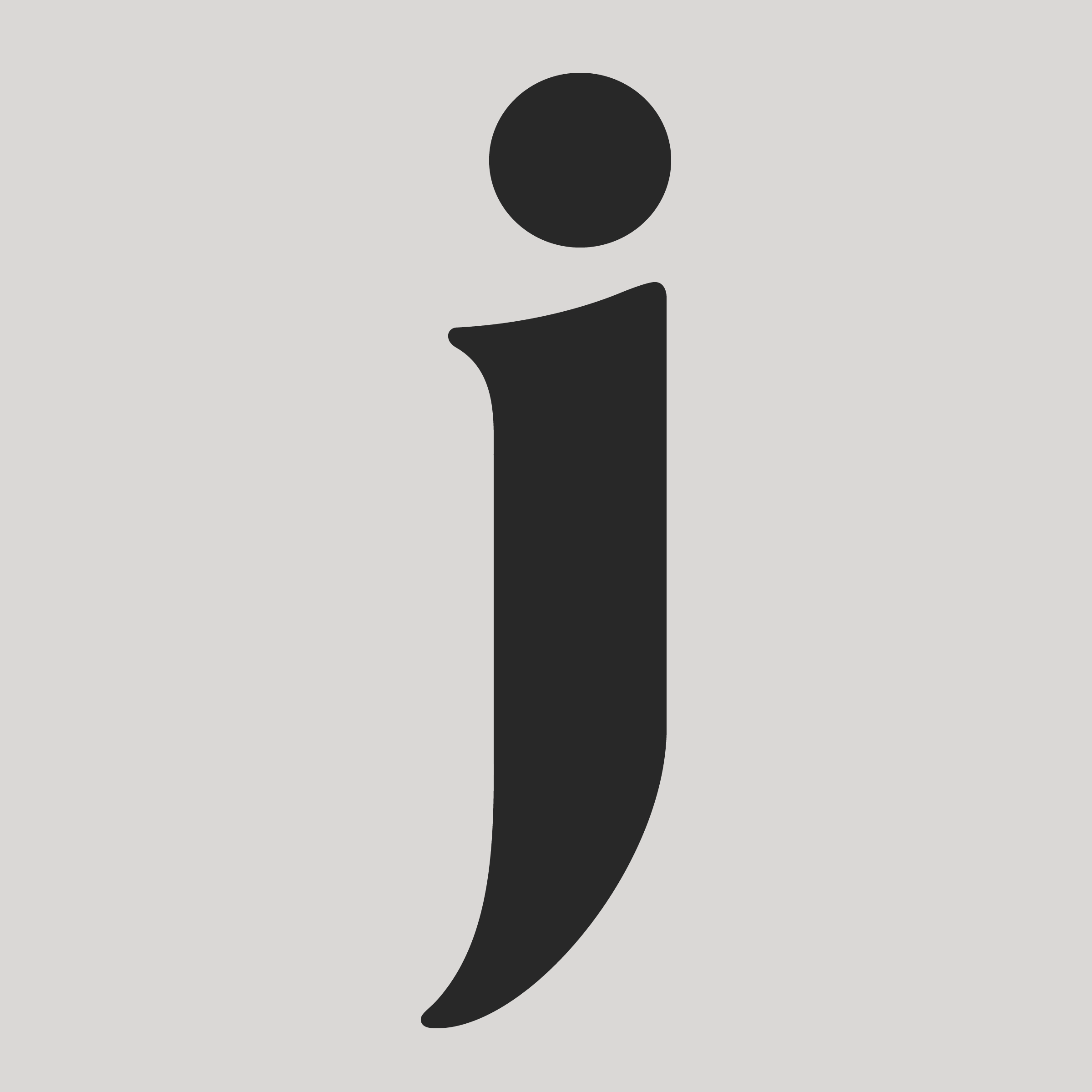
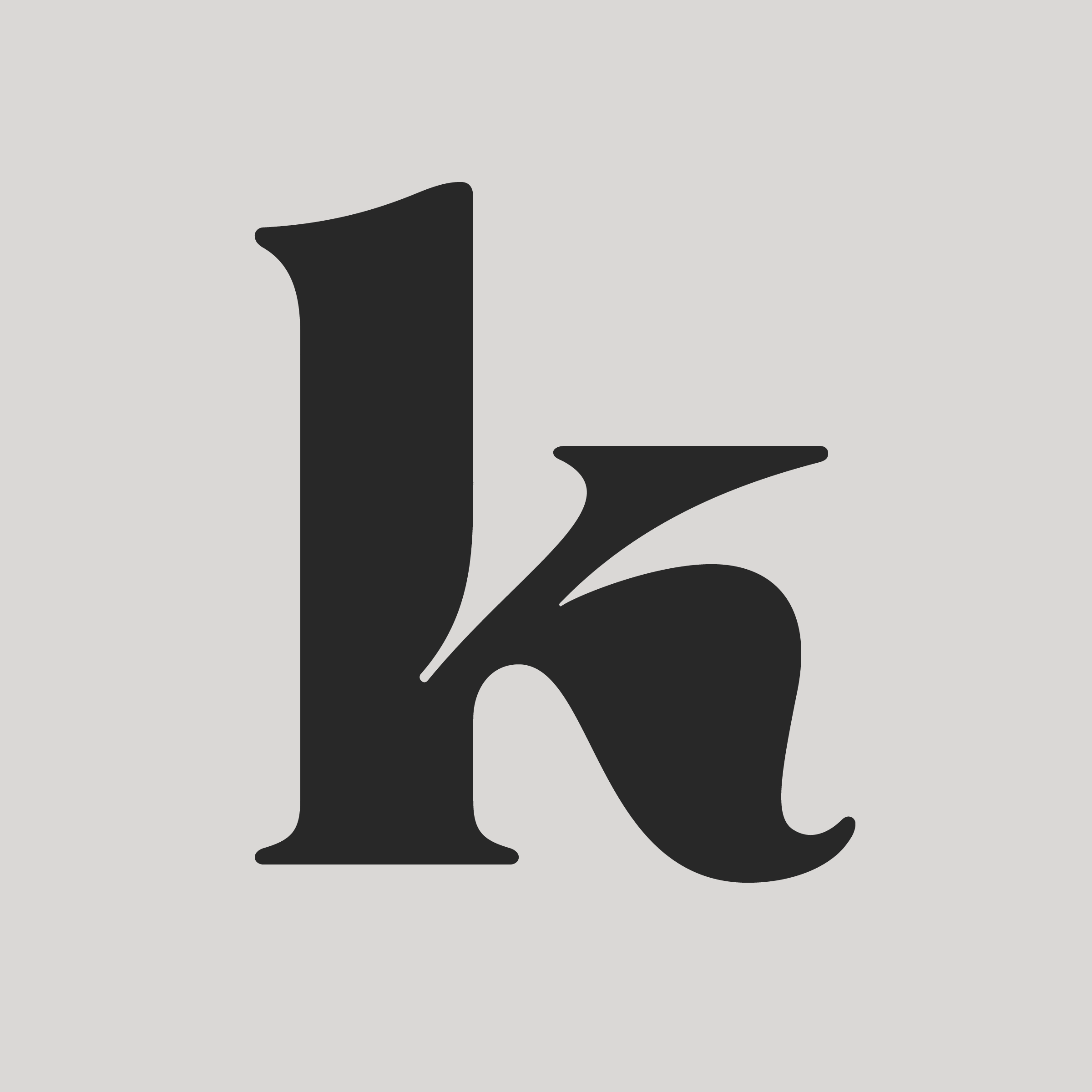
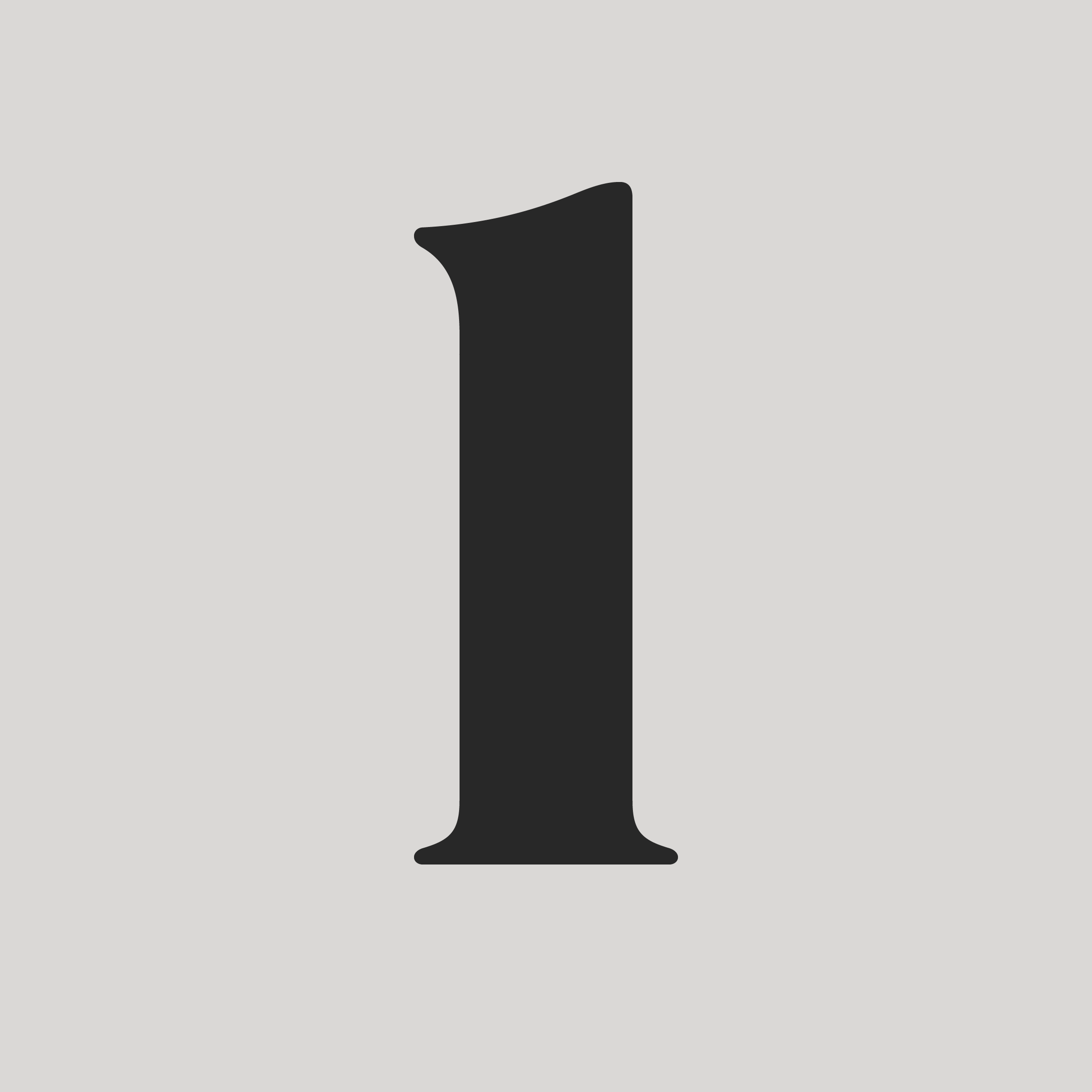
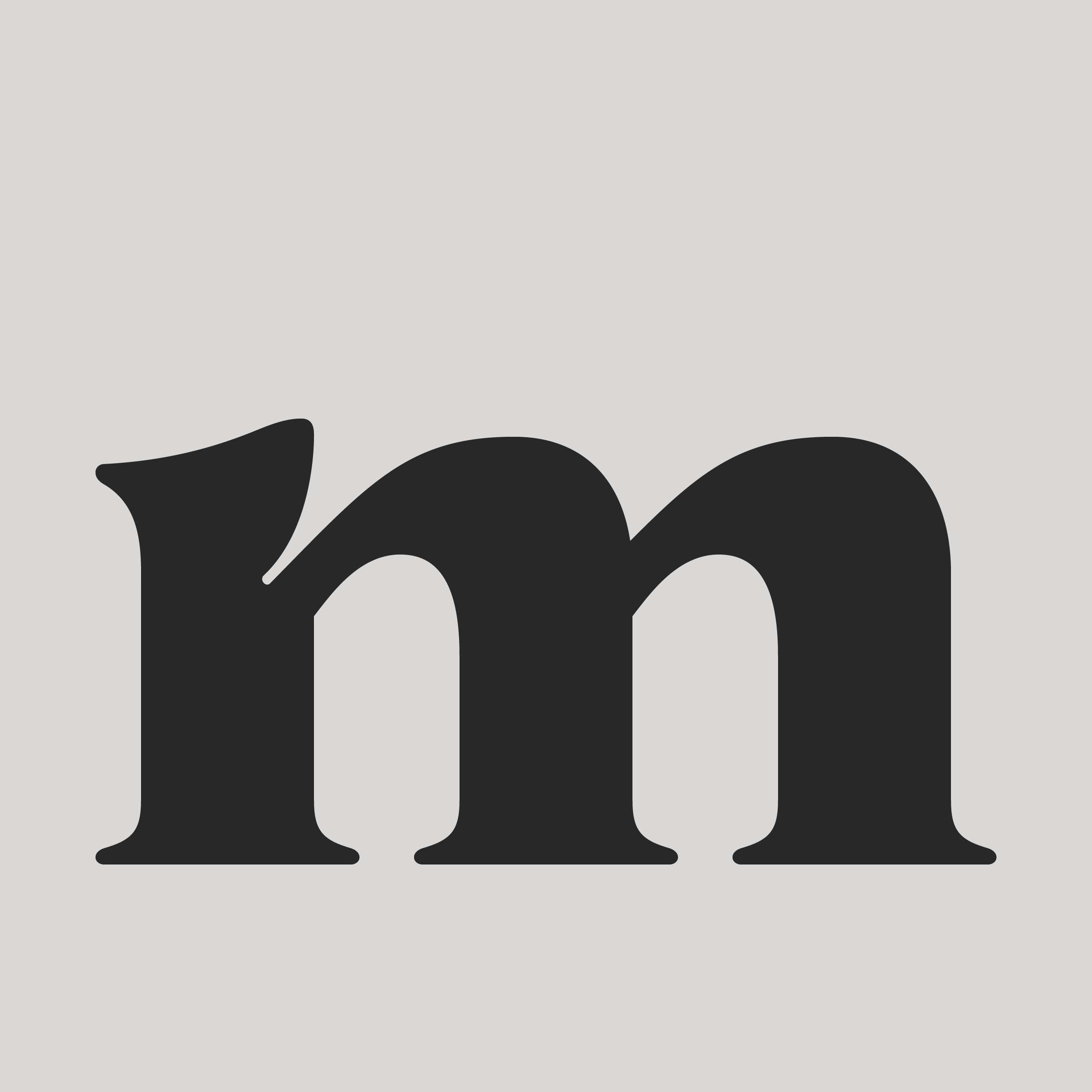
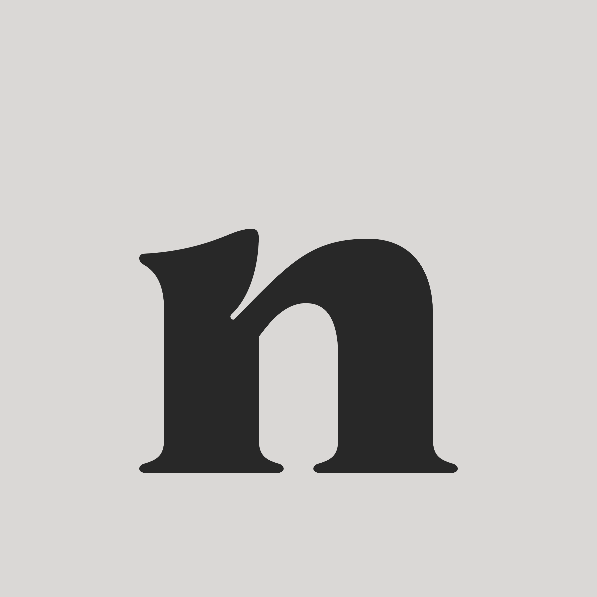
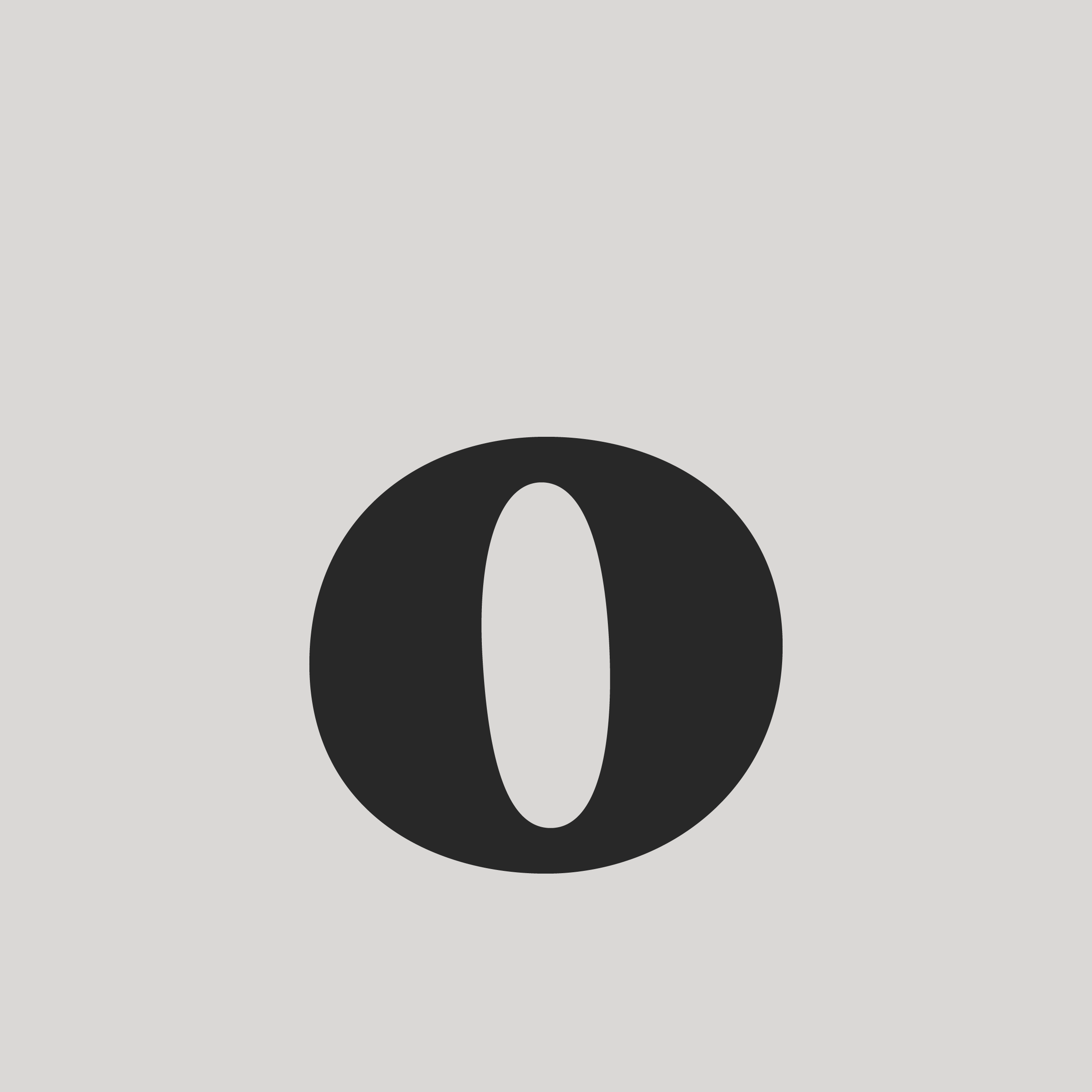
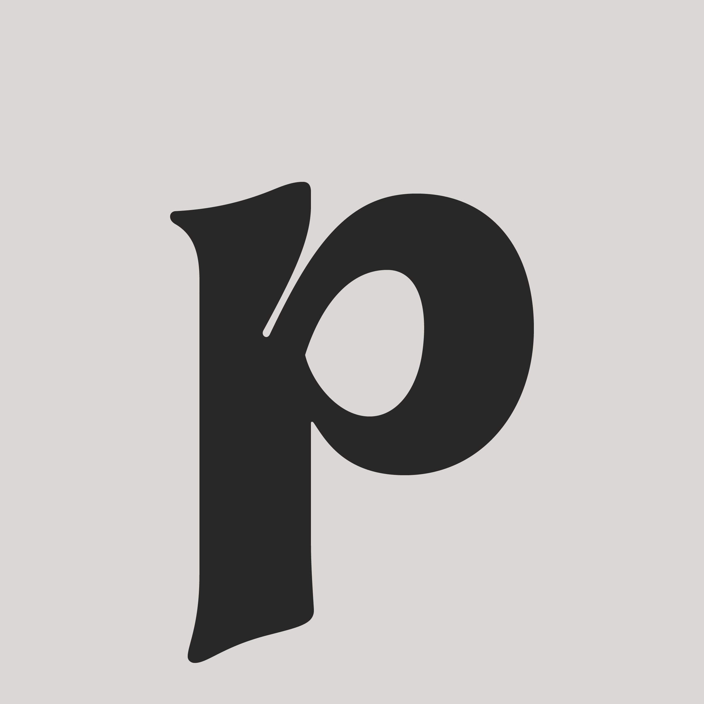
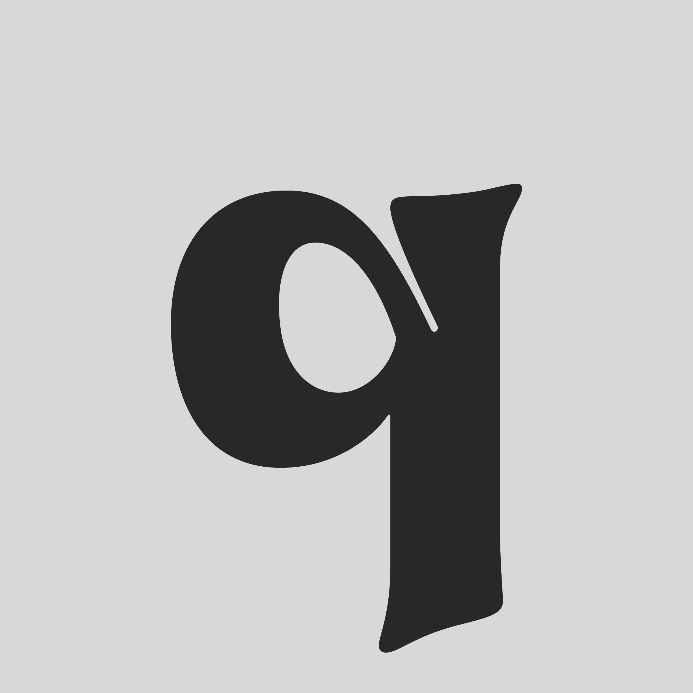
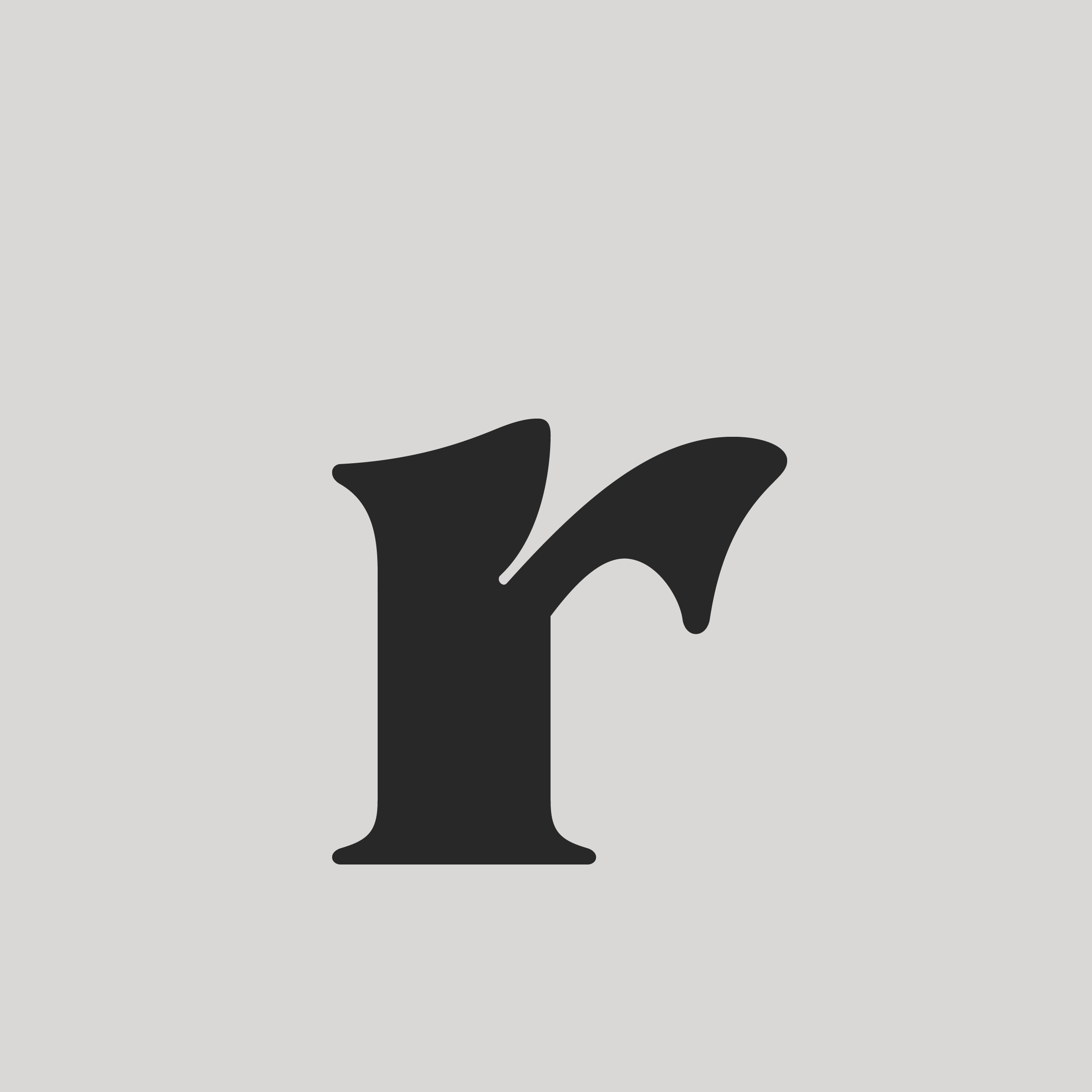
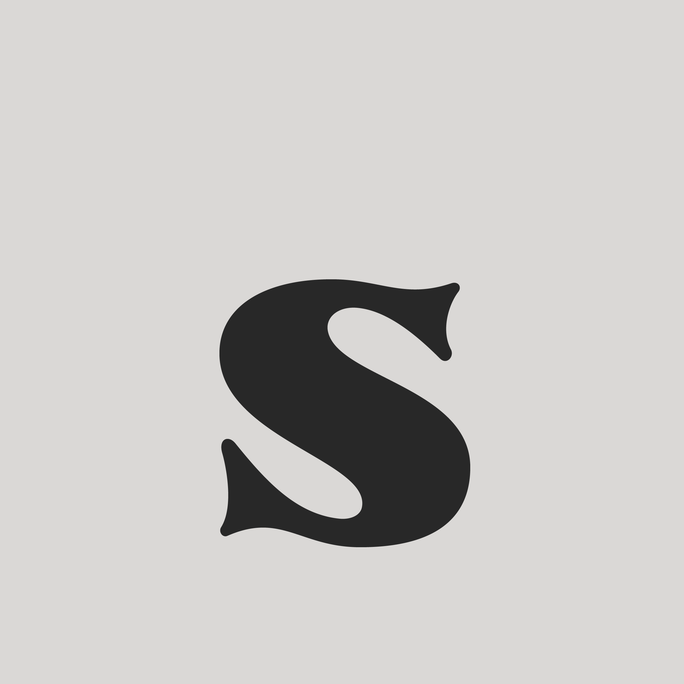
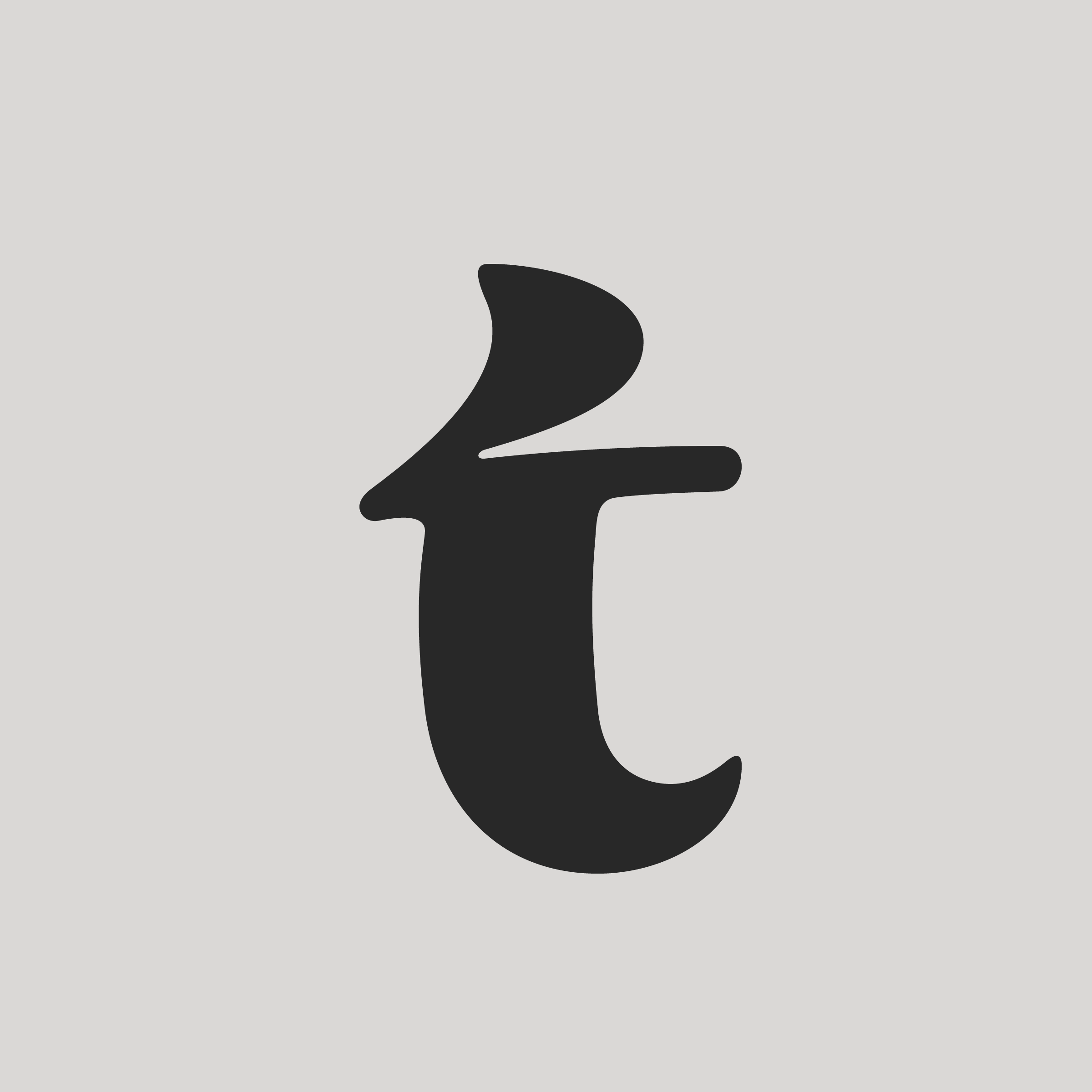
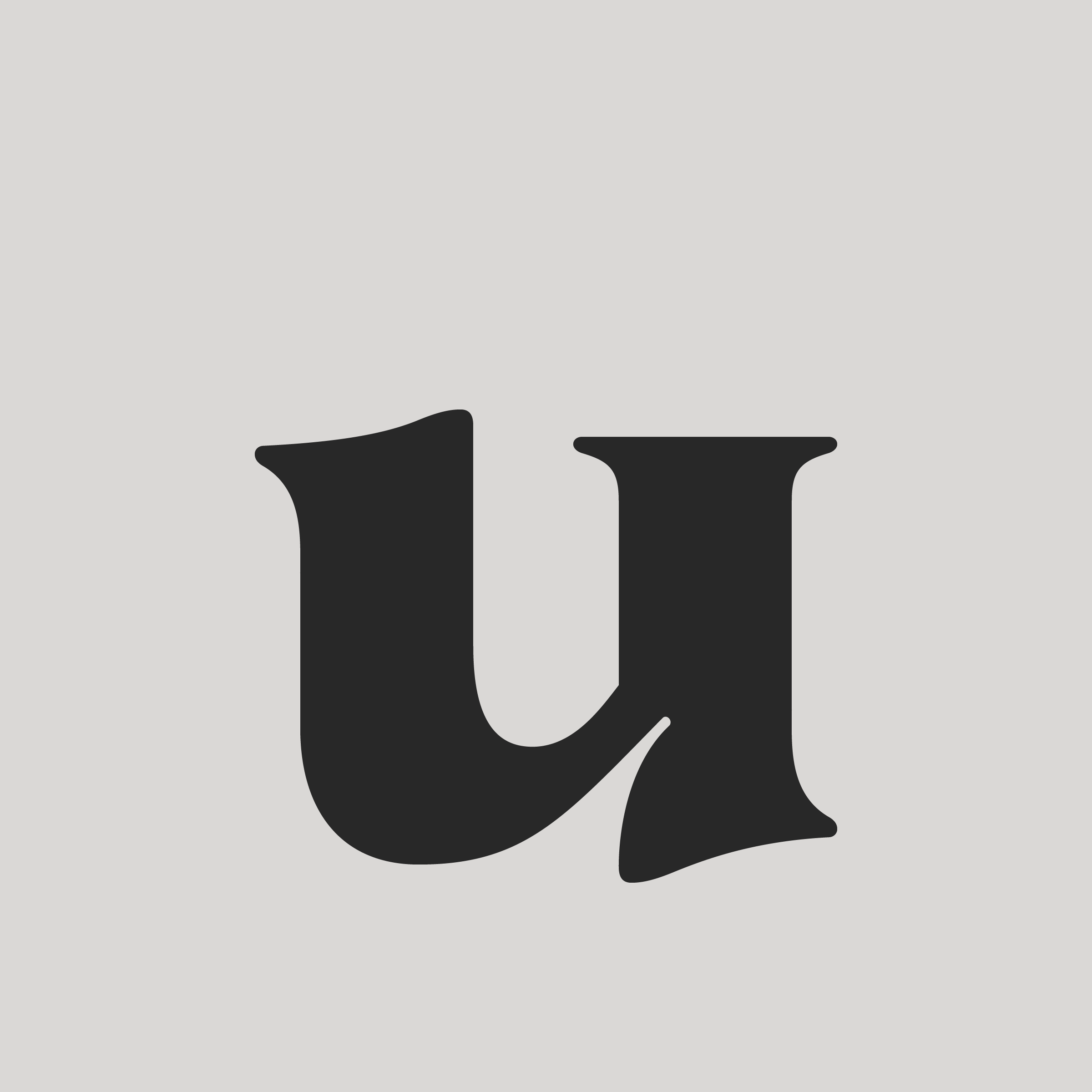
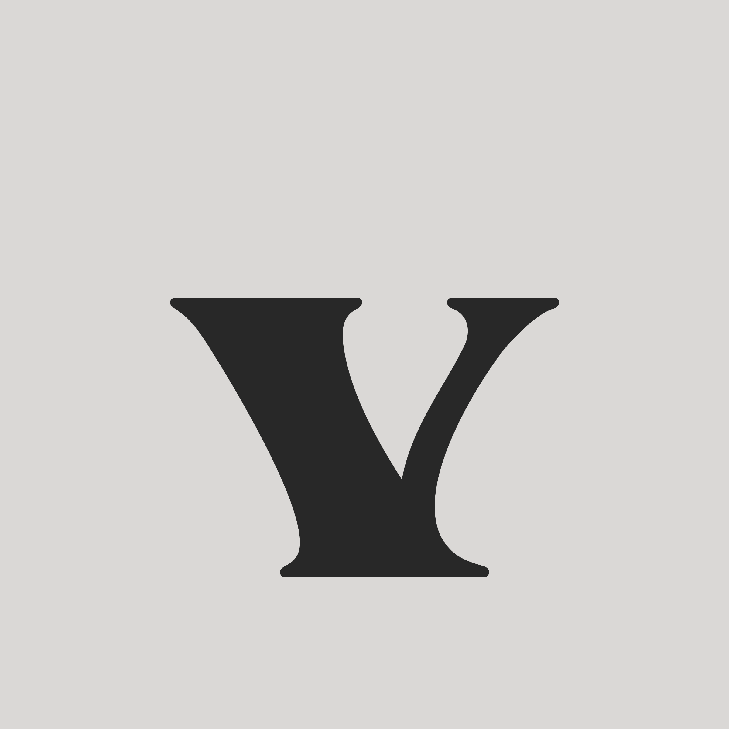
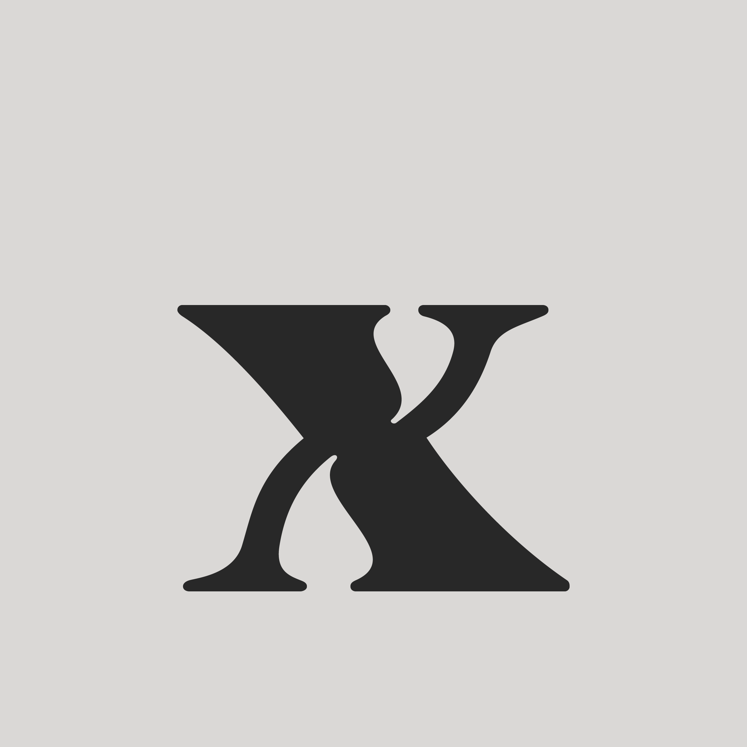
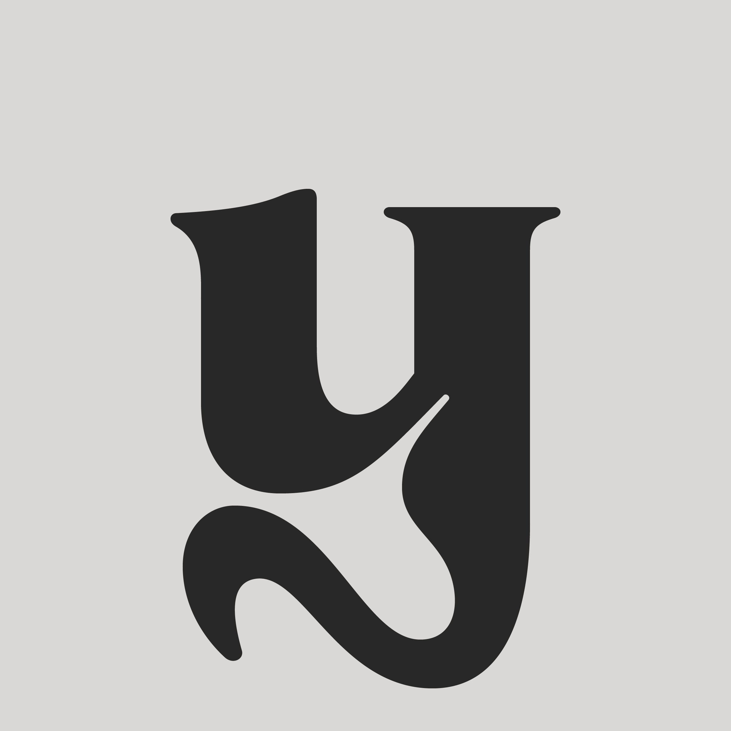
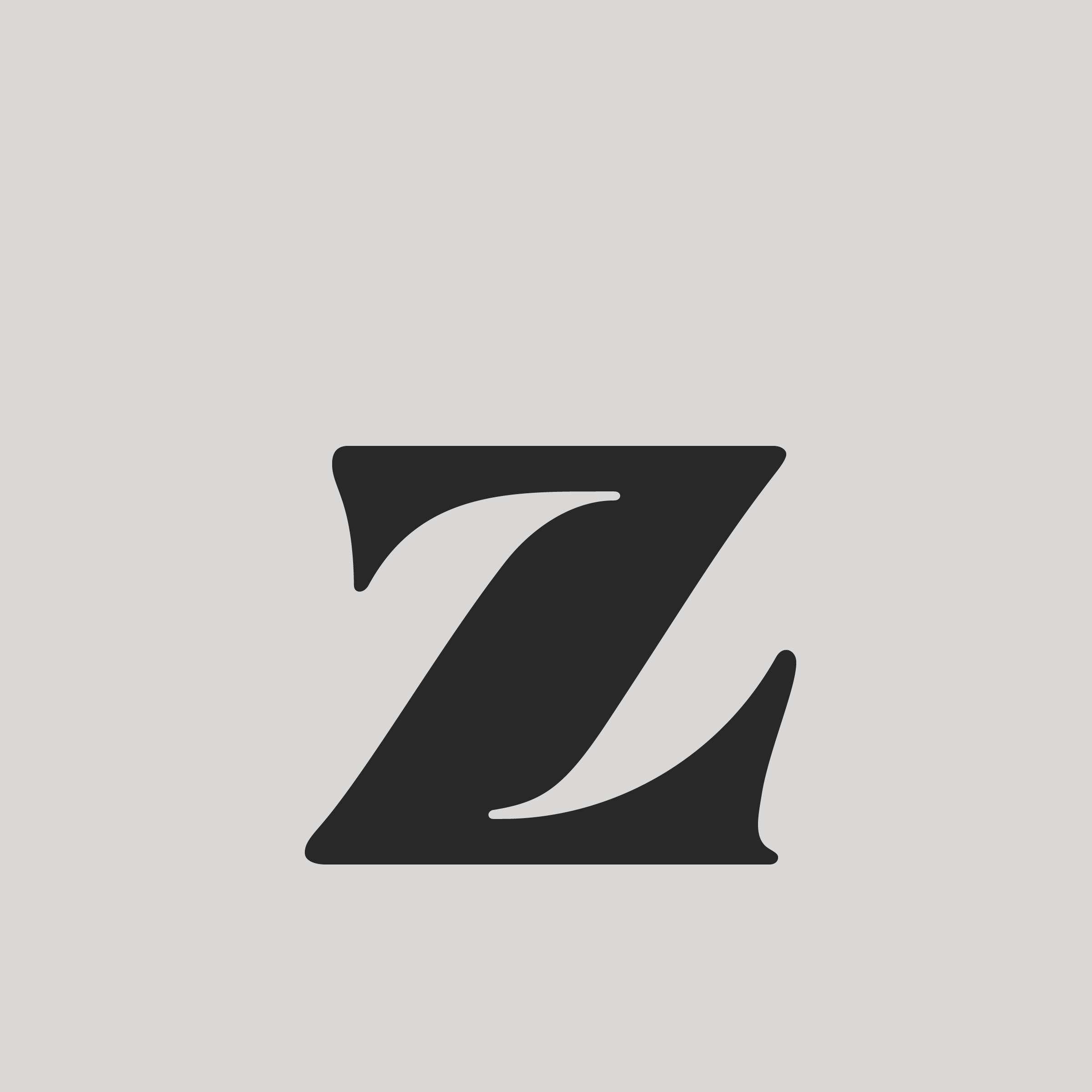
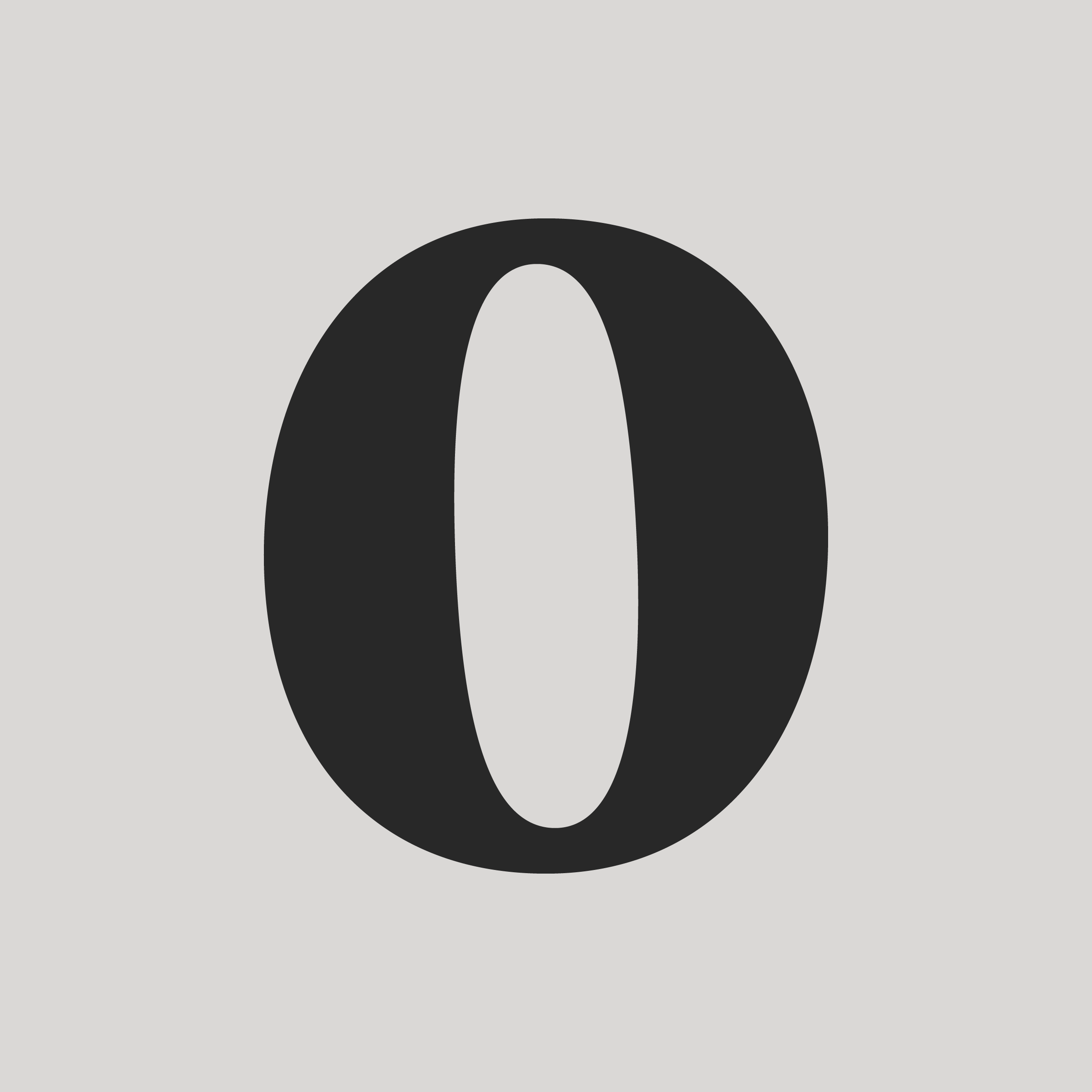
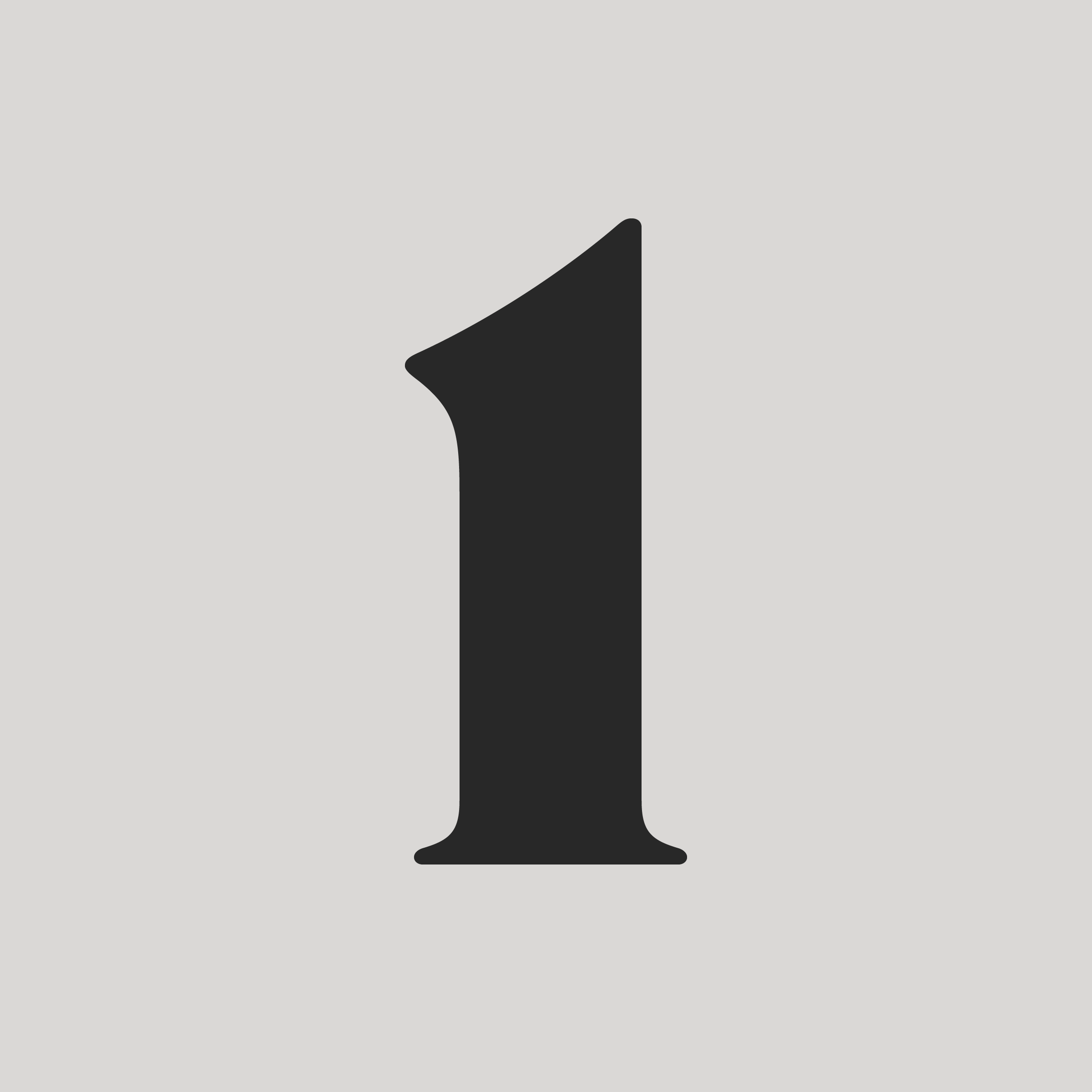
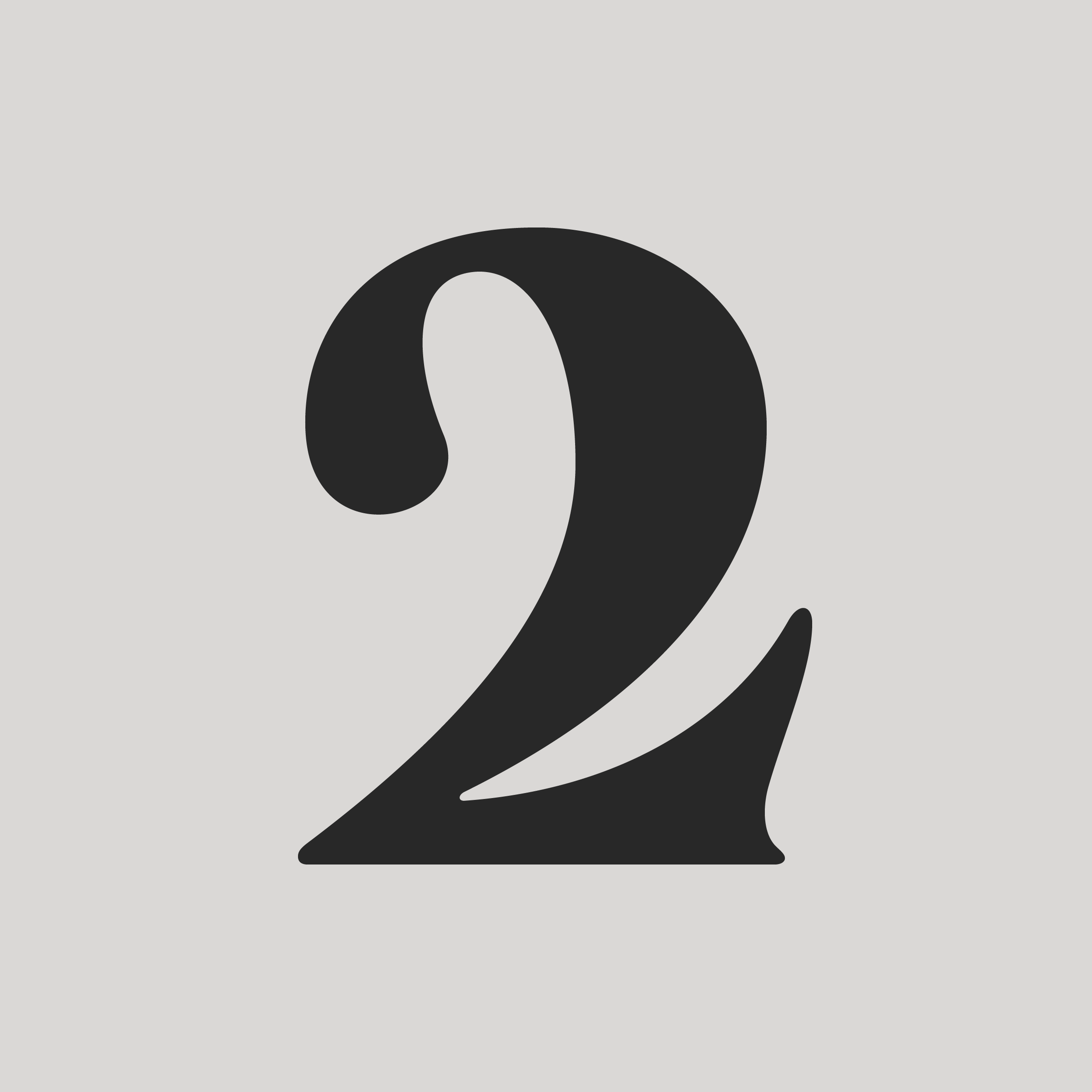
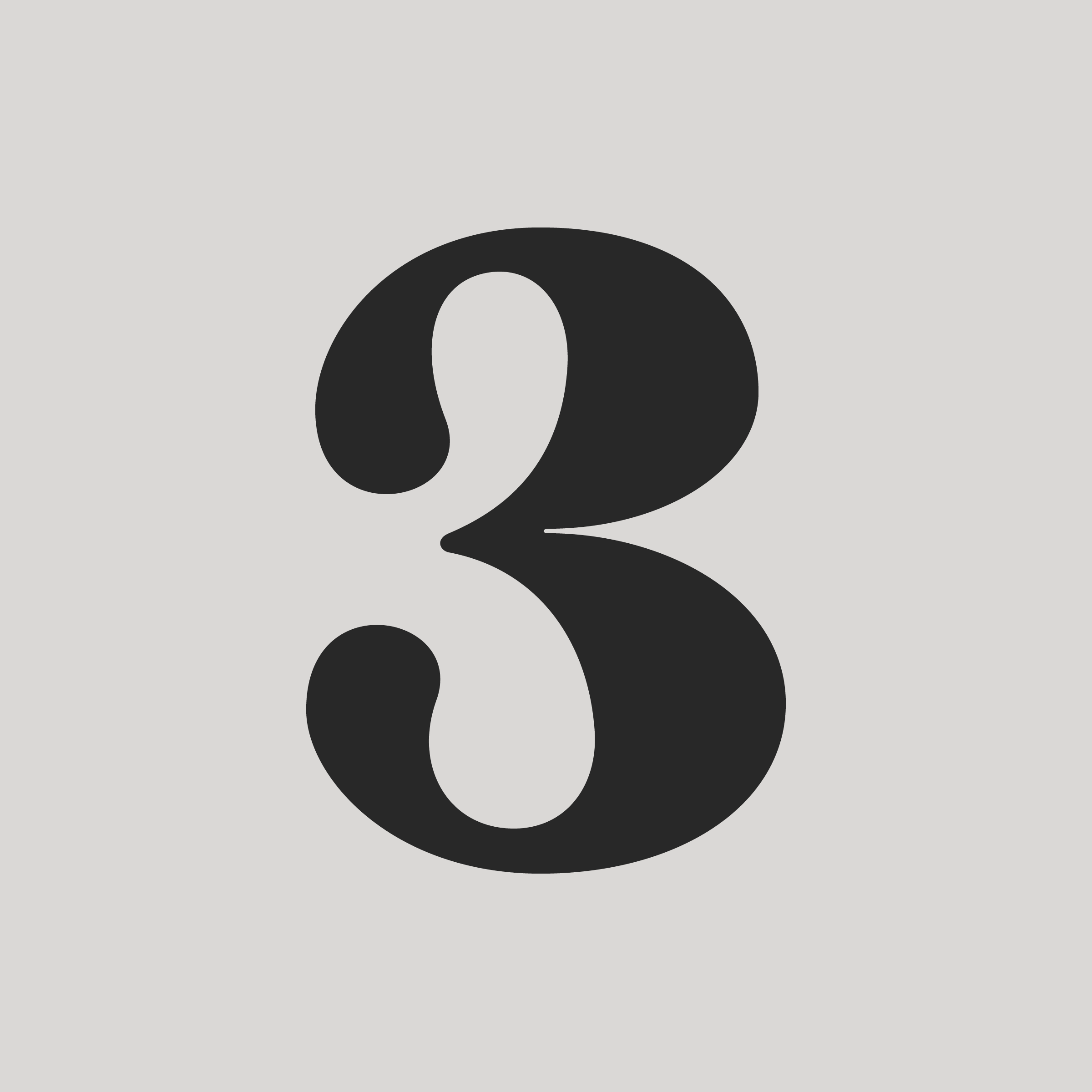
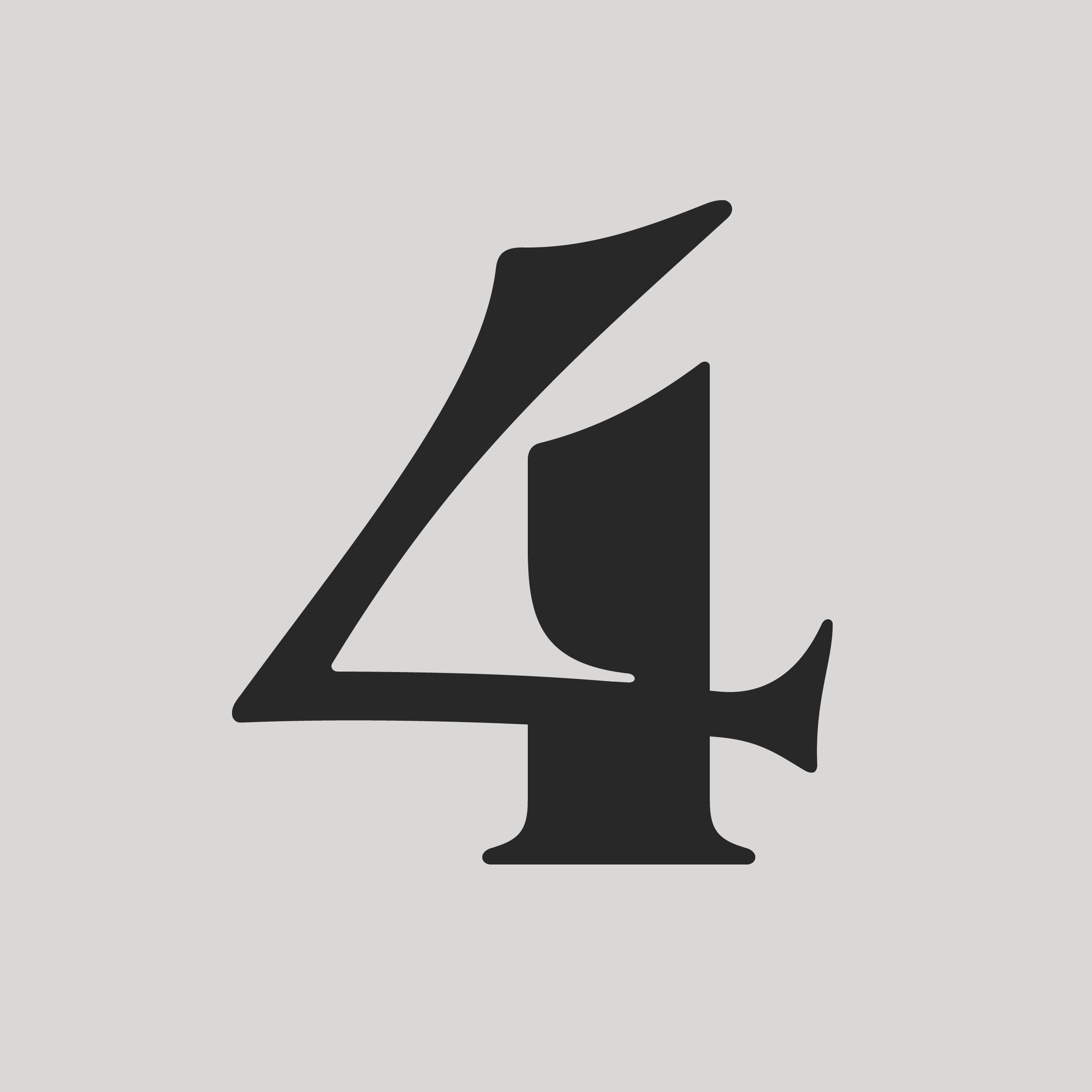
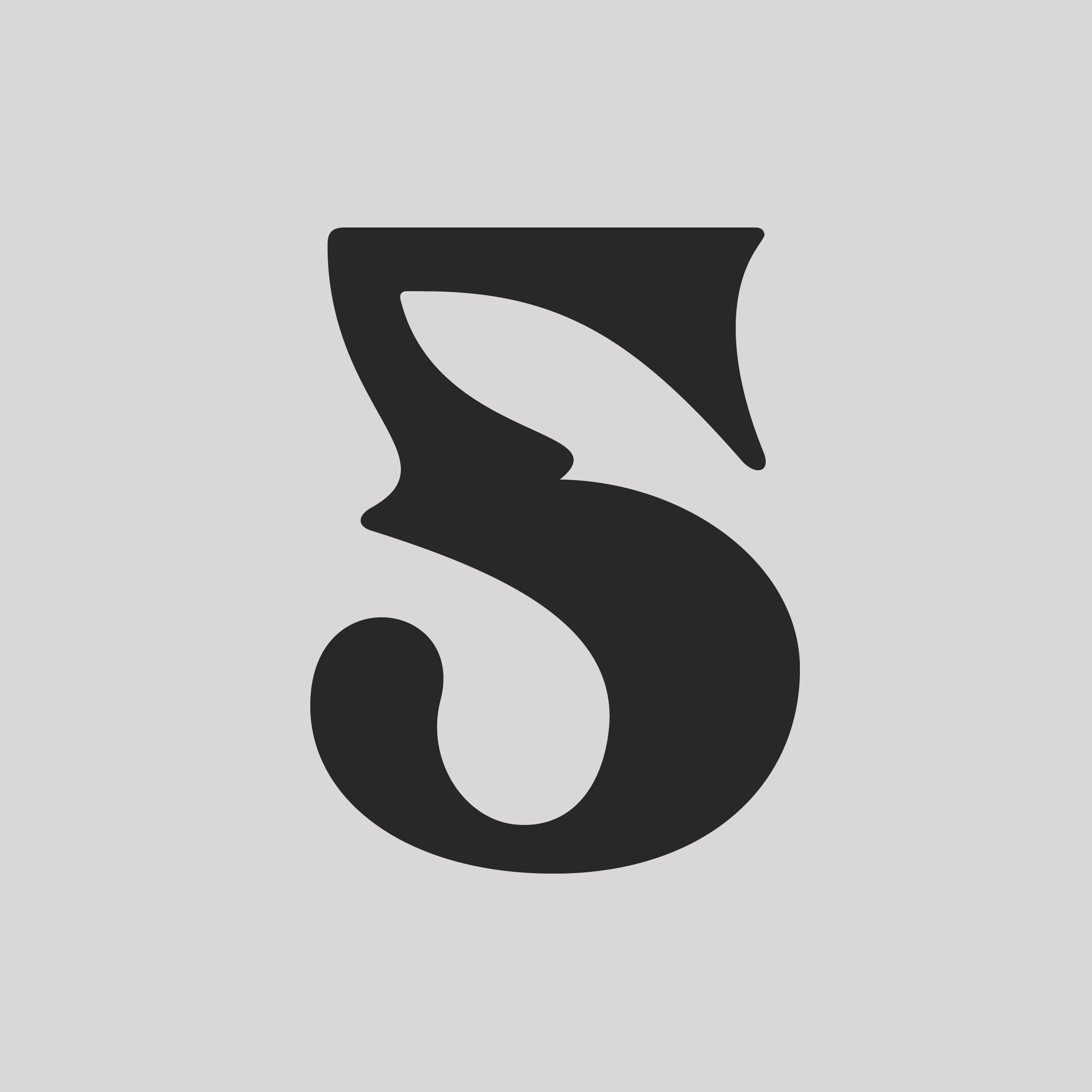
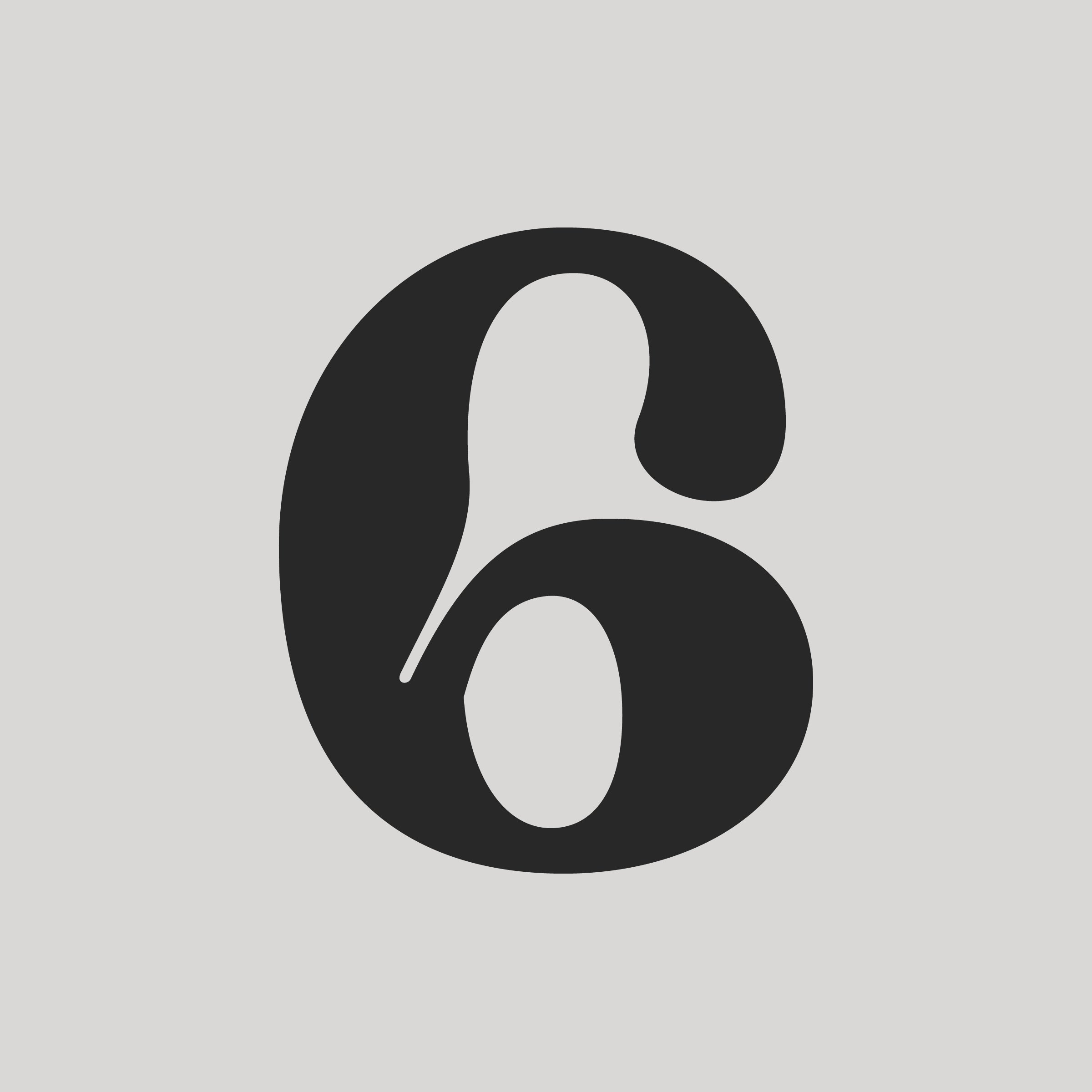
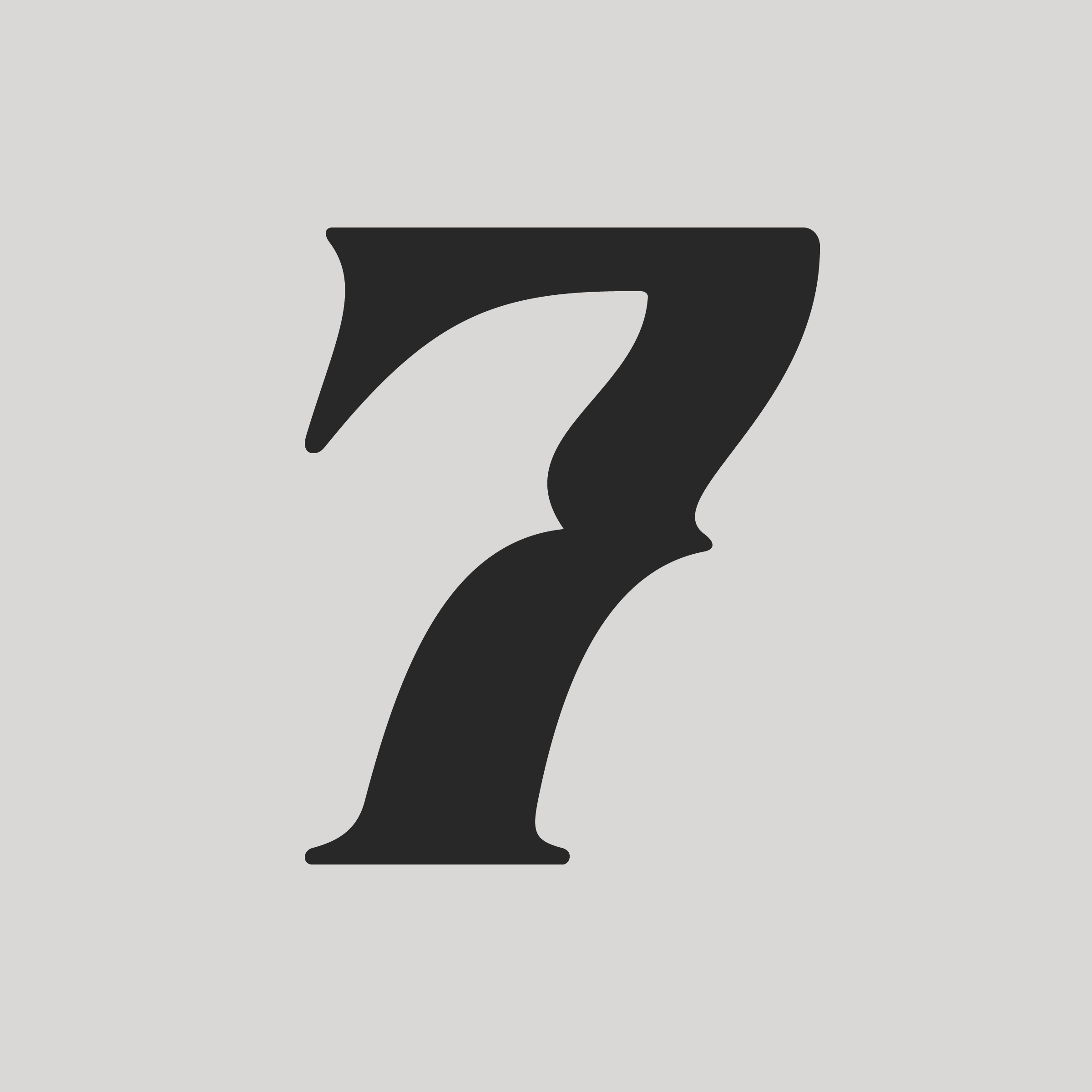
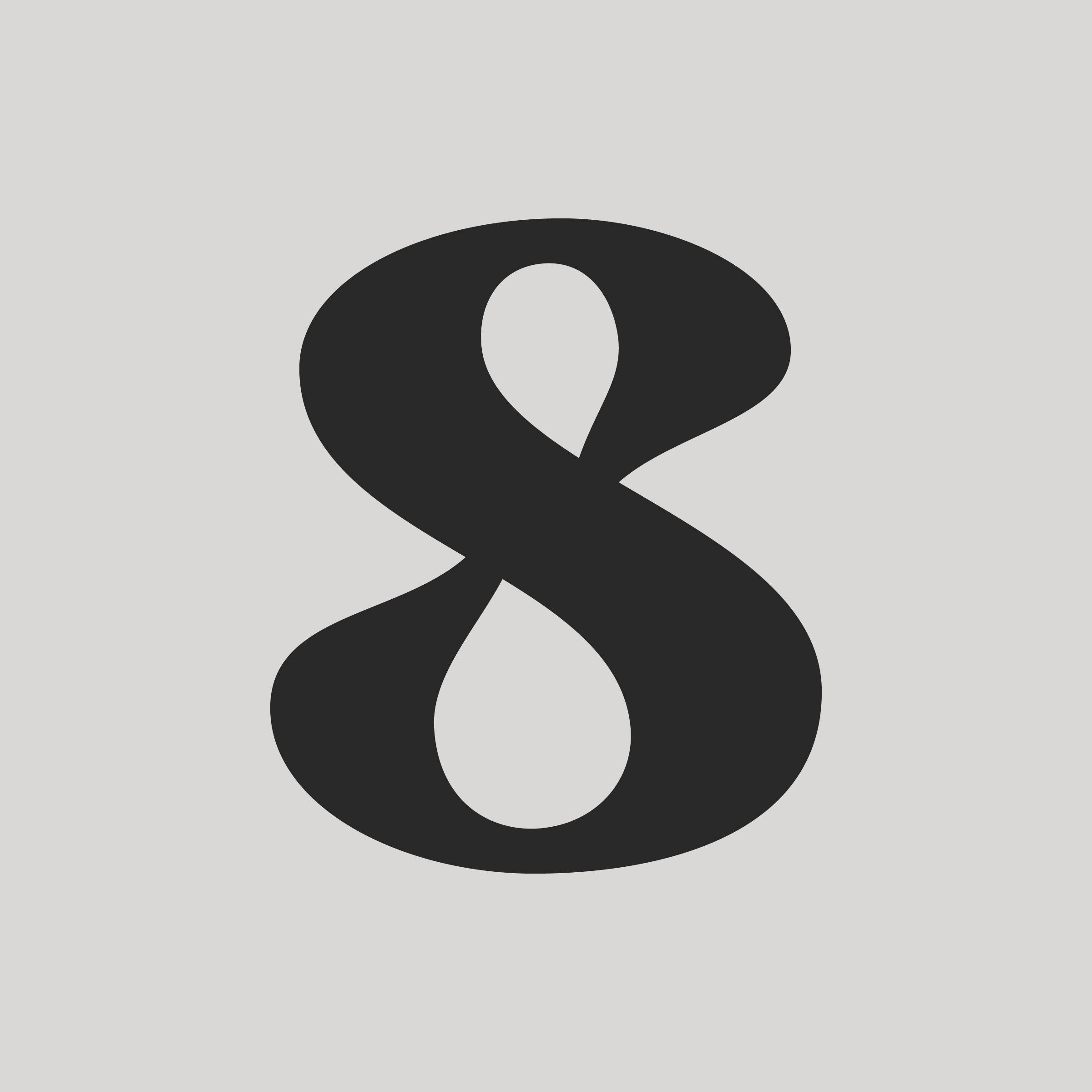
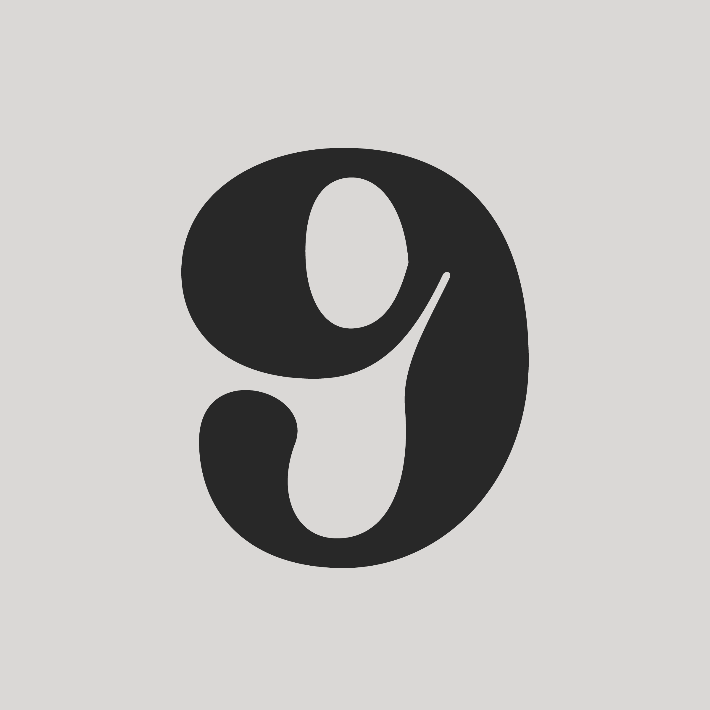
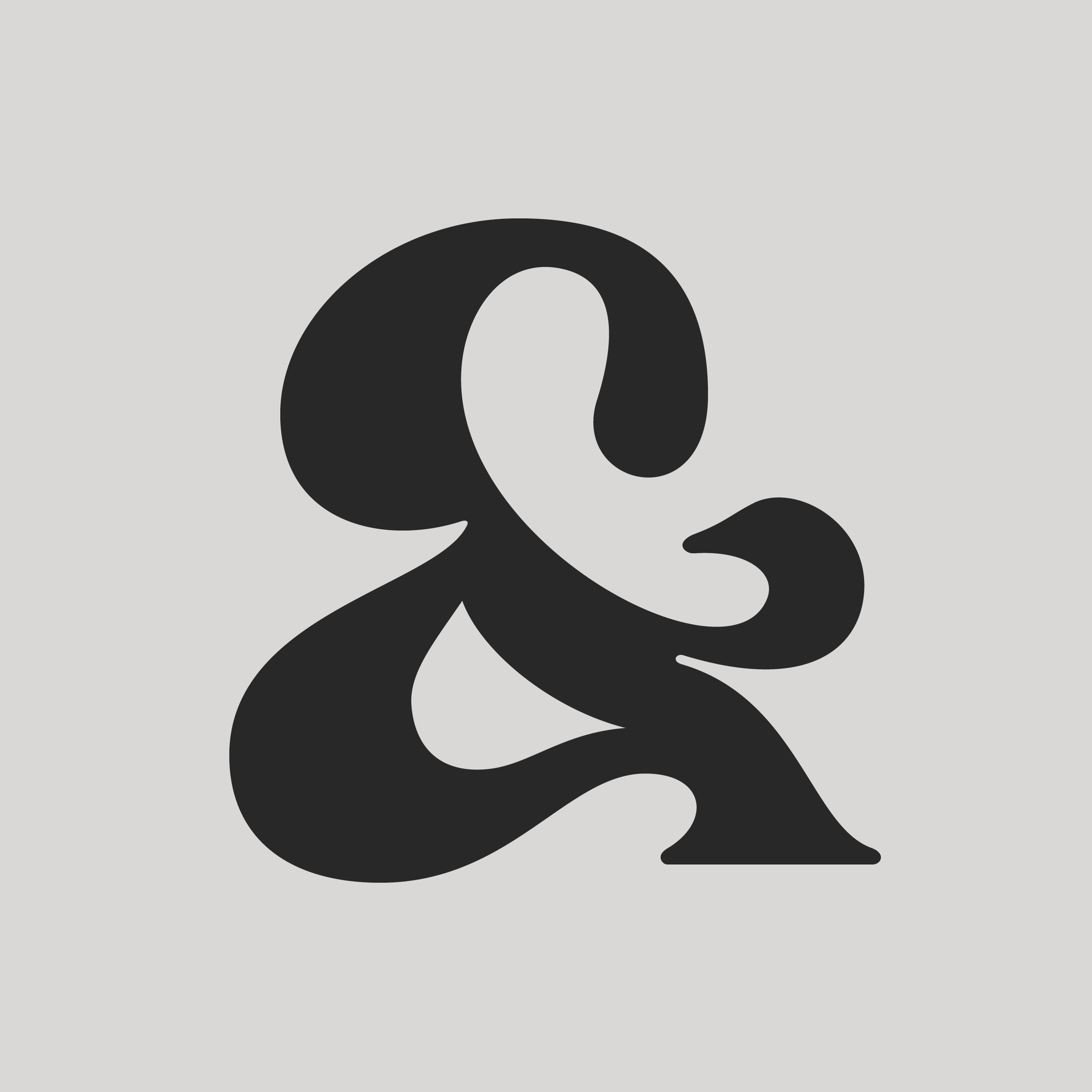
Once again flying solo on the now-defunct 36 Days of Type for an exploration of new type design. I set out to create 63 glyphs over roughly a month, taking ideas from the year before to build a coherent font family. The idea was to create something more analog than I had done before, harkening back to hand-carved metal type, characterized by dramatic ink traps and inky limbs, with irregular surfaces that seek to break free from their programming.
36 Days of Type (‘24)