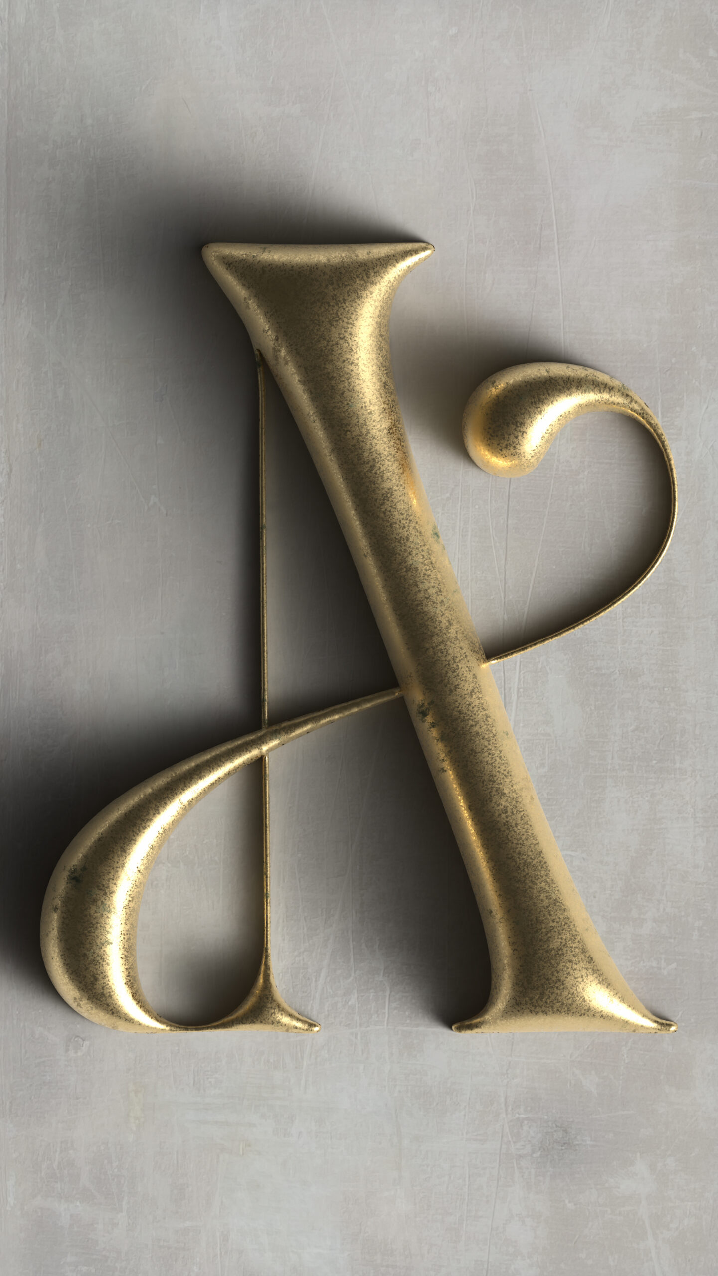
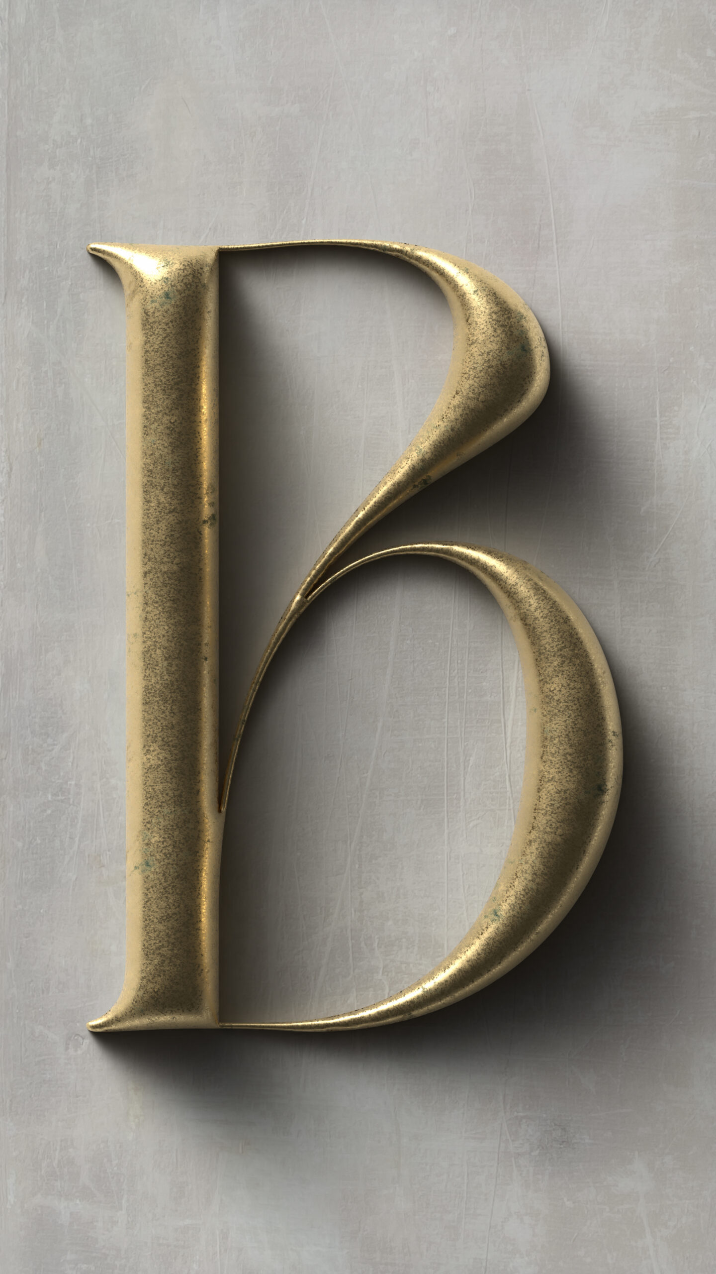
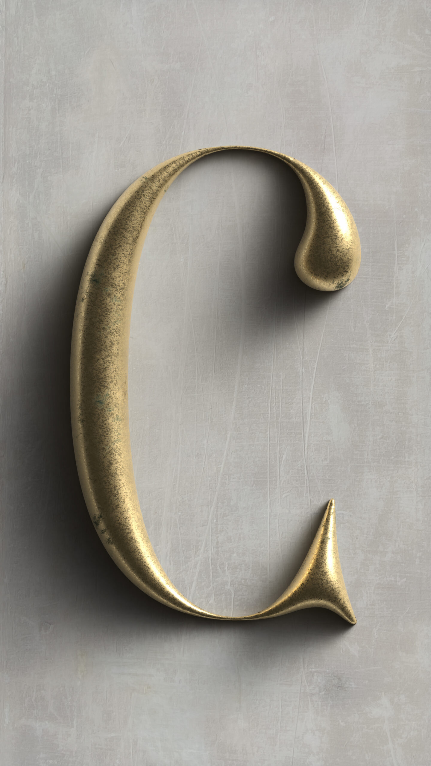
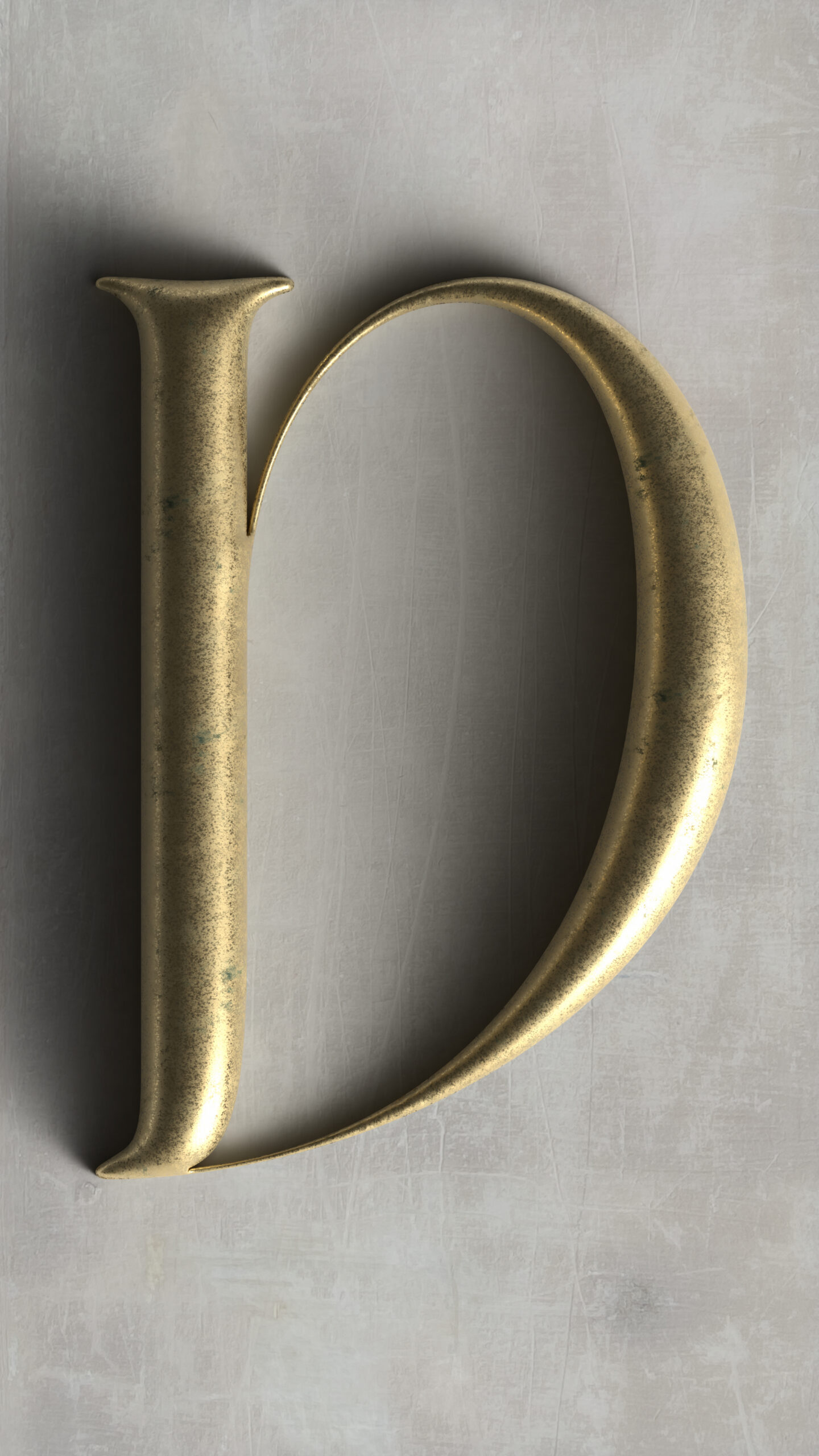
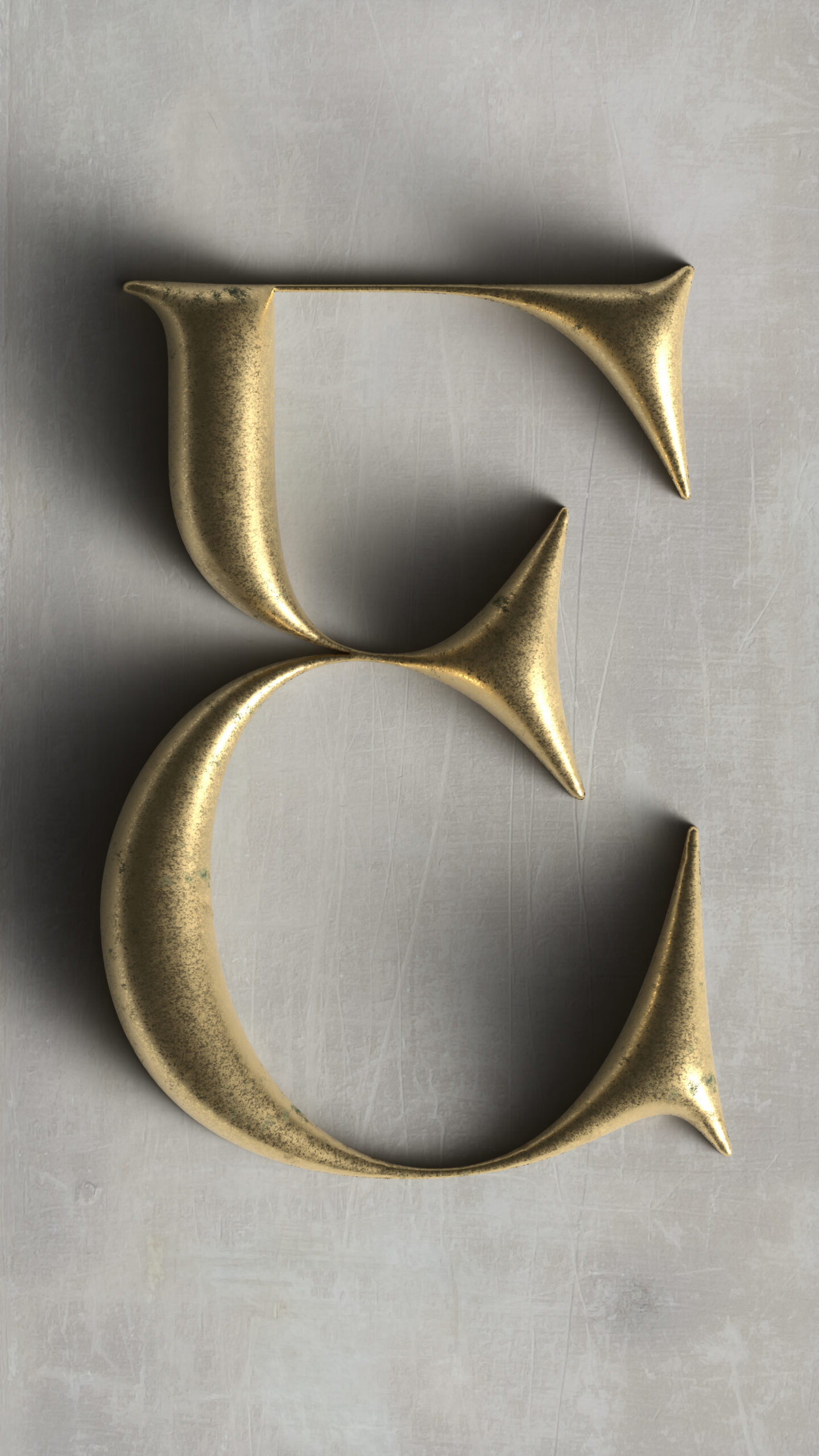
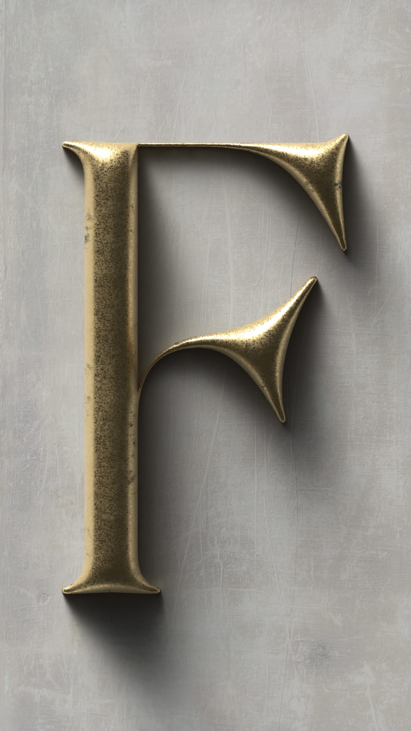
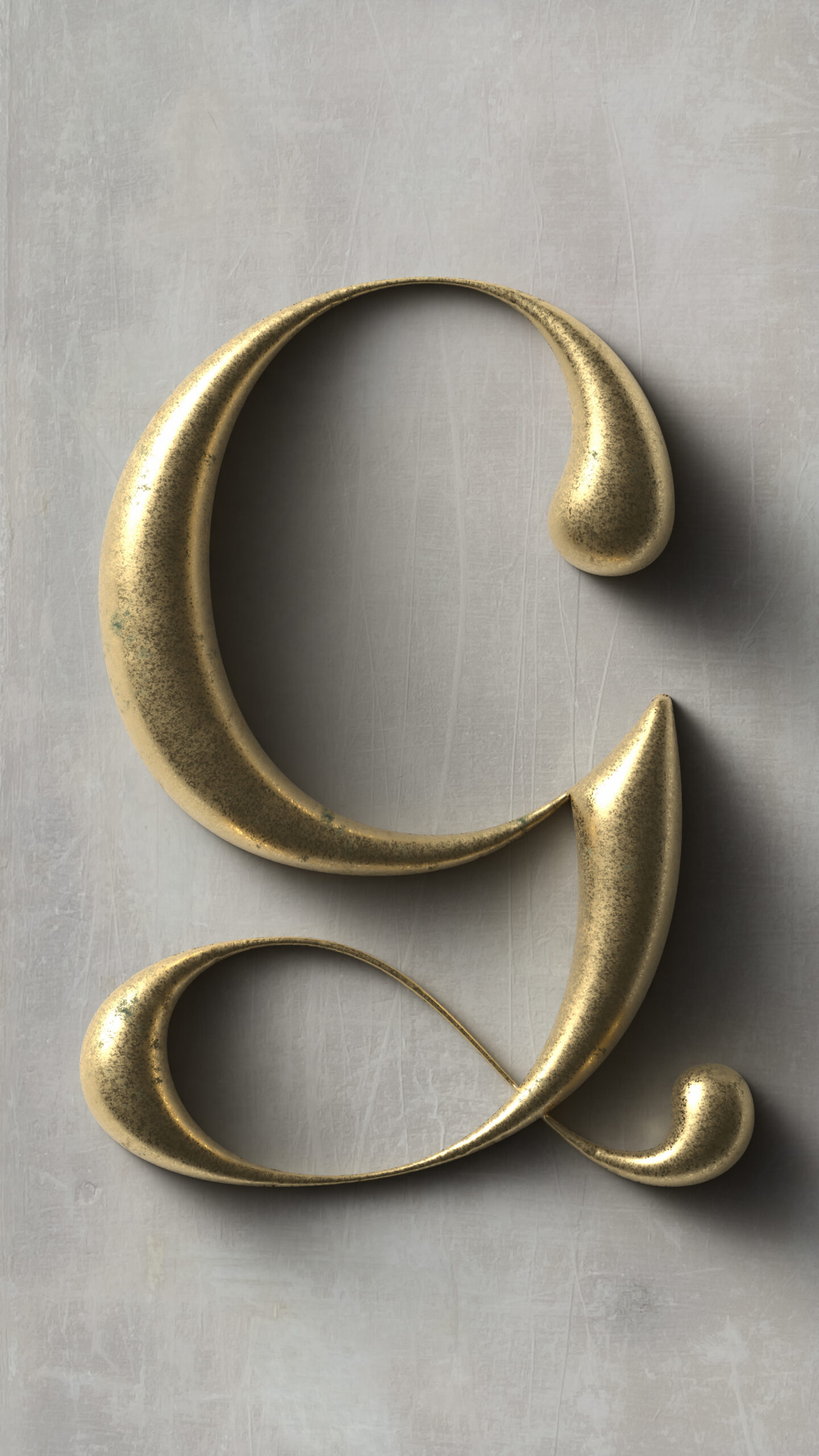
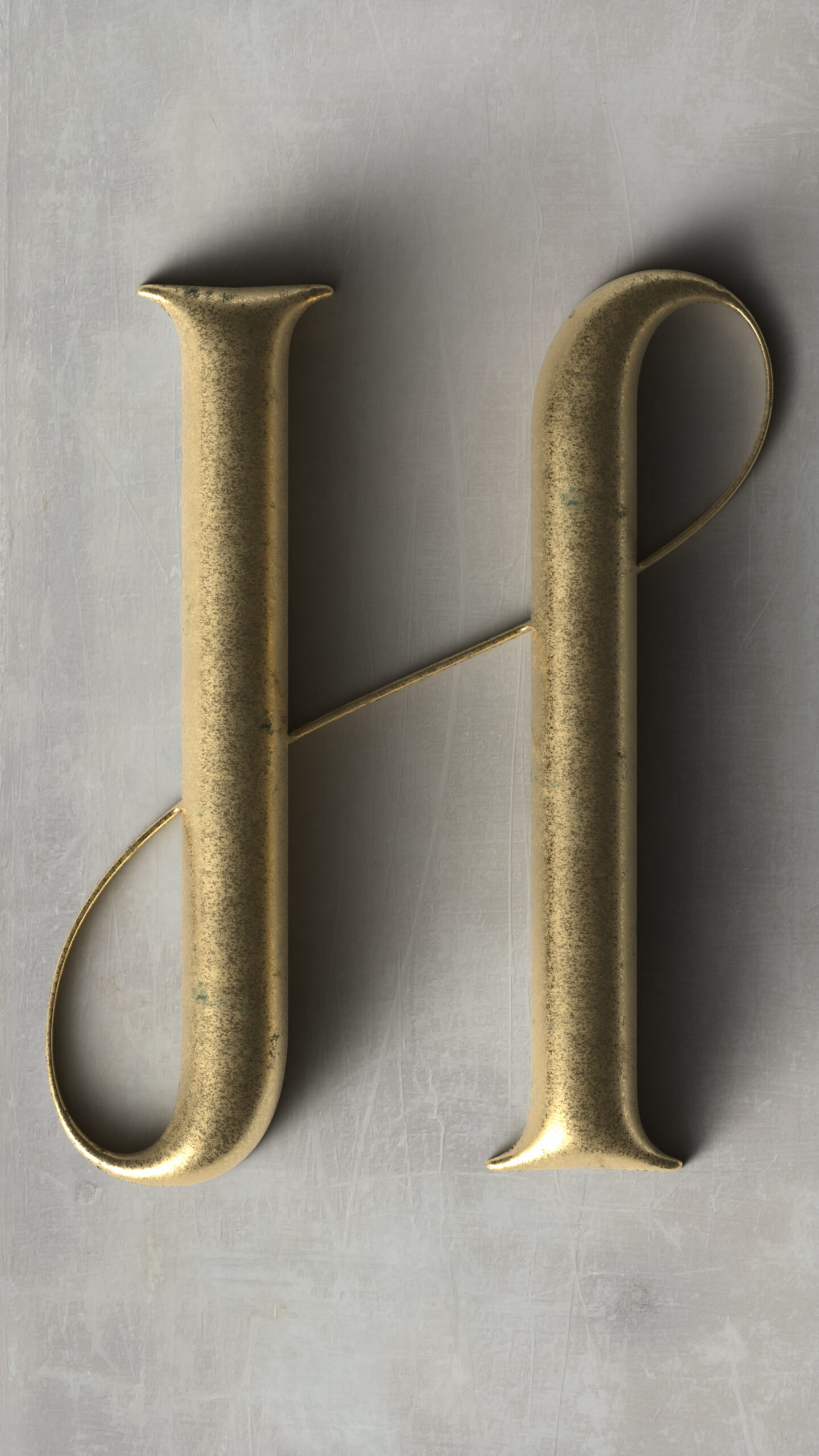
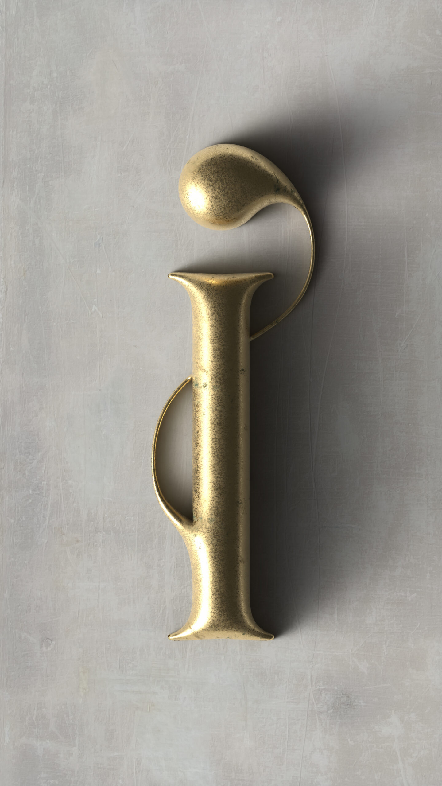
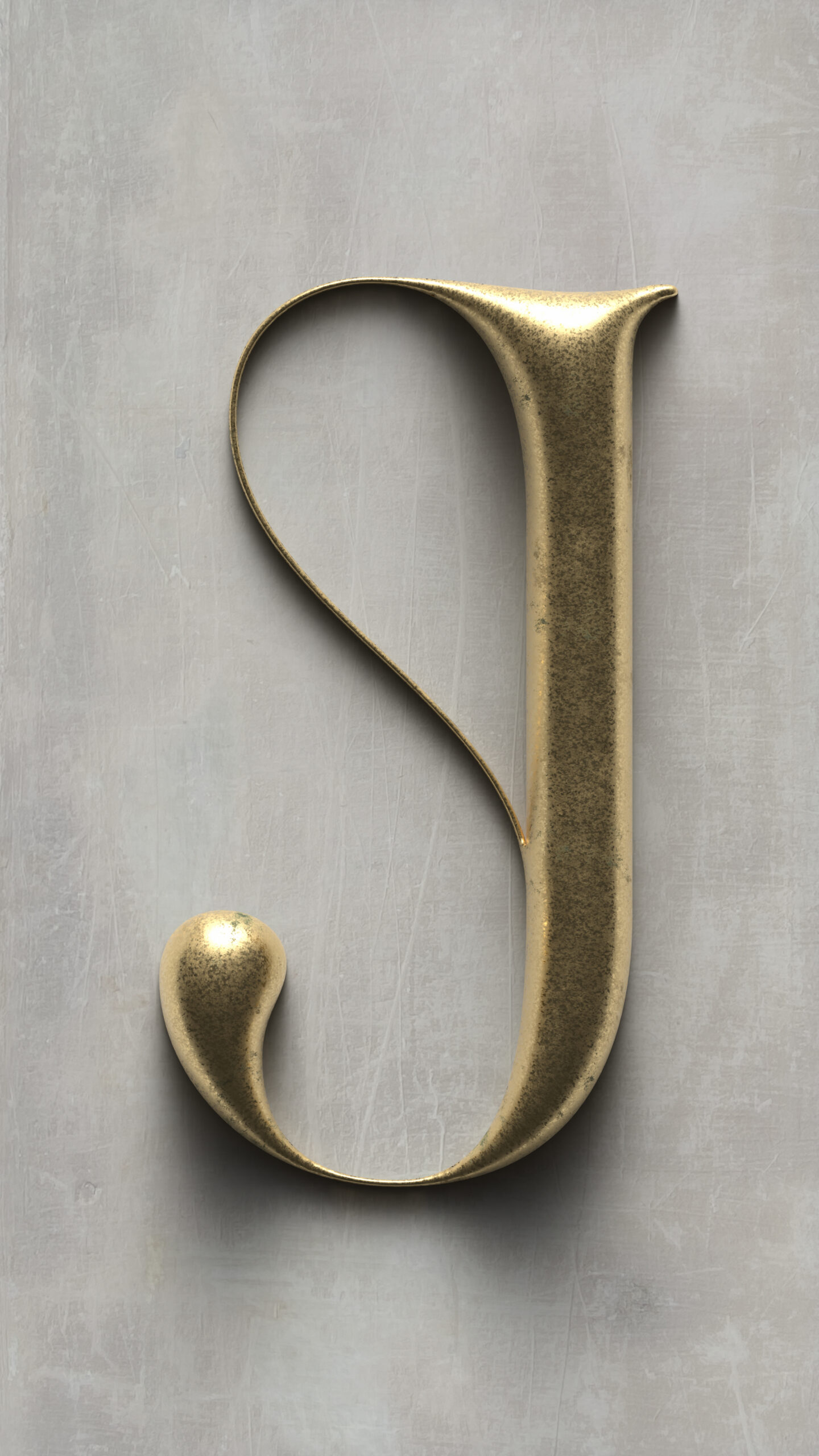
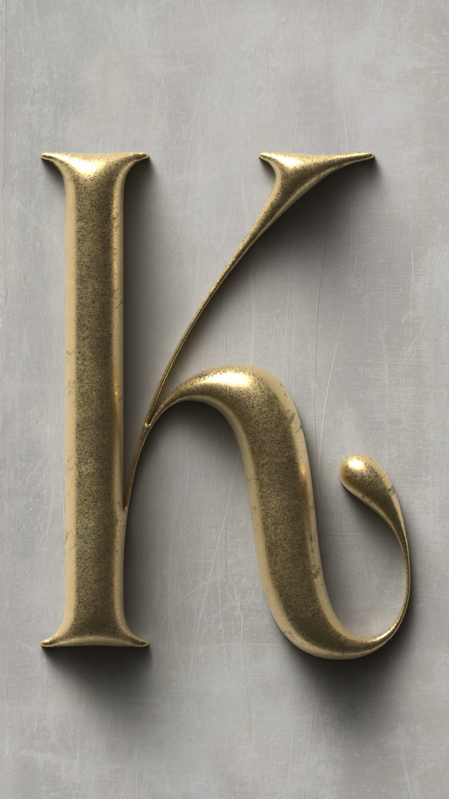
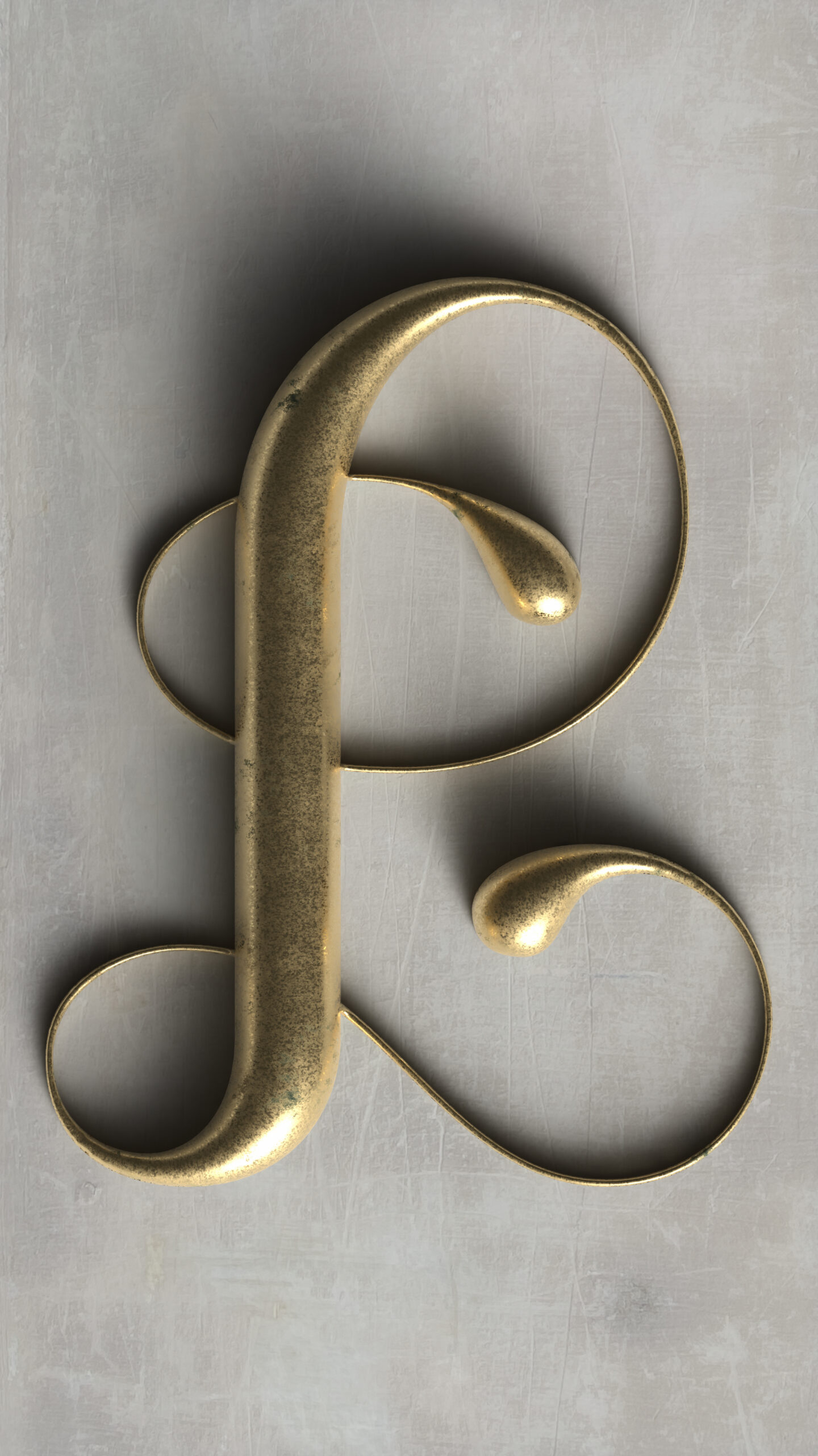
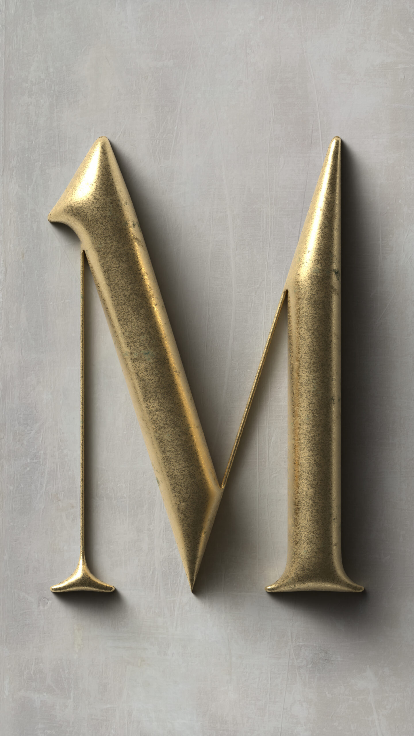
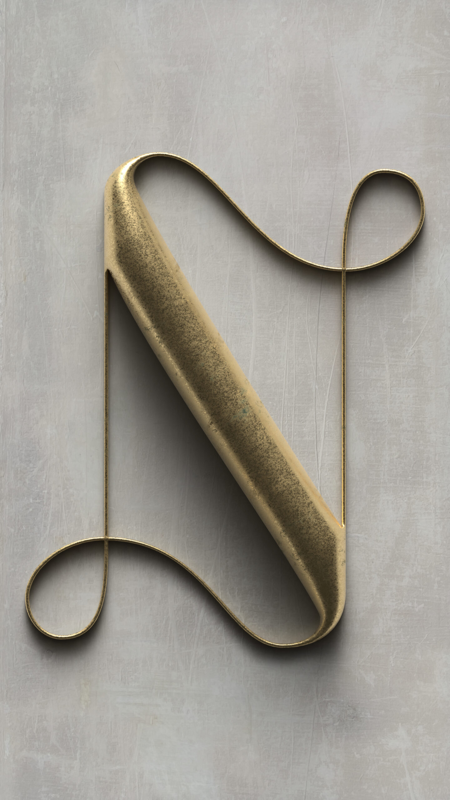
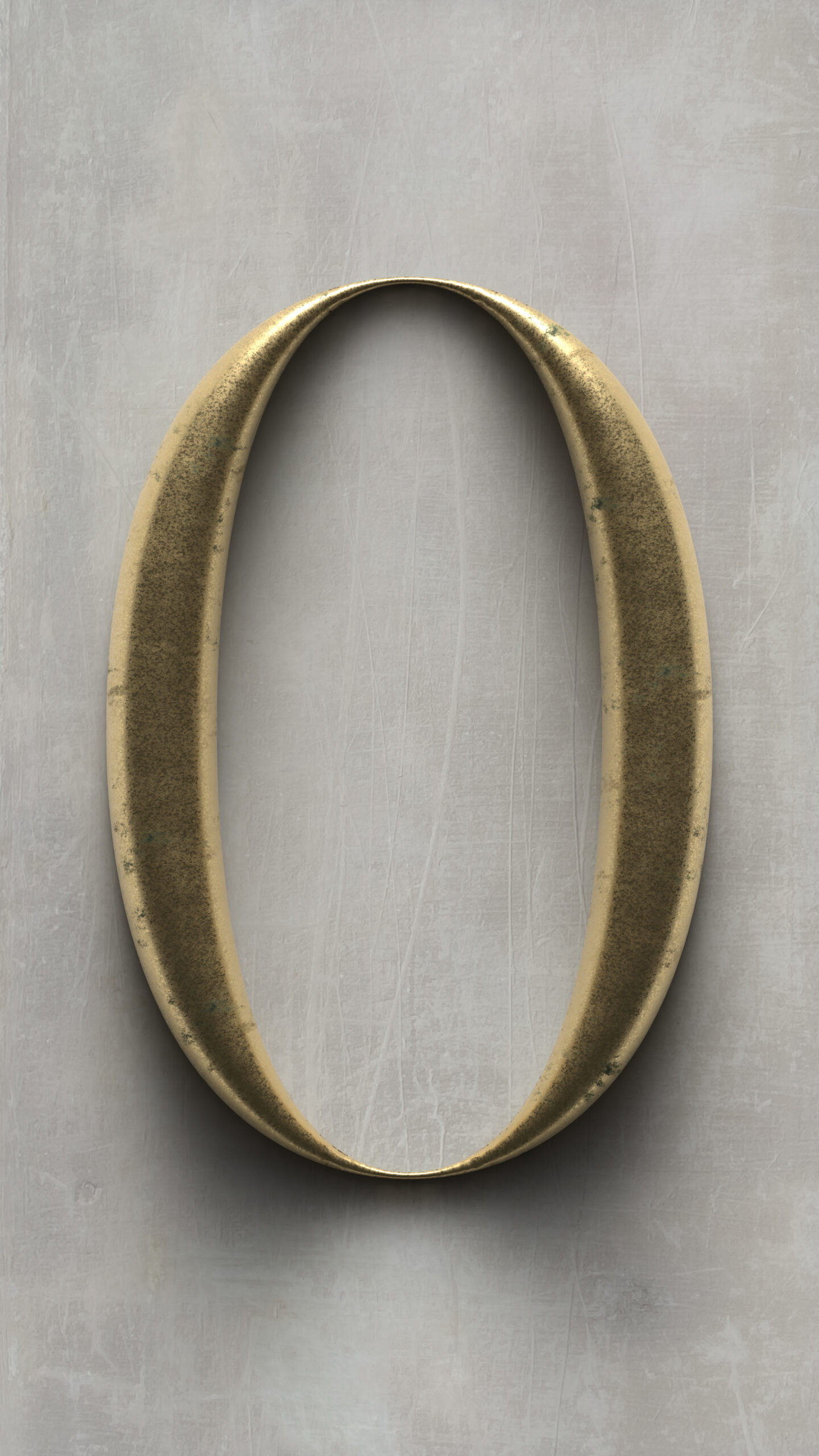
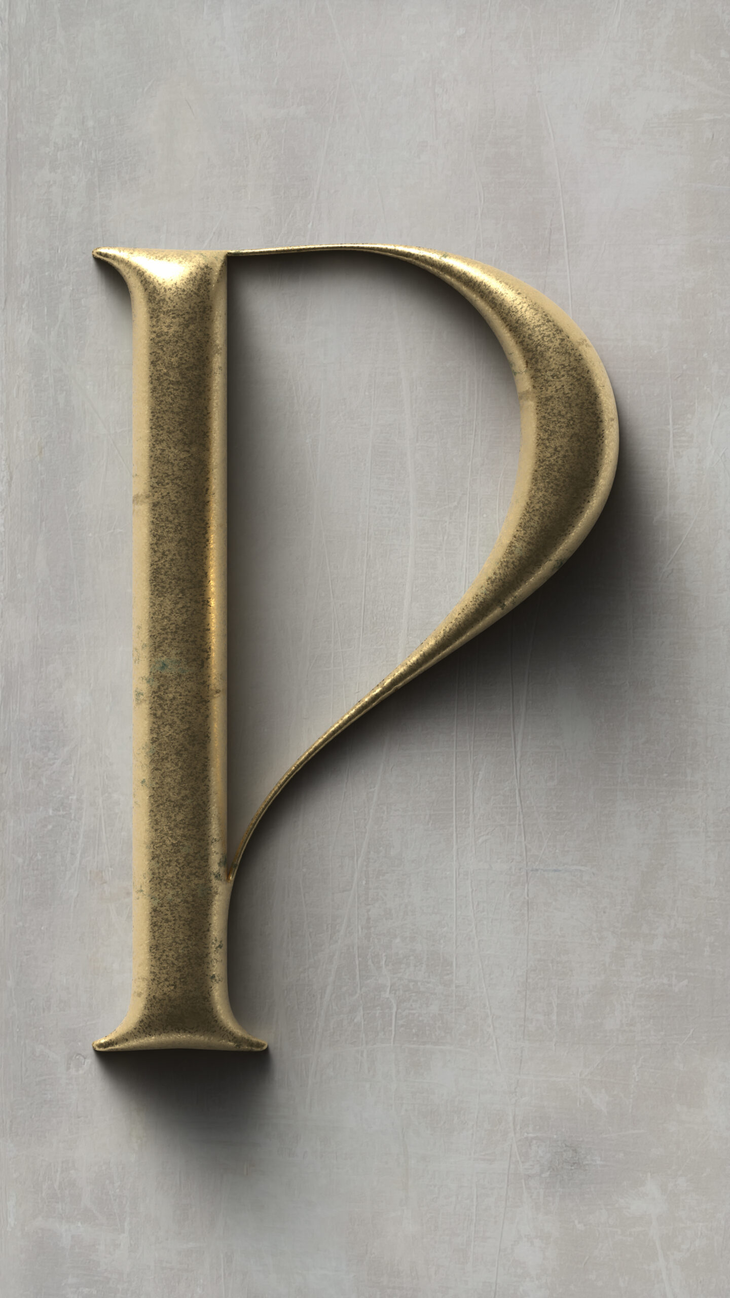
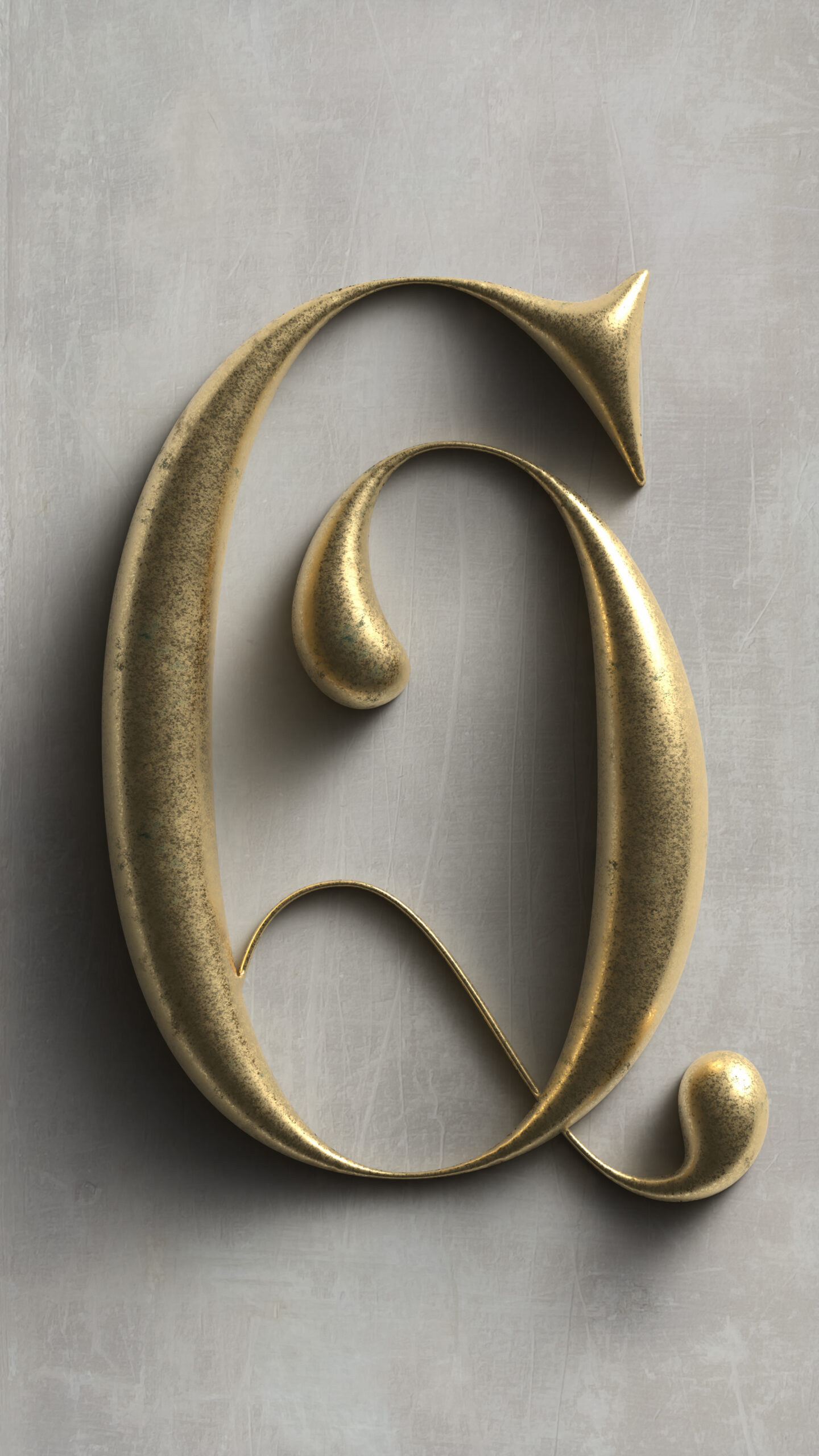
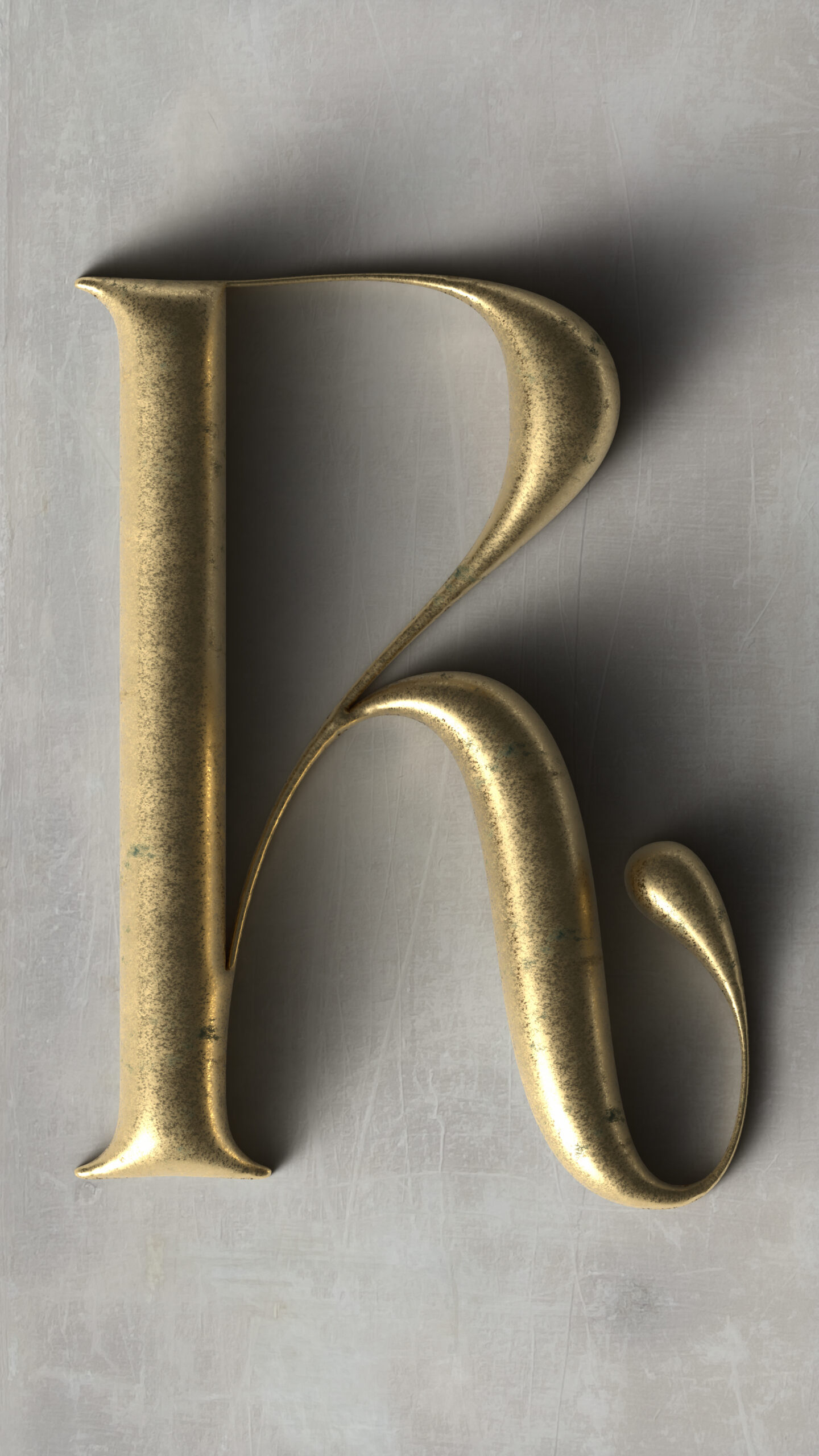
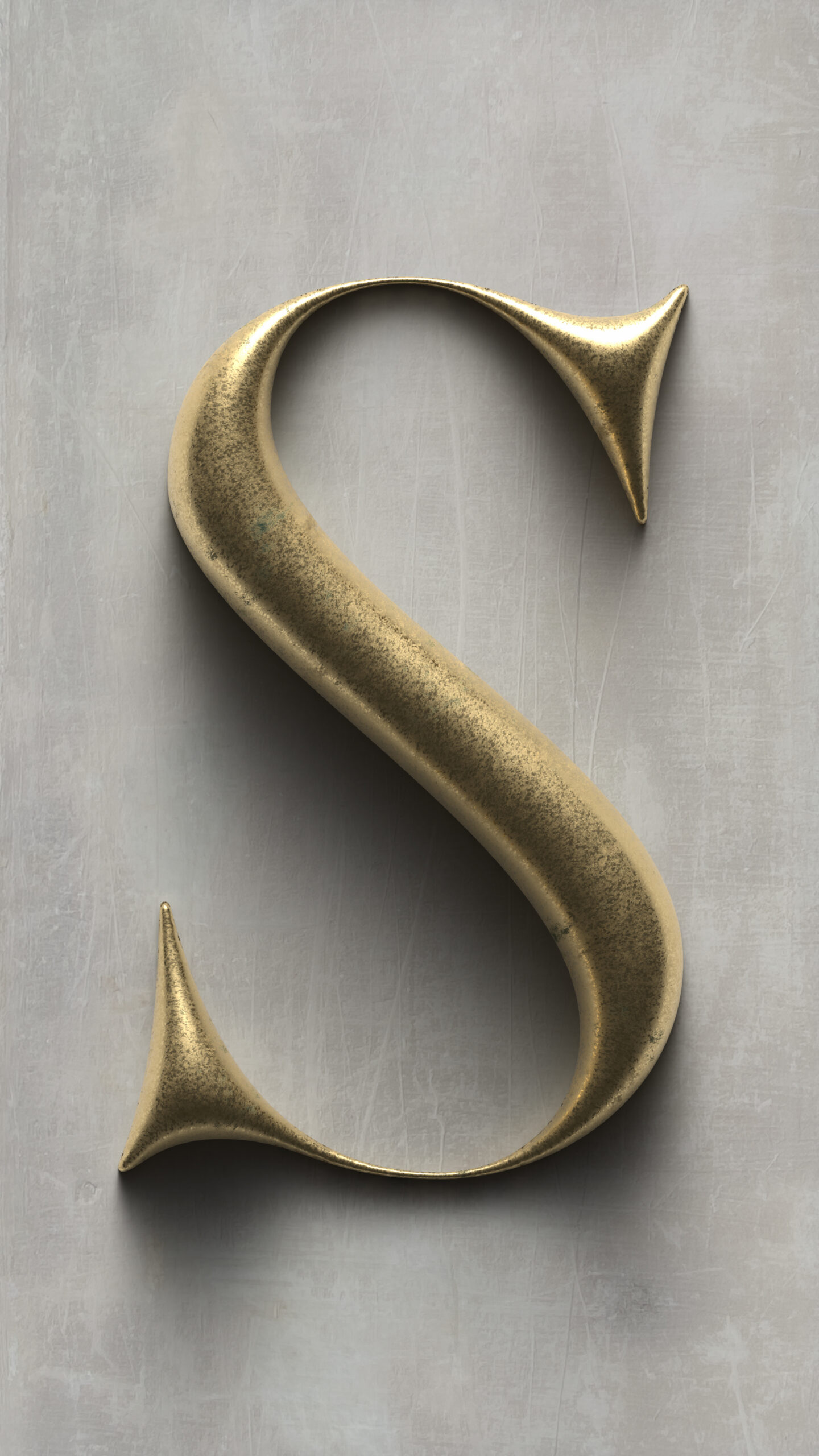
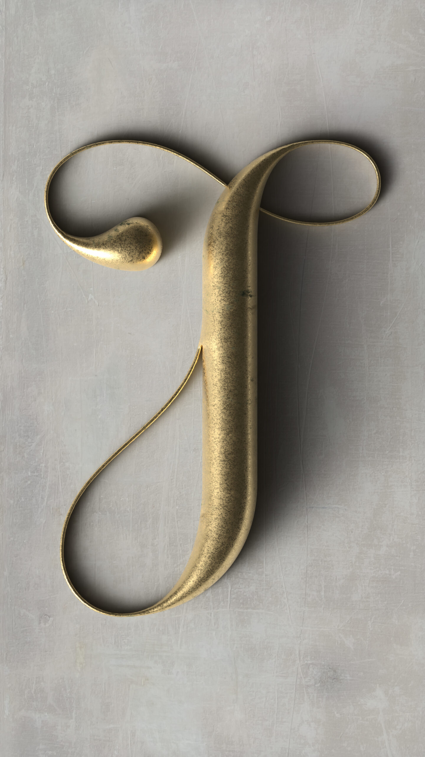
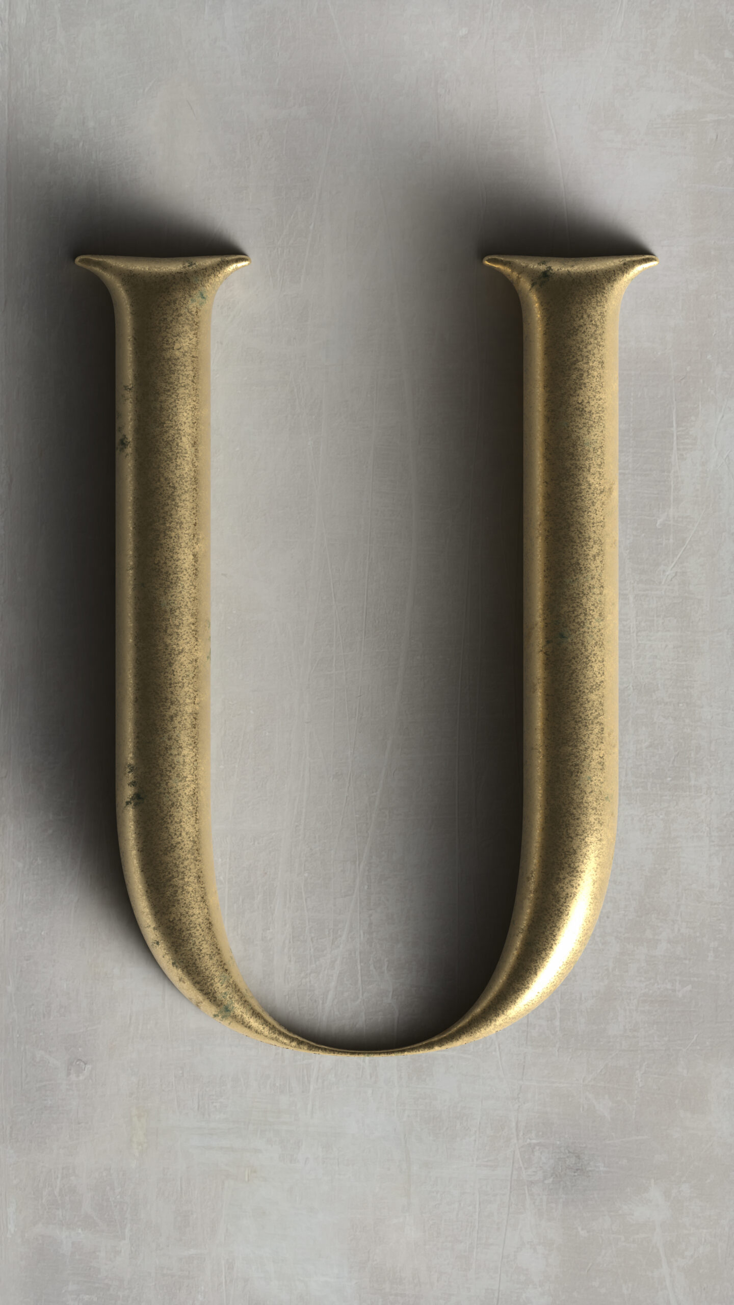
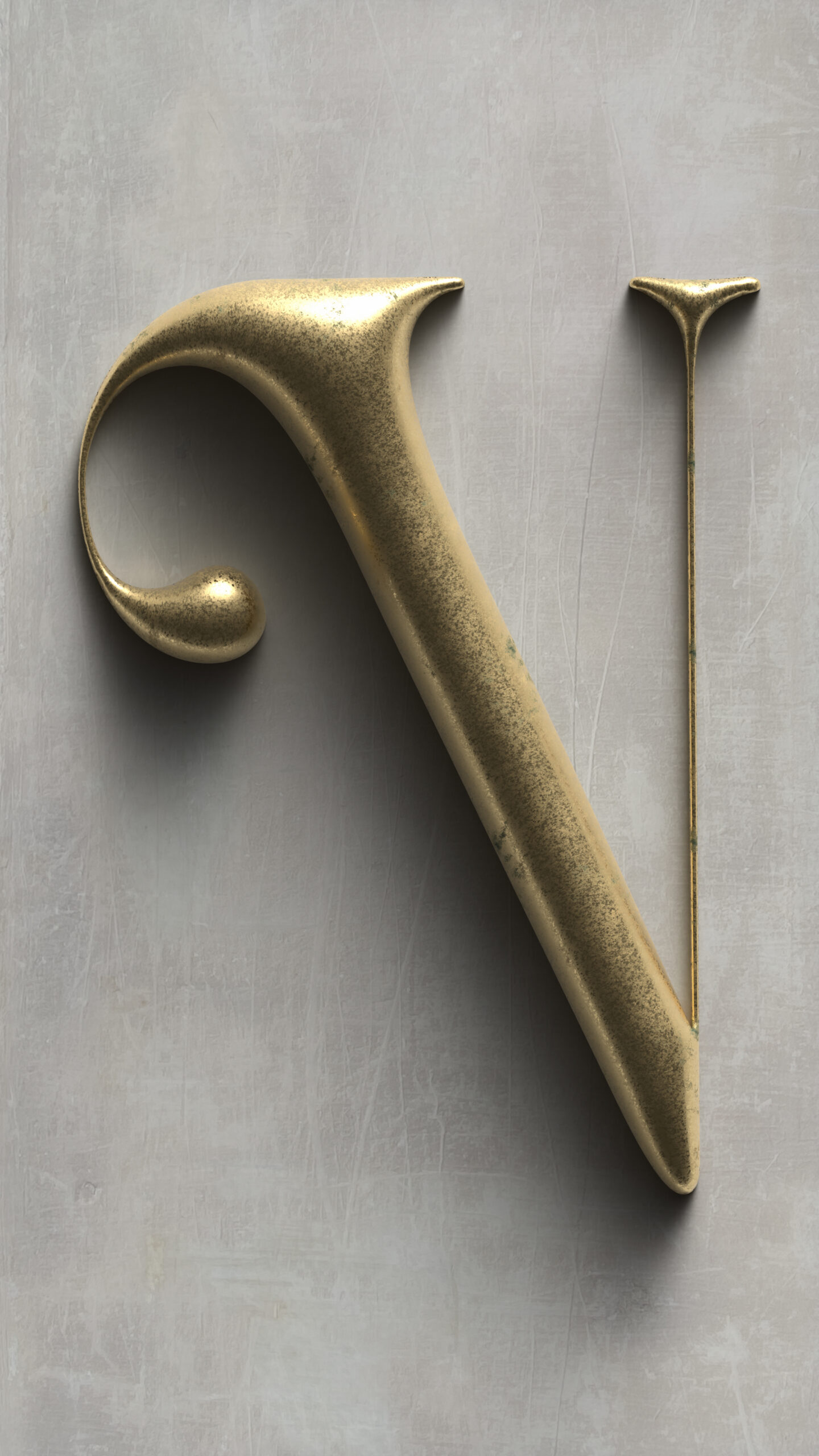
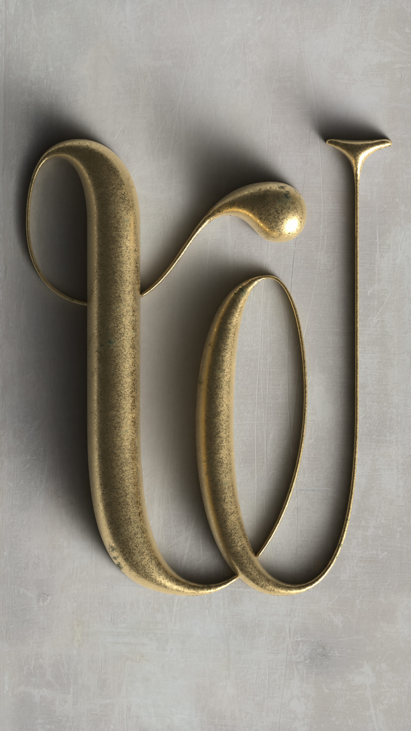
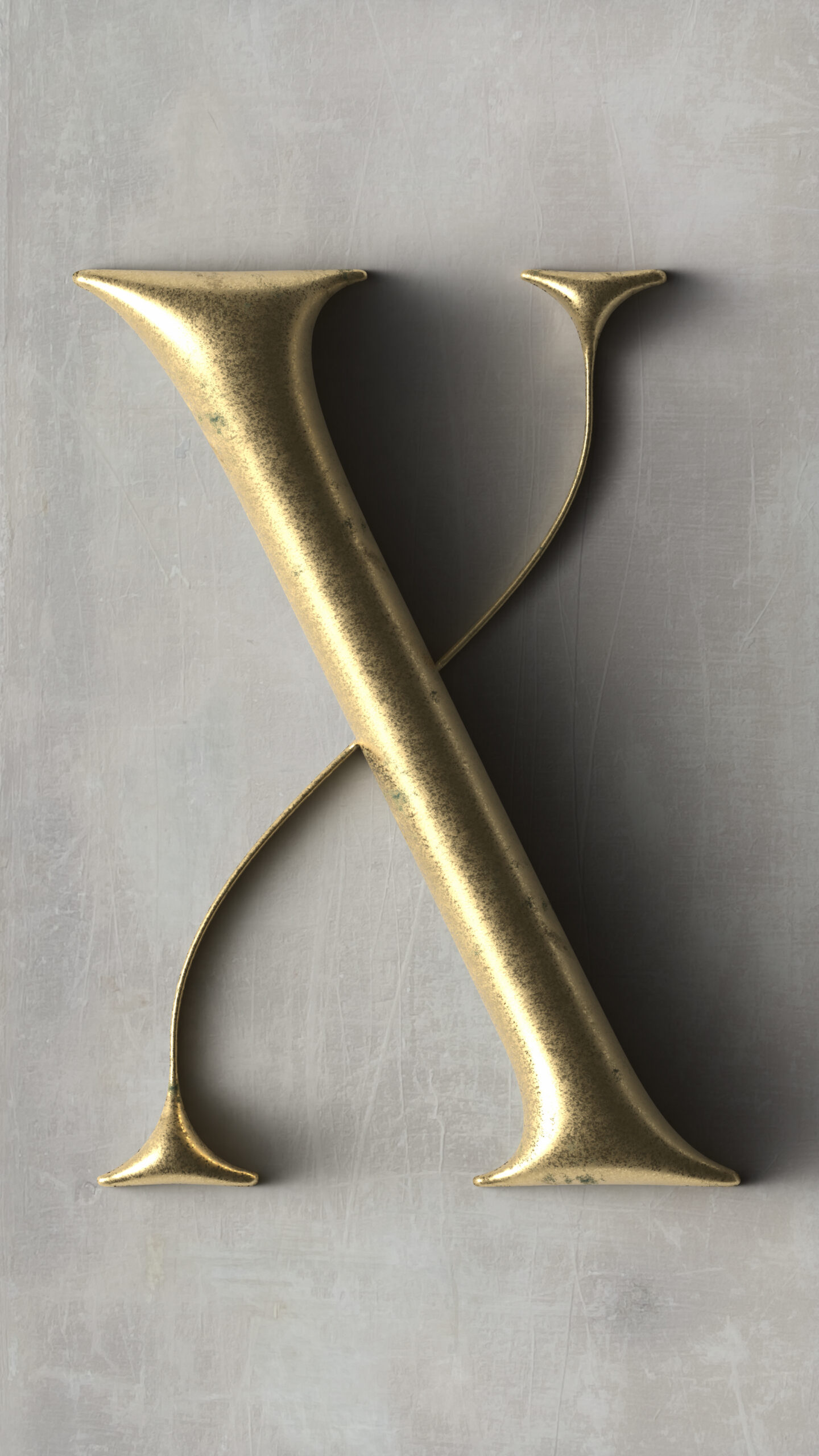
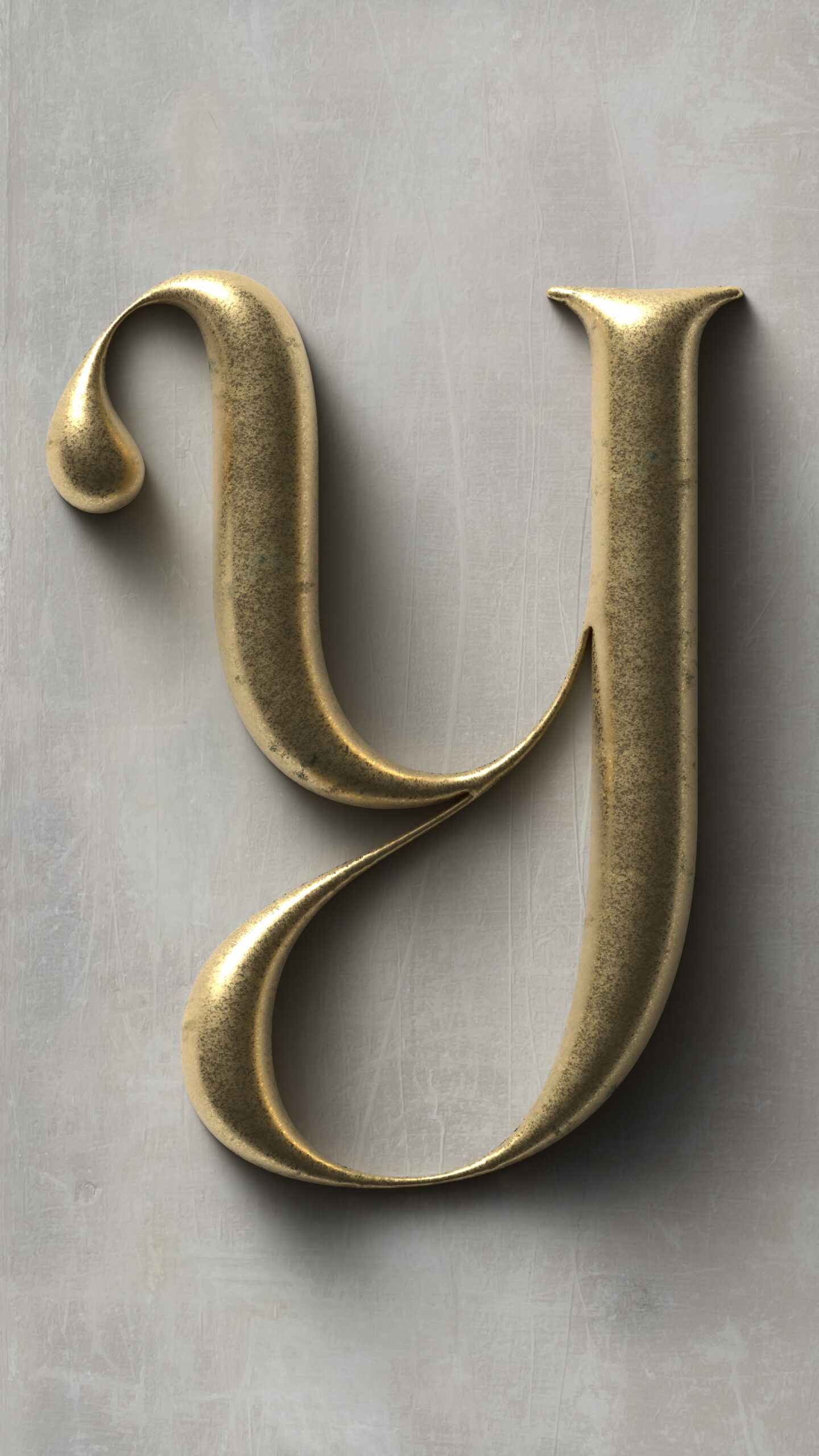
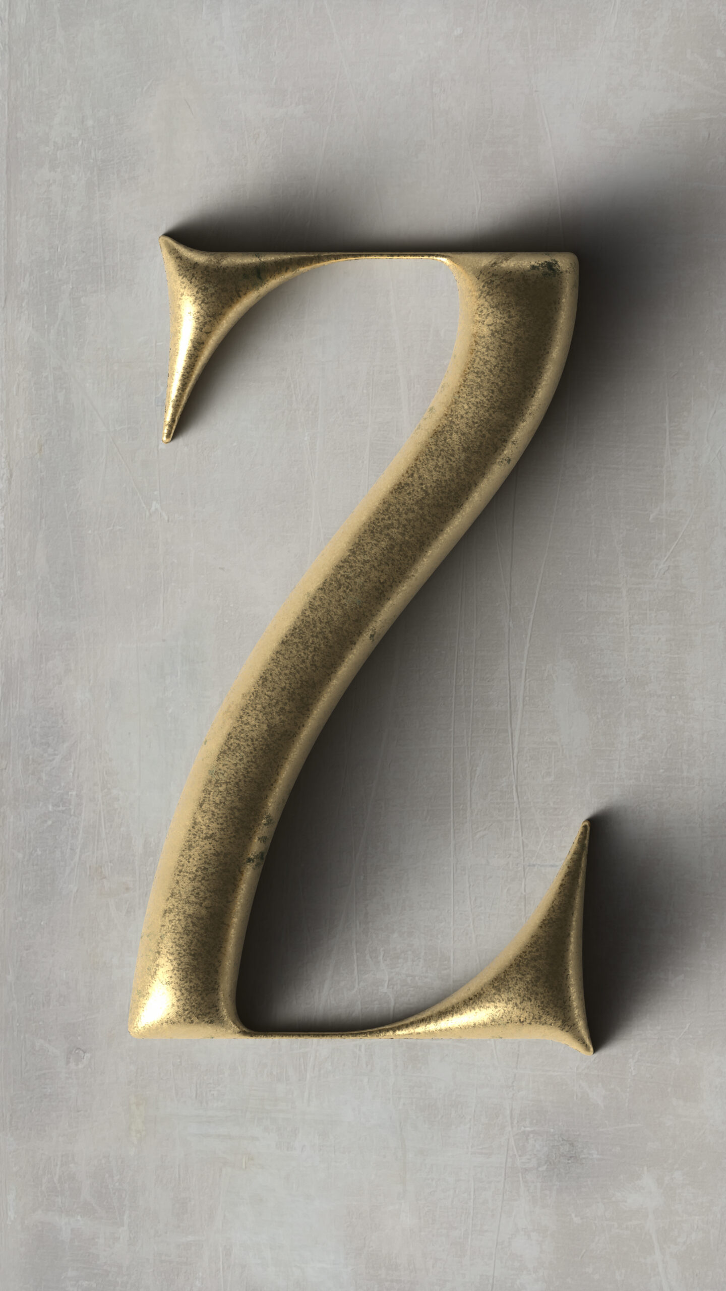
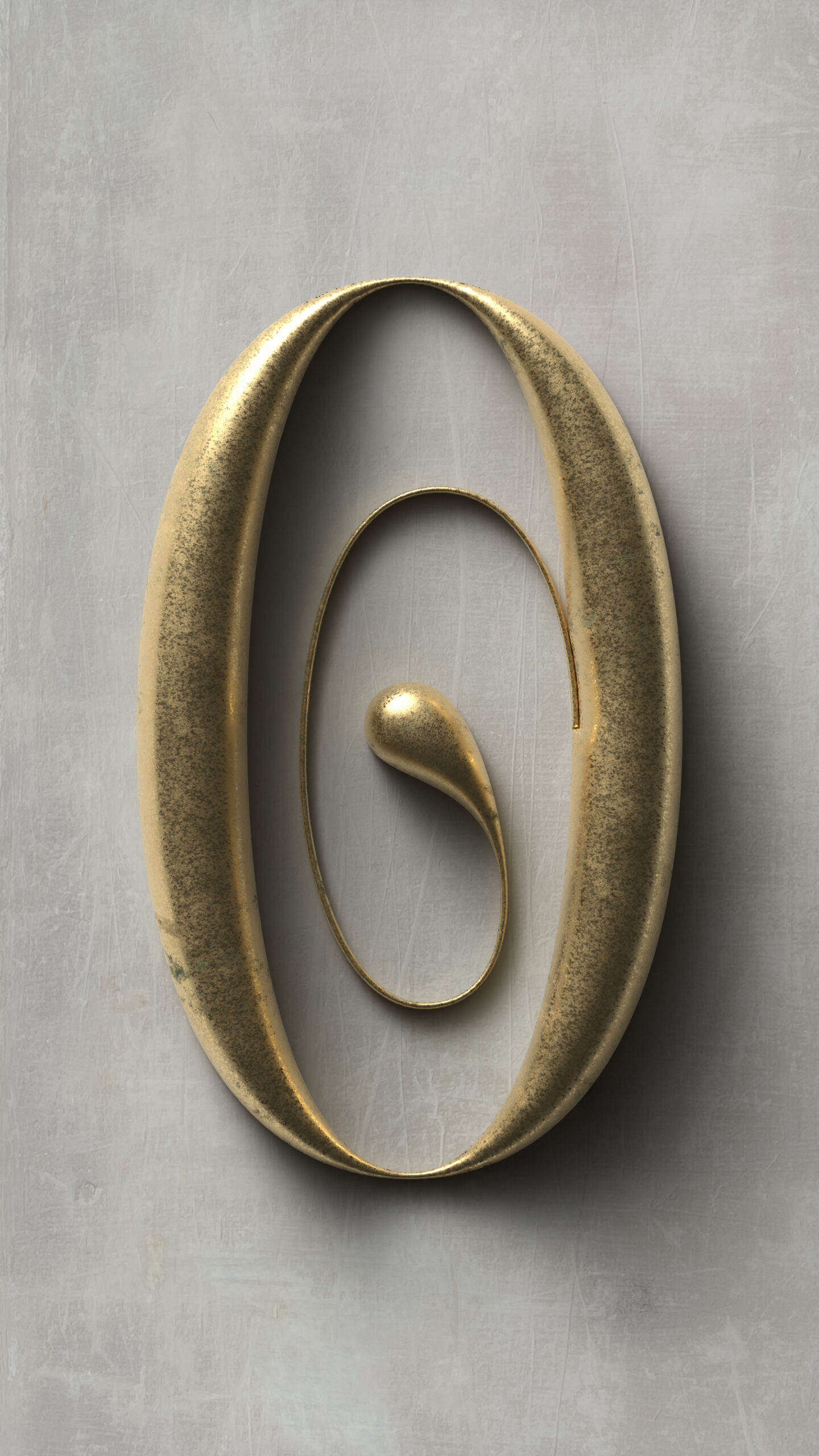
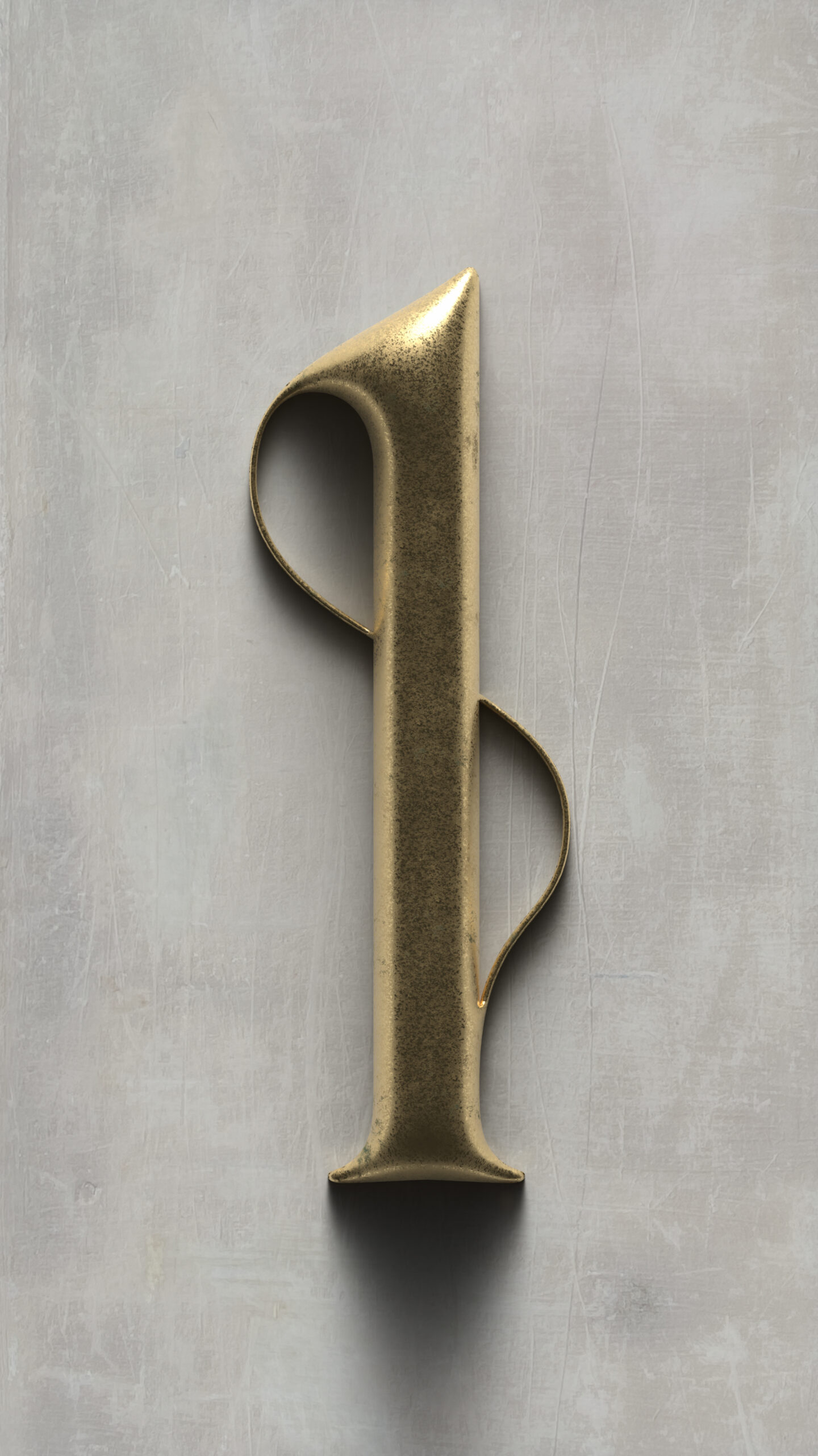
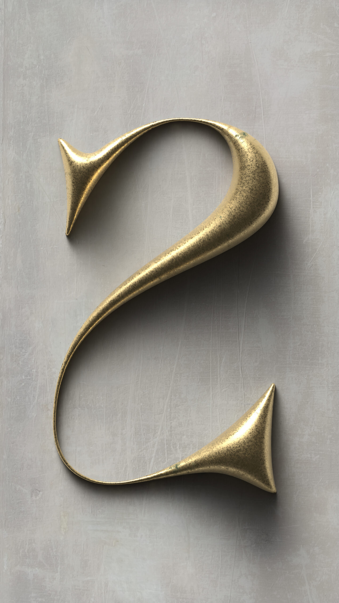
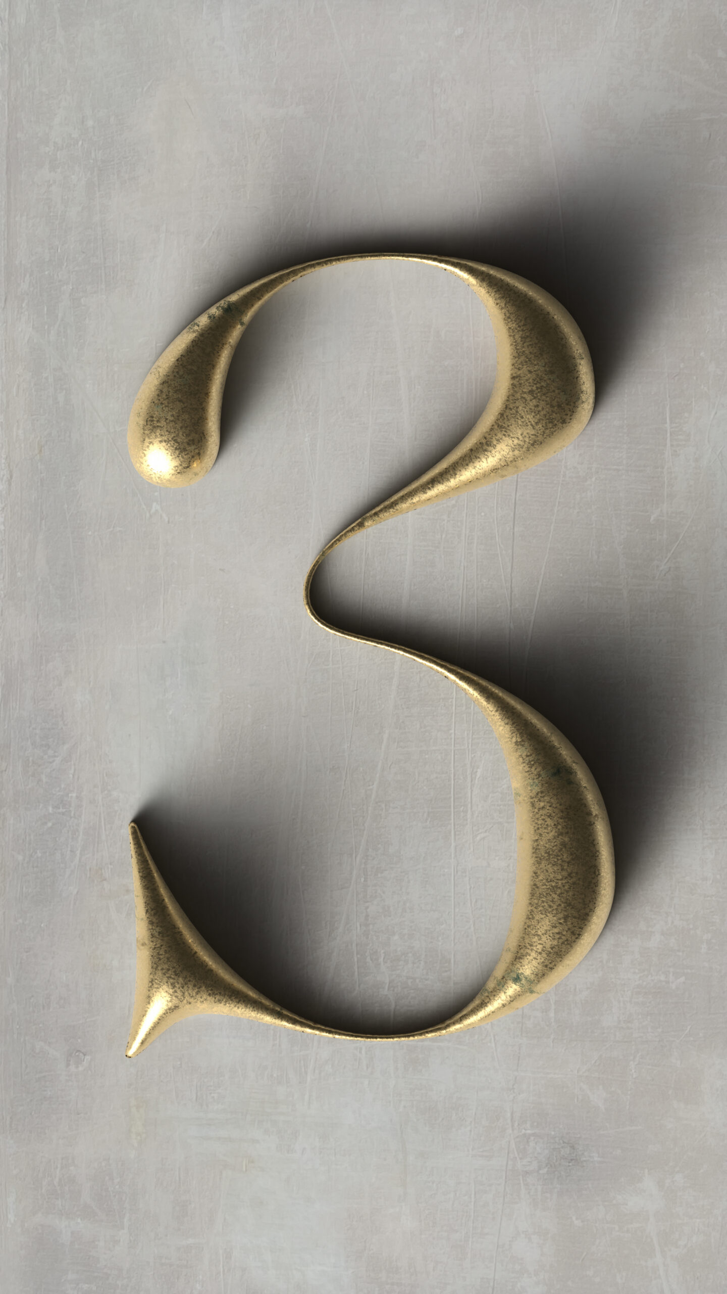
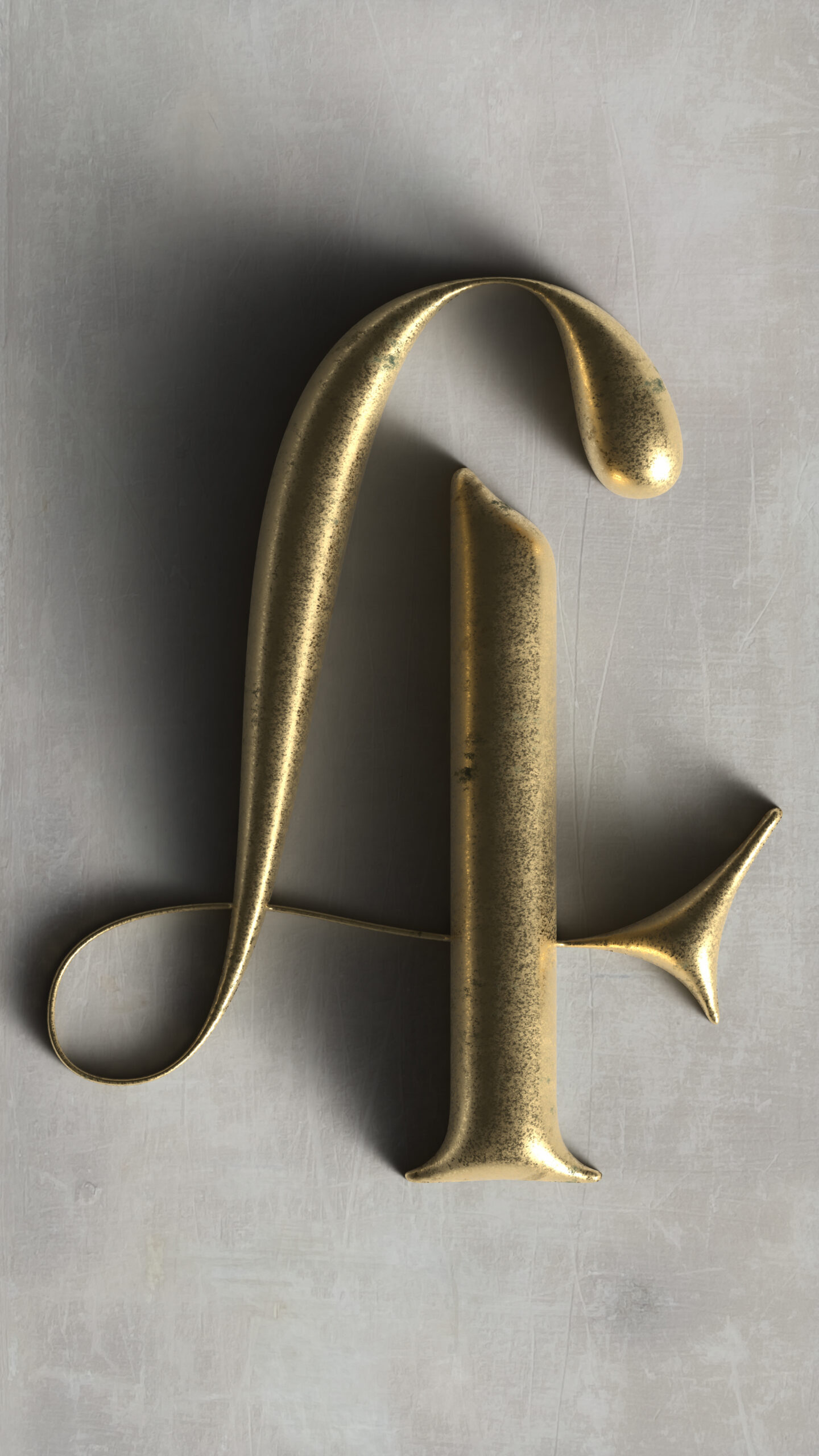
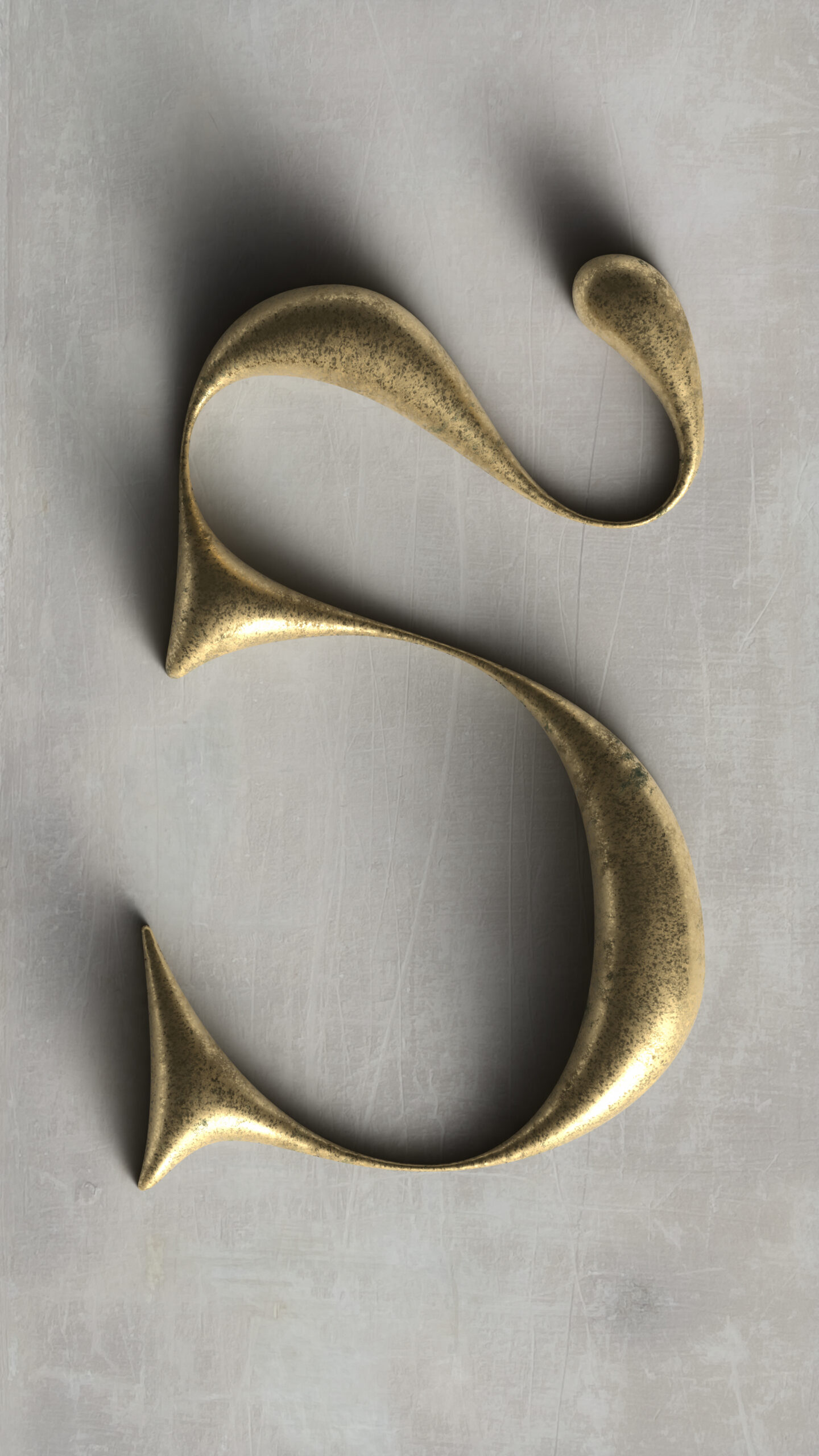
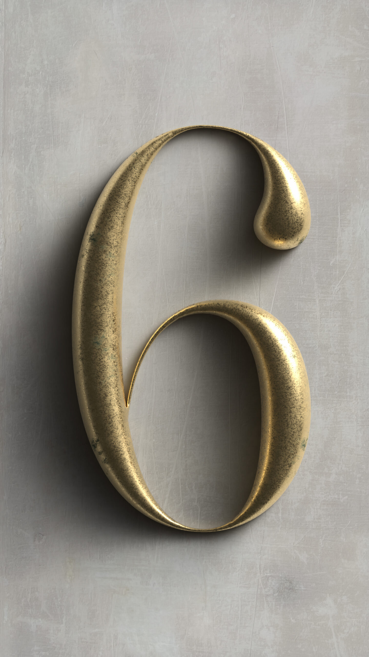
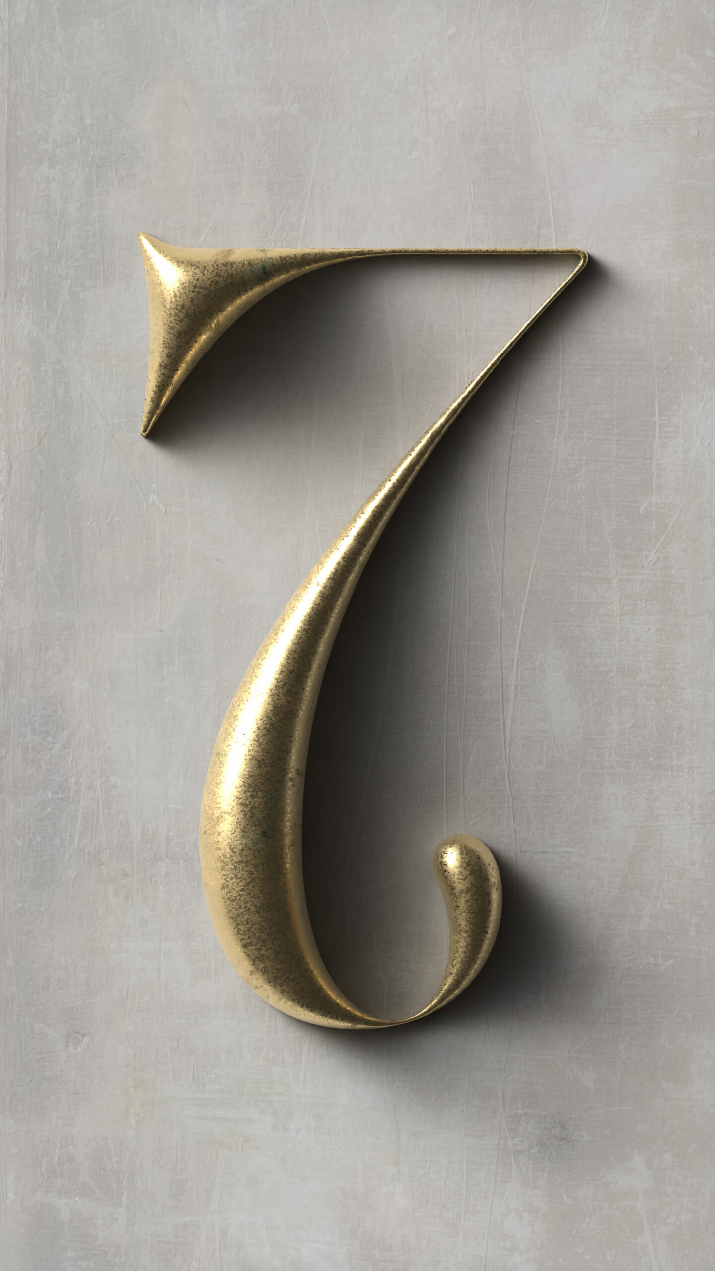
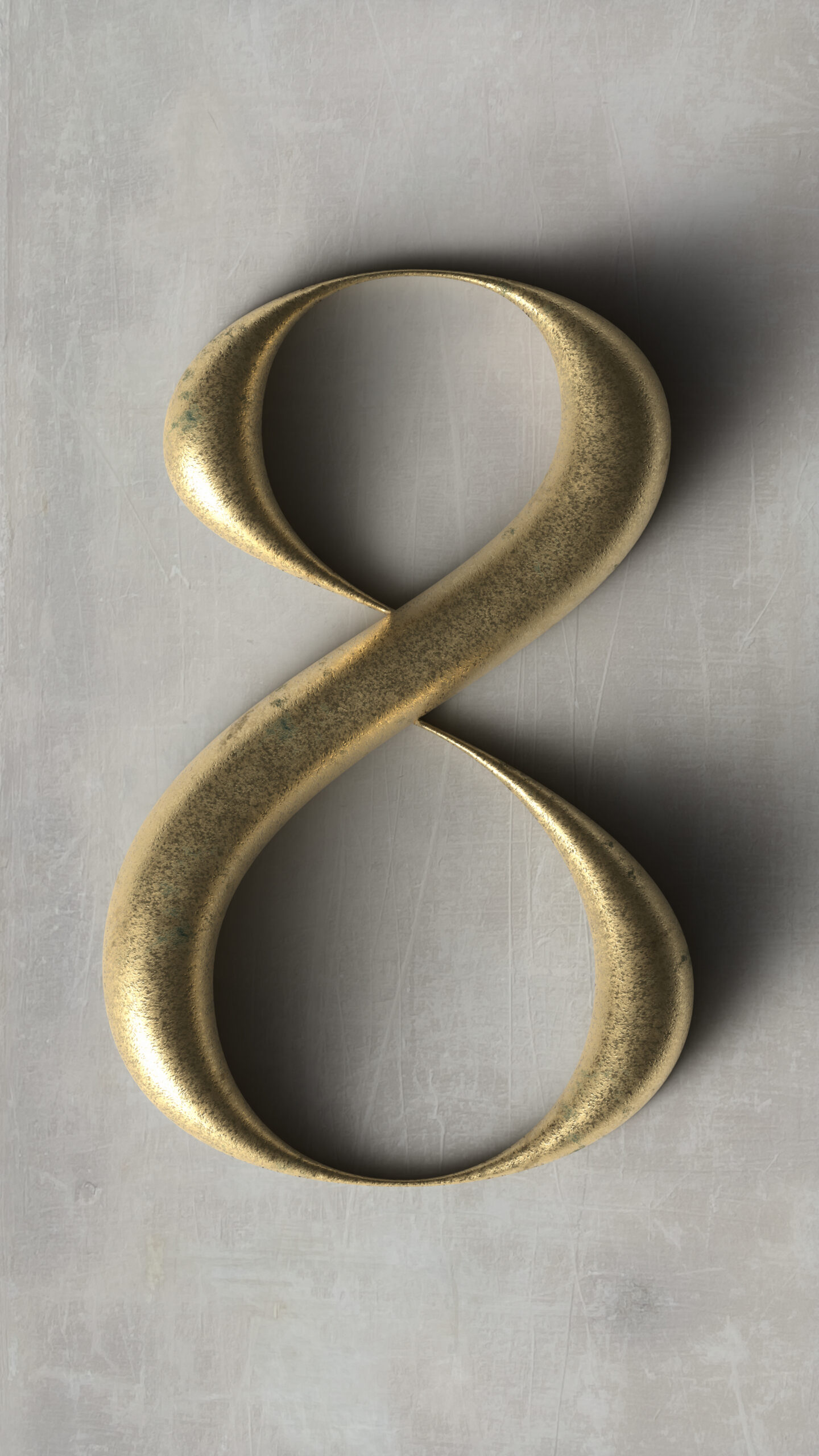
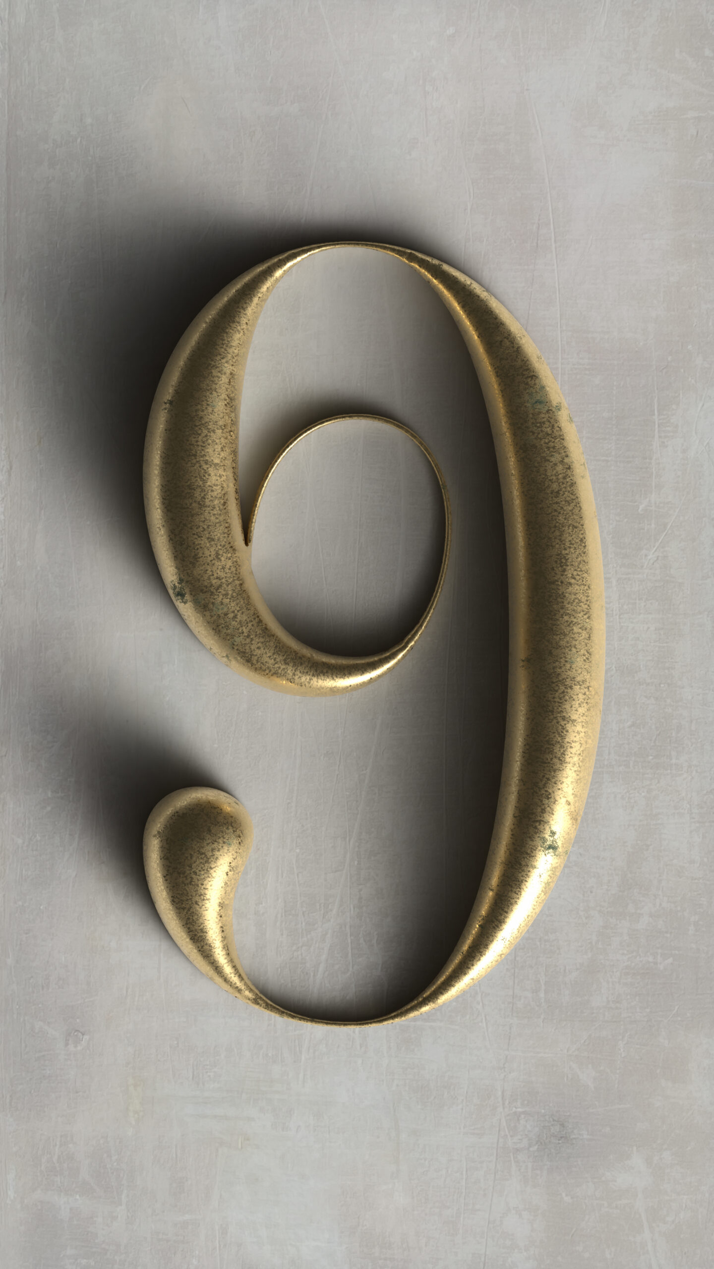
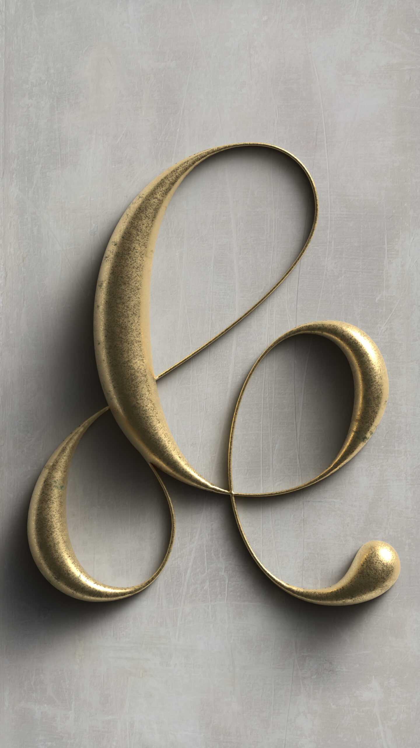
Once again utilizing the 3D and Materials effect in Adobe Illustrator, using the virtual bronze for the entire series with varied lighting angles. The typeface itself straddles the line between high-contrast calligraphy and mechanical display fonts. The intitial inspiration was an ampersand I designed 6 months ago that was nothing but curves, so I thought it would be interesting to figure out what universe that character lives in.
As an aside, after I was midway through creating this series, and in light of the now defunct #36daysoftype, I was delighted to discover a new group who is inheriting the mantle of social media typgraphy challenges. I’ll be excited to participate in the new 36 Days of Typography next year—April 1st, 2027.